Demos
How to import
<script lang="ts">
    import { Button, ButtonGroup, SplitButtonGroup } from '@fibrae/semi-ui-svelte';
</script>
Button Type
Buttons support the following types:
- Primary button ("primary", default)
- Secondary button ("secondary")
- Tertiary button ("tertiary")
- Warning button ("warning")
- Danger button ("danger")
Code
<script lang="ts">
    import { Button } from '@fibrae/semi-ui-svelte';
</script>

<div class="btn-margin-right">
    <Button>主要按钮</Button>
    <Button type="secondary">次要按钮</Button>
    <Button type="tertiary">第三按钮</Button>
    <Button type="warning">警告按钮</Button>
    <Button type="danger">危险按钮</Button>
</div>
About the Font Color
CSS Variables are used with the button:
var(--semi-color-primary): mainvar(--semi-color-secondary): secondaryvar(--semi-color-tertiary): thirdvar(--semi-color-warning): warningvar(--semi-color-danger): danger
You can define your elements directly using these theme colors.
Code
<script lang="ts">
    const types = [
        ['primary', '主要'],
        ['secondary', '次要'],
        ['tertiary', '第三'],
        ['warning', '警告'],
        ['danger', '危险'],
    ];
</script>

<article>
    {#each types as [type, label] (type)}
        <strong style={`color: var(--semi-color-${type}); margin-right: 10px`}>
            {label}
        </strong>
    {/each}
</article>
Button Theme
The themes currently available are:
light: light backgroundsolid: dark backgroundborderless: no backgroundoutline: border mode
The default theme is light
Light Background
Code
<script lang="ts">
    import { Button } from '@fibrae/semi-ui-svelte';
</script>

<Button style="margin-right: 8px" theme="light" type="primary">浅色主要</Button>
<Button style="margin-right: 8px" theme="light" type="secondary">浅色次要</Button>
<Button style="margin-right: 8px" theme="light" type="tertiary">浅色第三</Button>
<Button style="margin-right: 8px" theme="light" type="warning">浅色警告</Button>
<Button style="margin-right: 8px" theme="light" type="danger">浅色危险</Button>
Dark Background
Code
<script lang="ts">
    import { Button } from '@fibrae/semi-ui-svelte';
</script>

<Button style="margin-right: 8px" theme="solid" type="primary">深色主要</Button>
<Button style="margin-right: 8px" theme="solid" type="secondary">深色次要</Button>
<Button style="margin-right: 8px" theme="solid" type="tertiary">深色第三</Button>
<Button style="margin-right: 8px" theme="solid" type="warning">深色警告</Button>
<Button style="margin-right: 8px" theme="solid" type="danger">深色危险</Button>
No Background
Code
<script lang="ts">
    import { Button } from '@fibrae/semi-ui-svelte';
</script>

<Button style="margin-right: 8px" theme="borderless" type="primary">主要</Button>
<Button style="margin-right: 8px" theme="borderless" type="secondary">次要</Button>
<Button style="margin-right: 8px" theme="borderless" type="tertiary">第三</Button>
<Button style="margin-right: 8px" theme="borderless" type="warning">警告</Button>
<Button style="margin-right: 8px" theme="borderless" type="danger">危险</Button>
Border Mode
Code
<script lang="ts">
    import { Button } from '@fibrae/semi-ui-svelte';
</script>

<Button style="margin-right: 8px" theme="outline" type="primary">主要</Button>
<Button style="margin-right: 8px" theme="outline" type="secondary">次要</Button>
<Button style="margin-right: 8px" theme="outline" type="tertiary">第三</Button>
<Button style="margin-right: 8px" theme="outline" type="warning">警告</Button>
<Button style="margin-right: 8px" theme="outline" type="danger">危险</Button>
Size
Three sizes are defined by default:
- Big: "Large"
- Default: "default."
- Small: "Small"
Code
<script lang="ts">
    import { Button } from '@fibrae/semi-ui-svelte';
</script>

<div>
    <Button size="large" style="margin-right: 8px">大尺寸</Button>
    <Button size="default" style="margin-right: 8px">默认尺寸</Button>
    <Button size="small">小尺寸</Button>
</div>
Block Button
The block button has a predefined width, and its width is independent of the width of the contents of the button.
Code
<script lang="ts">
    import { Button } from '@fibrae/semi-ui-svelte';
</script>

<div>
    <Button block>块级按钮</Button>
</div>
Icon Button
An icon that defines a button.
Pass the icon through the icon snippet; iconPosition decides where it goes. The rest of the tag content is the text (children). Without children the button is treated as icon-only, so pass an aria-label.
禁用状态:
复合类型:
更改主题:
更改图标位置:
Code
<script lang="ts">
    import { IconCamera, IconChevronDown, IconSidebar } from '@fibrae/semi-icons-svelte';
    import { Button } from '@fibrae/semi-ui-svelte';
</script>

{#snippet camera()}
    <IconCamera />
{/snippet}

<div>
    <strong>默认状态:</strong>
    <Button aria-label="截屏" icon={camera} />
    <br />
    <br />
    <strong>禁用状态:</strong>
    <Button aria-label="截屏" disabled icon={camera} />
    <br />
    <br />
    <strong>复合类型:</strong>
    <span class="btn-margin-right">
        <Button aria-label="截屏" icon={camera} type="primary" />
        <Button aria-label="截屏" icon={camera} type="secondary" />
        <Button aria-label="截屏" icon={camera} type="warning" />
        <Button aria-label="截屏" icon={camera} type="danger" />
    </span>
    <br />
    <br />
    <strong>更改主题:</strong>
    <Button aria-label="截屏" icon={camera} style="margin-right: 10px" theme="solid" />
    <Button aria-label="截屏" icon={camera} theme="light" />
    <br />
    <br />
    <strong>更改图标位置:</strong>
    <Button style="margin-right: 10px" theme="solid">
        {#snippet icon()}
            <IconSidebar />
        {/snippet}
        收起
    </Button>
    <Button iconPosition="right" theme="solid">
        {#snippet icon()}
            <IconChevronDown />
        {/snippet}
        展开选项
    </Button>
    <br />
    <br />
</div>
Link Button
We recommend using Typography to achieve link text button. Refer to Typography for more information.
Code
<script lang="ts">
    import { IconLink } from '@fibrae/semi-icons-svelte';
    import { TypographyText } from '@fibrae/semi-ui-svelte';
</script>

<div>
    <TypographyText link={{ href: 'https://semi.design/' }}>链接文本</TypographyText>
    <br />
    <br />
    <TypographyText link={{ href: 'https://semi.design/' }}>打开网站</TypographyText>
    <br />
    <br />
    <TypographyText link underline>
        {#snippet icon()}
            <IconLink />
        {/snippet}
        带下划线的网页链接
    </TypographyText>
</div>
Prohibited Status
Code
<script lang="ts">
    import { Button } from '@fibrae/semi-ui-svelte';
</script>

<div>
    <Button disabled>禁用</Button>
    <Button disabled theme="borderless">无背景禁用</Button>
    <Button disabled theme="light">浅色禁用</Button>
    <Button disabled theme="borderless" type="primary">无背景主要禁用</Button>
    <Button disabled theme="solid" type="warning">深色警告禁用</Button>
</div>
Loading State
The button supports the Loading state, by setting the loading parameter value to true, note: the disabled state takes precedence over the loading state.
Code
<script lang="ts">
    import { IconDelete } from '@fibrae/semi-icons-svelte';
    import { Button } from '@fibrae/semi-ui-svelte';

    let saveLoading = $state(false);
    let delLoading = $state(true);
    let repLoading = $state(true);

    const reset = (status: boolean) => {
        saveLoading = status;
        delLoading = status;
        repLoading = status;
    };
</script>

<div>
    <div>
        <div class="btn-margin-right" style="display: inline-flex; align-items: center; padding-bottom: 14px">
            <Button onclick={() => reset(false)}>关闭加载态</Button>
            <Button onclick={() => reset(true)}>开启加载态</Button>
        </div>
    </div>
    <hr />
    <Button loading={saveLoading} style="margin-right: 14px" onclick={() => (saveLoading = true)}>保存</Button>
    <Button loading={delLoading} style="margin-right: 14px" type="danger" onclick={() => (delLoading = true)}>
        {#snippet icon()}
            <IconDelete />
        {/snippet}
        删除
    </Button>
    <div style="width: 200px; display: inline-block">
        <Button block loading={repLoading} theme="solid" type="warning" onclick={() => (repLoading = true)}>撤销</Button>
    </div>
</div>
AI style - Colorful buttons
Set colorful to get colorful buttons. Colorful buttons support all theme, and type only supports primary and tertiary.
A colorful button gives the icon snippet the argument { fill }, which you need to pass to the icon component: {#snippet icon({ fill })}<IconAIFilledLevel1 {fill} />{/snippet}.
Code
<script lang="ts">
    import { IconAIFilledLevel1, IconAIFilledLevel2, IconAIFilledLevel3 } from '@fibrae/semi-icons-svelte';
    import { Button } from '@fibrae/semi-ui-svelte';

    const contents = ['Colorful', undefined];
    const rows = [
        { theme: 'solid', primaryIcon: IconAIFilledLevel1, tertiaryIcon: IconAIFilledLevel3 },
        { theme: 'light', primaryIcon: IconAIFilledLevel3, tertiaryIcon: IconAIFilledLevel2 },
        { theme: 'outline', primaryIcon: IconAIFilledLevel1, tertiaryIcon: IconAIFilledLevel2 },
        { theme: 'borderless', primaryIcon: IconAIFilledLevel3, tertiaryIcon: IconAIFilledLevel2 },
    ] as const;
    const variants = [
        { type: 'primary', state: 'default' },
        { type: 'primary', state: 'loading' },
        { type: 'primary', state: 'disabled' },
        { type: 'tertiary', state: 'default' },
        { type: 'tertiary', state: 'loading' },
        { type: 'tertiary', state: 'disabled' },
    ] as const;
</script>

<!-- The text is the children snippet; leaving it out makes the button icon-only, so the label is passed or omitted as a whole. -->
{#each contents as content (content ?? 'icon-only')}
    {#snippet text()}{content}{/snippet}
    <div style="display: flex; row-gap: 16px; margin-top: 20px; margin-left: 10px; flex-direction: column">
        {#each rows as row (row.theme)}
            <div style="display: flex; column-gap: 16px">
                {#each variants as variant (`${variant.type}-${variant.state}`)}
                    {@const Icon = variant.type === 'primary' ? row.primaryIcon : row.tertiaryIcon}
                    {#snippet icon({ fill }: { fill?: string[] })}
                        <Icon {fill} />
                    {/snippet}
                    <Button aria-label={content ? undefined : 'AI'} children={content ? text : undefined} colorful disabled={variant.state === 'disabled'} {icon} loading={variant.state === 'loading'} theme={row.theme} type={variant.type} />
                {/each}
            </div>
        {/each}
    </div>
{/each}
Button Combination
You can put multiple buttons in a ButtonGroup container and set size, disabled, type, theme and colorful on it to give the buttons a shared size, disabled state, type, theme and colorful style. These props are only defaults: a value set on a button itself wins. Other props such as data-*, id, aria-* and event handlers go to the group's root element (role="group").
Combined Dimensions
Code
<script lang="ts">
    import { Button, ButtonGroup } from '@fibrae/semi-ui-svelte';

    const sizes = ['large', 'default', 'small'] as const;
</script>

<div style="display: flex">
    {#each sizes as size (size)}
        <div style="margin-right: 10px">
            <ButtonGroup aria-label="操作按钮组" {size}>
                <Button>拷贝</Button>
                <Button>查询</Button>
                <Button>剪切</Button>
            </ButtonGroup>
        </div>
    {/each}
</div>
Combined Disabled
Code
<script lang="ts">
    import { Button, ButtonGroup } from '@fibrae/semi-ui-svelte';
</script>

<div style="display: flex">
    <div style="margin-right: 10px">
        <ButtonGroup disabled>
            <Button>拷贝</Button>
            <Button>查询</Button>
            <Button>剪切</Button>
        </ButtonGroup>
    </div>
</div>
Combined Type
Code
<script lang="ts">
    import { Button, ButtonGroup } from '@fibrae/semi-ui-svelte';

    const types = ['primary', 'secondary', 'tertiary', 'warning', 'danger'] as const;
</script>

<div style="display: flex">
    {#each types as type (type)}
        <div style="margin-right: 10px">
            <ButtonGroup aria-label="操作按钮组" {type}>
                <Button>拷贝</Button>
                <Button>查询</Button>
                <Button>剪切</Button>
            </ButtonGroup>
        </div>
    {/each}
</div>
Split Button Group
In the scene where Button and Dropdown are combined, split buttons can be used. The split buttons add the space between the buttons and change the rounded corners of the buttons.
Basic Usage
Code
<script lang="ts">
    import { IconTreeTriangleDown } from '@fibrae/semi-icons-svelte';
    import { Button, Dropdown, SplitButtonGroup, type DropDownMenuItem } from '@fibrae/semi-ui-svelte';

    const menu: DropDownMenuItem[] = [
        { node: 'item', name: '编辑项目', onclick: () => console.log('编辑项目点击') },
        { node: 'item', name: '重置项目' },
        { node: 'divider' },
        { node: 'item', name: '复制项目' },
        { node: 'item', name: '从项目创建模版' },
        { node: 'divider' },
        { node: 'item', name: '删除项目', type: 'danger' },
    ];

    let btnVisible = $state<Record<number, boolean>>({ 1: false, 2: false, 3: false });
</script>

<div>
    <SplitButtonGroup aria-label="项目操作按钮组" style="margin-right: 10px">
        <Button theme="solid" type="primary">分裂按钮</Button>
        <Dropdown {menu} onVisibleChange={(visible) => (btnVisible[1] = visible)} position="bottomRight" trigger="click">
            {#snippet child({ props })}
                <Button {...props} aria-label="更多操作" style={`${btnVisible[1] ? 'background: var(--semi-color-primary-hover); ' : ''}padding: 8px 4px`} theme="solid" type="primary">
                    {#snippet icon()}
                        <IconTreeTriangleDown />
                    {/snippet}
                </Button>
            {/snippet}
        </Dropdown>
    </SplitButtonGroup>
    <SplitButtonGroup aria-label="项目操作按钮组" style="margin-right: 10px">
        <Button theme="light" type="primary">分裂按钮</Button>
        <Dropdown {menu} onVisibleChange={(visible) => (btnVisible[2] = visible)} position="bottomRight" trigger="click">
            {#snippet child({ props })}
                <Button {...props} aria-label="更多操作" style={`${btnVisible[2] ? 'background: var(--semi-color-fill-1); ' : ''}padding: 8px 4px`} theme="light" type="primary">
                    {#snippet icon()}
                        <IconTreeTriangleDown />
                    {/snippet}
                </Button>
            {/snippet}
        </Dropdown>
    </SplitButtonGroup>
    <SplitButtonGroup aria-label="项目操作按钮组">
        <Button style={btnVisible[3] ? 'background: var(--semi-color-fill-0)' : undefined} theme="borderless" type="primary">分裂按钮</Button>
        <Dropdown {menu} onVisibleChange={(visible) => (btnVisible[3] = visible)} position="bottomRight" trigger="click">
            {#snippet child({ props })}
                <Button {...props} aria-label="更多操作" style={`${btnVisible[3] ? 'background: var(--semi-color-fill-1); ' : ''}padding: 8px 4px`} theme="borderless" type="primary">
                    {#snippet icon()}
                        <IconTreeTriangleDown />
                    {/snippet}
                </Button>
            {/snippet}
        </Dropdown>
    </SplitButtonGroup>
</div>
API Reference
Button
Props
| Property | Description | Type | Default |
|---|---|---|---|
| block | Renders the button as a block-level button. | boolean | false |
| children | Snippet for the button text. Without children, a button that shows an icon or is loading is treated as an icon-only button. | Snippet | - |
| colorful | Colorful button, supported for the primary and tertiary types only. Falls back to the ButtonGroup it is in, and finally to false. | boolean | - |
| contentClassName | Class name of the content area. | string | - |
| disabled | Disabled state, which takes precedence over loading. Falls back to the ButtonGroup it is in, and finally to false. | boolean | - |
| htmlType | Native type of the button: button, reset or submit. | HtmlType | "button" |
| icon | Snippet for the button icon, placed by iconPosition. Its argument is { fill }: a colorful button supplies the fill, which has to be passed to the icon component. | TypeSnippet<[ButtonIconArgs]> | - |
| iconPosition | Icon position: left or right. | 'left' | 'right' | "left" |
| loading | Loading state. A loading button stays focusable, its onclick is not called, and a submit button does not submit its form. | boolean | false |
| noHorizontalPadding | Removes horizontal padding: true, left, right or an array of both. Applies only to a button that shows an icon or the loading spinner. | boolean | HorizontalPaddingType | HorizontalPaddingType[] | false |
| size | Button size: large, default or small. Falls back to the ButtonGroup it is in, and finally to default. | Size | - |
| theme | Button theme: solid, borderless, light or outline. Falls back to the ButtonGroup it is in, and finally to light. | Theme | - |
| type | Button type: primary, secondary, tertiary, warning or danger. Falls back to the ButtonGroup it is in, and finally to primary. | Type | - |
class, style and native attributes and events (such as id, aria-*, onclick and onmousedown) land on the native <button>; style only accepts a string. onclick is not called while loading.
ButtonGroup
Props
| Property | Description | Type | Default |
|---|---|---|---|
| children | Buttons in the group. | Snippet | - |
| colorful | Colorful style, used as the default of the buttons in the group. | boolean | - |
| disabled | Disabled state, used as the default of the buttons in the group. | boolean | - |
| size | Button size, used as the default of the buttons in the group. | Size | - |
| theme | Button theme, used as the default of the buttons in the group. | Theme | - |
| type | Button type, used as the default of the buttons in the group. | Type | - |
class, style and native attributes (such as data-* and aria-*) land on the root element of the group (role="group"); a role you pass replaces the default group. Any descendant Button of the group gets a separator, not only direct children; the separators are added after mounting, so the server-rendered first frame has none.
SplitButtonGroup
Props
| Property | Description | Type | Default |
|---|---|---|---|
| children | A Button followed by a Dropdown that wraps a Button. | Snippet | - |
class, style and native attributes (such as aria-*) land on the root element of the split button group (role="group").
Accessibility
ARIA
aria-labelis used to indicate the function of the button. For icon buttons, we recommend using this attributearia-disabledis true when the button is disabled or loading, indicating that the button cannot be operated
Keyboard and Focus
Button's focus management is consistent with nativebutton, keyboard users can useTabandShift + Tabto switch focus- The trigger of
Buttonis the same as the nativebutton, when thebuttonis focused, it can be activated byEnterorSpacekey - The buttons in the
ButtonGroupare managed in the same way as the focus of a singlebutton, and can be switched byTabandShift + Tab
Content Guidelines
- Buttons need to be clear and predictable, users should be able to predict what will happen when they click the button
- Buttons should always start with a strong verb that encourages action
- To give the user enough context, use {verb}+{noun} content formulas on buttons; in addition to common actions like "Done", "Close", "Cancel" or "OK"
| ✅ Recommended usage | ❌ Deprecated usage |
|---|---|
No permission to view this page | No permission to view this page |
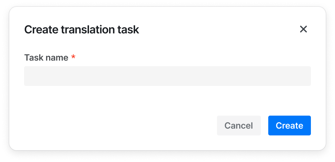
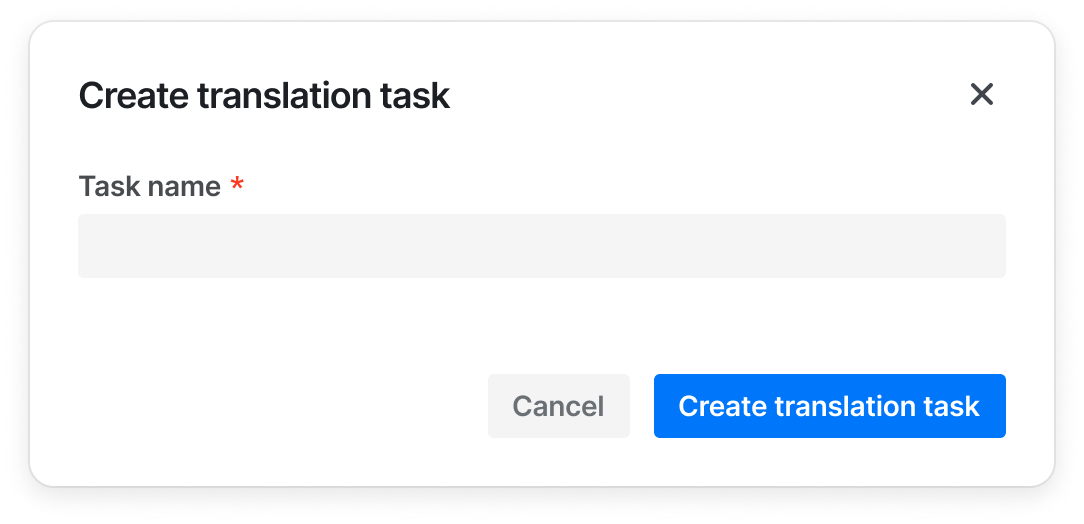
- When the button is combined with other components, the button can only display {verb}, such as "Add", "Create", if the other components (such as Modal and Sidesheet) already provide enough context for the information
| ✅ Recommended usage | ❌ Deprecated usage |
|---|---|
 |  |
- Always write in Sentence case
| ✅ Recommended usage | ❌ Deprecated usage |
|---|---|
| Create project | Create Create a project |
| Edit profile | Edit |
Design Tokens
| Sass variable | Value | Usage |
|---|---|---|
| $transition_duration-button_primary-bg | var(--semi-transition_duration-none) | 主要按钮-背景色-动画持续时间 |
| $transition_function-button_primary-bg | var(--semi-transition_function-easeIn) | 主要按钮-背景色-过渡曲线 |
| $transition_delay-button_primary-bg | var(--semi-transition_delay-none) | 主要按钮-背景色-延迟时间 |
| $transition_duration-button_secondary-bg | var(--semi-transition_duration-none) | 次要按钮-背景色-动画持续时间 |
| $transition_function-button_secondary-bg | var(--semi-transition_function-easeIn) | 次要按钮-背景色-过渡曲线 |
| $transition_delay-button_secondary-bg | var(--semi-transition_delay-none) | 次要按钮-背景色-延迟时间 |
| $transition_duration-button_tertiary-bg | var(--semi-transition_duration-none) | 三级按钮-背景色-动画持续时间 |
| $transition_function-button_tertiary-bg | var(--semi-transition_function-easeIn) | 三级按钮-背景色-过渡曲线 |
| $transition_delay-button_tertiary-bg | var(--semi-transition_delay-none) | 三级按钮-背景色-延迟时间 |
| $transition_duration-button_light-bg | var(--semi-transition_duration-none) | 浅色按钮-背景色-动画持续时间 |
| $transition_function-button_light-bg | var(--semi-transition_function-easeIn) | 浅色按钮-背景色-过渡曲线 |
| $transition_delay-button_light-bg | var(--semi-transition_delay-none) | 浅色按钮-背景色-延迟时间 |
| $transition_duration-button_warning-bg | var(--semi-transition_duration-none) | 警告按钮-背景色-动画持续时间 |
| $transition_function-button_warning-bg | var(--semi-transition_function-easeIn) | 警告按钮-背景色-过渡曲线 |
| $transition_delay-button_warning-bg | var(--semi-transition_delay-none) | 警告按钮-背景色-延迟时间 |
| $transition_duration-button_danger-bg | var(--semi-transition_duration-none) | 危险按钮-背景色-动画持续时间 |
| $transition_function-button_danger-bg | var(--semi-transition_function-easeIn) | 危险按钮-背景色-过渡曲线 |
| $transition_delay-button_danger-bg | var(--semi-transition_delay-none) | 危险按钮-背景色-延迟时间 |
| $transition_duration-button_borderless-bg | var(--semi-transition_duration-none) | 无边框按钮-背景色-动画持续时间 |
| $transition_function-button_borderless-bg | var(--semi-transition_function-easeIn) | 无边框按钮-背景色-过渡曲线 |
| $transition_delay-button_borderless-bg | var(--semi-transition_delay-none) | 无边框按钮-背景色-延迟时间 |
| $transition_duration-button_primary-border | var(--semi-transition_duration-none) | 主要按钮-边框-动画持续时间 |
| $transition_function-button_primary-border | var(--semi-transition_function-easeIn) | 主要按钮-边框-过渡曲线 |
| $transition_delay-button_primary-border | var(--semi-transition_delay-none) | 主要按钮-边框-延迟时间 |
| $transition_duration-button_secondary-border | var(--semi-transition_duration-none) | 次要按钮-边框-动画持续时间 |
| $transition_function-button_secondary-border | var(--semi-transition_function-easeIn) | 次要按钮-边框-过渡曲线 |
| $transition_delay-button_secondary-border | var(--semi-transition_delay-none) | 次要按钮-边框-延迟时间 |
| $transition_duration-button_tertiary-border | var(--semi-transition_duration-none) | 三级按钮-边框-动画持续时间 |
| $transition_function-button_tertiary-border | var(--semi-transition_function-easeIn) | 三级按钮-边框-过渡曲线 |
| $transition_delay-button_tertiary-border | var(--semi-transition_delay-none) | 三级按钮-边框-延迟时间 |
| $transition_duration-button_light-border | var(--semi-transition_duration-none) | 浅色按钮-边框-动画持续时间 |
| $transition_function-button_light-border | var(--semi-transition_function-easeIn) | 浅色按钮-边框-过渡曲线 |
| $transition_delay-button_light-border | var(--semi-transition_delay-none) | 浅色按钮-边框-延迟时间 |
| $transition_duration-button_warning-border | var(--semi-transition_duration-none) | 警告按钮-边框-动画持续时间 |
| $transition_function-button_warning-border | var(--semi-transition_function-easeIn) | 警告按钮-边框-过渡曲线 |
| $transition_delay-button_warning-border | var(--semi-transition_delay-none) | 警告按钮-边框-延迟时间 |
| $transition_duration-button_danger-border | var(--semi-transition_duration-none) | 危险按钮-边框-动画持续时间 |
| $transition_function-button_danger-border | var(--semi-transition_function-easeIn) | 危险按钮-边框-过渡曲线 |
| $transition_delay-button_danger-border | var(--semi-transition_delay-none) | 危险按钮-边框-延迟时间 |
| $transform_scale-button_primary | var(--semi-transform_scale-none) | 主要按钮-放大 |
| $transform_scale-button_secondary | var(--semi-transform_scale-none) | 次要按钮-放大 |
| $transform_scale-button_tertiary | var(--semi-transform_scale-none) | 三级按钮-放大 |
| $transform_scale-button_light | var(--semi-transform_scale-none) | 浅色按钮-放大 |
| $transform_scale-button_warning | var(--semi-transform_scale-none) | 警告按钮-放大 |
| $transform_scale-button_danger | var(--semi-transform_scale-none) | 危险按钮-放大 |
| $transform_scale-button_borderless | var(--semi-transform_scale-none) | 无边框按钮-放大 |
| $animation_duration-button_icon_loading | 600ms | 加载图标容器旋转一周时长 |
| $color-button_primary-bg-default | var(--semi-color-primary) | 主要按钮背景颜色 |
| $color-button_primary-border-default | transparent | 主要按钮描边颜色 |
| $color-button_primary-text-default | var(--semi-white) | 主要按钮文字颜色 - solid 模式 |
| $color-button_primary-bg-hover | var(--semi-color-primary-hover) | 主要按钮背景颜色 - 悬浮 |
| $color-button_primary-bg-active | var(--semi-color-primary-active) | 主要按钮背景颜色 - 按下 |
| $color-button_primary_outline-focus | $color-focus-ring | 主要按钮轮廓 - 聚焦 |
| $color-button_primary_outline-border-default | var(--semi-color-border) | 主要按钮边框颜色 - 边框模式 |
| $color-button_primary_borderless-text-default | var(--semi-color-primary) | 主要按钮文字颜色 - 浅色/边框/无边框模式 |
| $color-button_primary_solid_colorful-bg-default | var(--semi-color-ai-general) | Colorful 主要按钮背景颜色 - solid 主题 |
| $color-button_primary_solid_colorful-bg-hover | var(--semi-color-ai-general-hover) | Colorful 主要按钮背景颜色 - solid 主题 - 悬浮 |
| $color-button_primary_solid_colorful-bg-active | var(--semi-color-ai-general-active) | Colorful 主要按钮背景颜色 - solid 主题 - 按下 |
| $color-button_primary_light_colorful-text-default | var(--semi-color-ai-general) | Colorful 主要按钮文字填充色 - 浅色模式 |
| $color-button_primary_light_outline-text-default | var(--semi-color-ai-purple) | Colorful 主要按钮文字颜色 - 边框模式 |
| $color-button_primary_light_outline-border | var(--semi-color-ai-purple) | Colorful 主要按钮边框颜色 - 边框模式 |
| $color-button_primary_light_borderless-text-default | var(--semi-color-ai-general) | Colorful 主要按钮文字填充色 - 无边框模式 |
| $color-button_secondary-bg-default | var(--semi-color-secondary) | 次要按钮背景颜色 |
| $color-button_secondary-border-default | var(--semi-color-secondary) | 次要按钮描边颜色 |
| $color-button_secondary-text-default | var(--semi-white) | 次要按钮文字颜色 - solid 模式 |
| $color-button_secondary-bg-hover | var(--semi-color-secondary-hover) | 次要按钮背景颜色 - 悬浮 |
| $color-button_secondary-bg-active | var(--semi-color-secondary-active) | 次要按钮背景颜色 - 按下 |
| $color-button_secondary_outline-border-default | var(--semi-color-border) | 次要按钮边框颜色 - 边框模式 |
| $color-button_secondary_borderless-text-default | var(--semi-color-secondary) | 次要按钮文字颜色 - 浅色/边框/无边框模式 |
| $color-button_danger-bg-default | var(--semi-color-danger) | 危险按钮背景颜色 |
| $color-button_danger-text-default | var(--semi-white) | 危险按钮文字颜色 - solid 模式 |
| $color-button_danger-bg-hover | var(--semi-color-danger-hover) | 危险按钮背景颜色 - 悬浮 |
| $color-button_danger-bg-active | var(--semi-color-danger-active) | 危险按钮背景颜色 - 按下 |
| $color-button_danger-outline-focus | var(--semi-color-danger-light-active) | 危险按钮轮廓 - 聚焦 |
| $color-button_danger_outline-border-default | var(--semi-color-danger) | 危险按钮边框颜色 - 边框模式 |
| $color-button_danger_borderless-text-default | var(--semi-color-danger) | 危险按钮文字颜色 - 浅色/边框/无边框模式 |
| $color-button_warning-bg-default | var(--semi-color-warning) | 警告按钮背景颜色 |
| $color-button_warning-text-default | var(--semi-white) | 警告按钮文字颜色 - solid 模式 |
| $color-button_warning-bg-hover | var(--semi-color-warning-hover) | 警告按钮背景颜色 - 悬浮 |
| $color-button_warning-bg-active | var(--semi-color-warning-active) | 警告按钮背景颜色 - 按下 |
| $color-button_warning-outline-focus | var(--semi-color-warning-light-active) | 警告按钮轮廓 - 聚焦 |
| $color-button_warning_outline-border-default | var(--semi-color-warning) | 警告按钮边框颜色 - 边框模式 |
| $color-button_warning_borderless-text-default | var(--semi-color-warning) | 警告按钮文字颜色 - 浅色/边框/无边框模式 |
| $color-button_tertiary-bg-default | var(--semi-color-tertiary) | 第三按钮背景颜色 |
| $color-button_tertiary-text-default | var(--semi-white) | 第三按钮文字颜色 - solid 模式 |
| $color-button_tertiary_solid_colorful-bg-default | var(--semi-ai-general-0) | colorful 第三按钮背景颜色 |
| $color-button_tertiary_solid_colorful-bg-hover | var(--semi-ai-general-1) | colorful 第三按钮背景颜色 - 悬浮 |
| $color-button_tertiary_solid_colorful-bg-active | var(--semi-ai-general-2) | colorful 第三按钮背景颜色 - 按下 |
| $color-button_tertiary_solid_colorful-text-default | var(--semi-color-ai-general) | Colorful 第三按钮文字填充色 - solid 主题 |
| $color-button_tertiary-bg-hover | var(--semi-color-tertiary-hover) | 第三按钮背景颜色 - 悬浮 |
| $color-button_tertiary-bg-active | var(--semi-color-tertiary-active) | 第三按钮背景颜色 - 按下 |
| $color-button_tertiary_outline-border-default | var(--semi-color-border) | 第三按钮边框颜色 - 边框模式 |
| $color-button_tertiary_solid-text-default | var(--semi-color-text-1) | 第三按钮文字颜色 - 浅色/边框/无边框模式 |
| $color-button_disabled_solid-text-default | var(--semi-color-disabled-text) | 禁用按钮文字颜色 - solid 主题 |
| $color-button_disabled-text-default | var(--semi-color-disabled-text) | 禁用按钮文字颜色 - 浅色主题或无背景 |
| $color-button_disabled_outline_text-default | var(--semi-color-disabled-text) | 禁用按钮文字颜色 - 边框模式 |
| $color-button_disabled-bg-default | var(--semi-color-disabled-bg) | 禁用按钮背景颜色 |
| $color-button_disabled-text-hover | $color-button_disabled-text-default | 禁用按钮文字颜色 - solid 主题 - 悬浮 |
| $color-button_disabled_primary-bg-default | $color-button_disabled-bg-default | 禁用 primary 按钮背景颜色 |
| $color-button_disabled_secondary-bg-default | $color-button_disabled-bg-default | 禁用 secondary 按钮背景颜色 |
| $color-button_disabled_danger-bg-default | $color-button_disabled-bg-default | 禁用 danger 按钮背景颜色 |
| $color-button_disabled_warning-bg-default | $color-button_disabled-bg-default | 禁用 warning 按钮背景颜色 |
| $color-button_disabled_tertiary-bg-default | $color-button_disabled-bg-default | 禁用 tertiary 按钮背景颜色 |
| $color-button_disabled_outline-border-default | var(--semi-color-border) | 禁用按钮边框颜色 - 边框模式 |
| $color-button_light-bg-default | var(--semi-color-fill-0) | 浅色按钮背景颜色 |
| $color-button_light-bg-hover | var(--semi-color-fill-1) | 浅色按钮背景颜色 - 悬浮 |
| $color-button_light-bg-active | var(--semi-color-fill-2) | 浅色按钮背景颜色 - 按下 |
| $color-button_light-border-default | transparent | 浅色按钮描边颜色 |
| $color-button_light-border-hover | $color-button_light-border-default | 浅色按钮描边颜色 - 悬浮 |
| $color-button_light-border-active | $color-button_light-border-hover | 浅色按钮描边颜色 - 按下 |
| $width-button_light-border | 0 | 浅色按钮描边宽度 |
| $color-button_disabled_light_primary-bg-default | $color-button_light-bg-default | 禁用 light primary 按钮背景颜色 |
| $color-button_disabled_light_secondary-bg-default | $color-button_light-bg-default | 禁用 light secondary 按钮背景颜色 |
| $color-button_disabled_light_danger-bg-default | $color-button_light-bg-default | 禁用 light danger 按钮背景颜色 |
| $color-button_disabled_light_warning-bg-default | $color-button_light-bg-default | 禁用 light warning 按钮背景颜色 |
| $color-button_disabled_light_tertiary-bg-default | $color-button_light-bg-default | 禁用 light tertiary 按钮背景颜色 |
| $color-button_borderless-bg-hover | var(--semi-color-fill-0) | 无背景按钮背景颜色 - 悬浮 |
| $color-button_borderless-bg-active | var(--semi-color-fill-1) | 无背景按钮背景颜色 - 按下 |
| $color-button_borderless-border-default | transparent | 无背景按钮描边颜色 |
| $color-button_borderless-border-hover | $color-button_borderless-border-default | 无背景按钮描边颜色 - 悬浮 |
| $color-button_borderless-border-active | $color-button_borderless-border-hover | 无背景按钮描边颜色 - 按下 |
| $width-button_borderless-border | 0 | 无背景按钮描边宽度 |
| $width-button_outline-border | 1px | 边框模式按钮边框宽度 |
| $color-button_outline-bg-hover | var(--semi-color-fill-0) | 边框模式按钮背景颜色 - 悬浮 |
| $color-button_outline-bg-active | var(--semi-color-fill-1) | 边框模式按钮背景颜色 - 按下 |
| $color-button_group-border-default | var(--semi-color-border) | 按钮组分割线颜色 |
| $width-button_group-border | $border-thickness-control | 按钮组分割线宽度 |
| $spacing-button_default-paddingTop | 6px | 按钮顶部内边距 - 默认 |
| $spacing-button_default-paddingLeft | $spacing-base-tight | 按钮左侧内边距 - 默认 |
| $spacing-button_default-paddingRight | $spacing-base-tight | 按钮右侧内边距 - 默认 |
| $spacing-button_large-paddingTop | 10px | 按钮顶部内边距 - 大尺寸 |
| $spacing-button_large-paddingBottom | 10px | 按钮底部内边距 - 大尺寸 |
| $spacing-button_large-paddingLeft | $spacing-base | 按钮左侧内边距 - 大尺寸 |
| $spacing-button_large-paddingRight | $spacing-base | 按钮右侧内边距 - 大尺寸 |
| $spacing-button_small-paddingTop | $spacing-super-tight | 按钮顶部内边距 - 小尺寸 |
| $spacing-button_small-paddingBottom | $spacing-super-tight | 按钮底部内边距 - 小尺寸 |
| $spacing-button_small-paddingLeft | $spacing-base-tight | 按钮左侧内边距 - 小尺寸 |
| $spacing-button_small-paddingRight | $spacing-base-tight | 按钮右侧内边距 - 小尺寸 |
| $spacing-button_iconOnly_default-paddingLeft | $spacing-tight | 图标按钮左侧内边距 - 默认 |
| $spacing-button_iconOnly_default-paddingRight | $spacing-tight | 图标按钮右侧内边距 - 默认 |
| $spacing-button_iconOnly_default-paddingTop | $spacing-tight | 图标按钮顶部内边距 - 默认 |
| $spacing-button_iconOnly_large-paddingLeft | $spacing-base-tight | 图标按钮左侧内边距 - 大尺寸 |
| $spacing-button_iconOnly_large-paddingRight | $spacing-base-tight | 图标按钮右侧内边距 - 大尺寸 |
| $spacing-button_iconOnly_large-paddingTop | $spacing-base-tight | 图标按钮顶部内边距 - 大尺寸 |
| $spacing-button_iconOnly_large-paddingBottom | $spacing-base-tight | 图标按钮底部内边距 - 大尺寸 |
| $spacing-button_iconOnly_small-paddingLeft | $spacing-extra-tight | 图标按钮左侧内边距 - 小尺寸 |
| $spacing-button_iconOnly_small-paddingRight | $spacing-extra-tight | 图标按钮右侧内边距 - 小尺寸 |
| $spacing-button_iconOnly_small-paddingTop | $spacing-extra-tight | 图标按钮顶部内边距 - 小尺寸 |
| $spacing-button_iconOnly_small-paddingBottom | $spacing-extra-tight | 图标按钮底部内边距 - 小尺寸 |
| $height-button_iconOnly_small | $height-control-small | 图标按钮 height - 小尺寸 |
| $width-button_iconOnly_small | $height-control-small | 图标按钮 width - 小尺寸 |
| $height-button_iconOnly_default | $height-control-default | 图标按钮 height - 默认 |
| $width-button_iconOnly_default | $height-control-default | 图标按钮 width - 默认 |
| $height-button_iconOnly_large | $height-control-large | 图标按钮 height - 大尺寸 |
| $width-button_iconOnly_large | $height-control-large | 图标按钮 width - 大尺寸 |
| $spacing-button_iconOnly_content-marginLeft | $spacing-tight | 按钮左侧图标距离文字间距 |
| $spacing-button_iconOnly_content-marginRight | $spacing-tight | 按钮右侧图标距离文字间距 |
| $font-button-fontWeight | $font-weight-bold | 按钮文字字重 - 默认 |
| $font-button-fontSize | $font-size-regular | 按钮文字字号- 默认 |
| $font-button-lineHeight | 20px | 按钮文字行高 - 默认 |
| $font-button_small-fontWeight | $font-weight-bold | 按钮文字字重 - 小尺寸 |
| $font-button_small-fontSize | $font-size-regular | 按钮文字字号- 小尺寸 |
| $font-button_small-lineHeight | 20px | 按钮文字行高 - 小尺寸 |
| $font-button_large-fontWeight | $font-weight-bold | 默认按钮文字字重 - 大尺寸 |
| $font-button_large-fontSize | $font-size-regular | 默认按钮文字字号 - 大尺寸 |
| $font-button_large-lineHeight | 20px | 默认按钮文字行高 - 大尺寸 |
| $height-button_large | $height-control-large | 按钮高度 - 大尺寸 |
| $height-button_small | $height-control-small | 按钮高度 - 小尺寸 |
| $height-button_default | $height-control-default | 按钮高度 - 默认 |
| $height-button_group_line_default | 20px | 分割线高度 - 默认 |
| $width-button-border | $border-thickness | 按钮描边宽度 |
| $radius-button | var(--semi-border-radius-small) | 按钮圆角大小 |
| $radius-button_group | $radius-button | 按钮组圆角大小 |
| $width-button-outline | $width-focus-ring | 按钮轮廓宽度 |
| $radius-button_splitButtonGroup_first_topLeft | var(--semi-border-radius-small) | 组合按钮(Split) - 首个按钮左上圆角 |
| $radius-button_splitButtonGroup_first_bottomLeft | var(--semi-border-radius-small) | 组合按钮(Split) - 首个按钮左下圆角 |
| $radius-button_splitButtonGroup_last_topRight | var(--semi-border-radius-small) | 组合按钮(Split) - 末尾按钮右上圆角 |
| $radius-button_splitButtonGroup_last_bottomRight | var(--semi-border-radius-small) | 组合按钮(Split) - 末尾按钮右下圆角 |
FAQ
-
Why is the icon of Button not shown?
The icon is passed through theiconsnippet, not aniconcomponent prop:<Button>{#snippet icon()}<IconCamera />{/snippet}</Button>.