Demos
How to import
<script lang="ts">
    import { Image, ImagePreview } from '@fibrae/semi-ui-svelte';
</script>
Basic usage
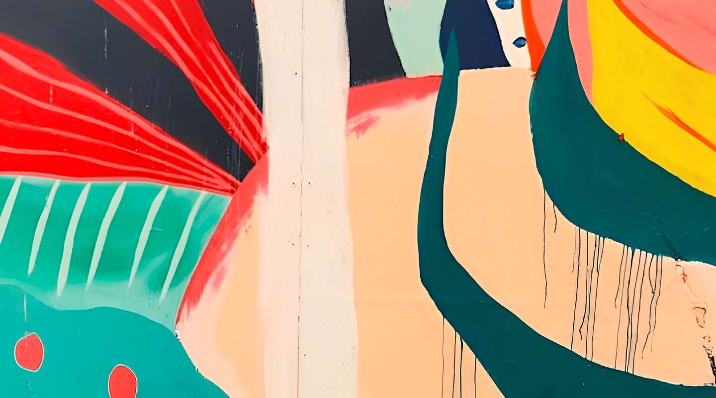
You can get an image with preview function by specifying the image path through src, and specify the width and height of the image through width, height
Code
<script lang="ts">
    import { Image } from '@fibrae/semi-ui-svelte';
</script>

<Image alt="Abstract colorful artwork" height={200} src="/assets/root-web-sites/abstract.jpg" width={360} />
Loading failed placeholder
fallback takes a string or a snippet: a string is the URL of the image shown when loading fails, and a snippet renders custom content; without it, the default failure icon is shown

自定义加载失败占位图
Code
<script lang="ts">
    import { IconUploadError } from '@fibrae/semi-icons-svelte';
    import { Image } from '@fibrae/semi-ui-svelte';
</script>

<div style="display: flex; align-items: center; flex-direction: column">
    <span>加载失败默认样式</span>
    <Image alt="加载失败的图片" height={200} src="https://load-error.jpeg" width={200} />
    <br />
    <span>自定义加载失败占位图</span>
    <Image alt="加载失败的图片" height={200} src="https://load-error.jpeg" width={200}>
        {#snippet fallback()}
            <IconUploadError style="font-size: 50px" />
        {/snippet}
    </Image>
</div>
Progressive loading
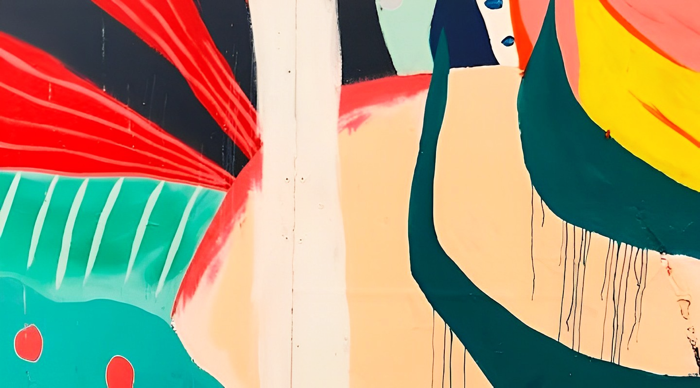
Large images can be progressively loaded through the placeholder snippet: what it renders is shown until the image has loaded
Code
<script lang="ts">
    import { Button, Image } from '@fibrae/semi-ui-svelte';

    let timestamp = $state('');
</script>

<Image alt="Abstract colorful artwork" height={200} src="/assets/root-web-sites/abstract-big.png?{timestamp}" width={300}>
    {#snippet placeholder()}
        <Image alt="" height={200} preview={false} src="/assets/root-web-sites/abstract-small.jpeg" width={300} />
    {/snippet}
</Image>
<br />
<Button style="margin-top: 10px" theme="solid" onclick={() => (timestamp = String(Date.now()))}>Reload</Button>
Customize the preview image
You can customize the preview image by setting the src of the Image component to be different from the src in the preview parameter
Code
<script lang="ts">
    import { Image } from '@fibrae/semi-ui-svelte';

    const preview = {
        src: '/assets/root-web-sites/abstract-big.png',
    };
</script>

<Image alt="Abstract colorful artwork" height={200} {preview} src="/assets/root-web-sites/abstract-small.jpeg" width={300} />
Multi-image preview
Use ImagePreview to wrap Image to achieve multi-image preview
The src array of ImagePreview defines the images of the group and their order; an Image does not register itself with the ImagePreview. An Image opens the preview at the position of its own src (or preview.src) in the list, and an Image whose src is not in the list previews on its own. Use titles and alts to set the title and alternative text of each image, one entry per src.



Code
<script lang="ts">
    import { Image, ImagePreview } from '@fibrae/semi-ui-svelte';

    const srcList = ['/assets/root-web-sites/abstract.jpg', '/assets/root-web-sites/sky.jpg', '/assets/root-web-sites/greenleaf.jpg', '/assets/root-web-sites/colorful.jpg'];
</script>

<ImagePreview src={srcList}>
    {#each srcList as src, index (src)}
        <Image alt="lamp{index + 1}" {src} style="margin-right: 5px" width={200} />
    {/each}
</ImagePreview>
Use the preview component alone
The preview component ImagePreview can be used alone, through bind:visible (or visible with onVisibleChange) to control whether to preview, src to pass in the image that can be previewed, and previewTitle (a string) to set the title at the top of the preview
Code
<script lang="ts">
    import { Button, ImagePreview } from '@fibrae/semi-ui-svelte';

    const srcList = ['/assets/root-web-sites/abstract.jpg', '/assets/root-web-sites/sky.jpg', '/assets/root-web-sites/greenleaf.jpg', '/assets/root-web-sites/colorful.jpg'];

    let visible1 = $state(false);
    let visible2 = $state(false);
</script>

<Button onclick={() => (visible1 = true)}>Preview single Image</Button>
<ImagePreview bind:visible={visible1} src="/assets/root-web-sites/sky.jpg" />
<br />
<Button style="margin-top: 20px" onclick={() => (visible2 = true)}>Preview multiple Images</Button>
<ImagePreview bind:visible={visible2} previewTitle="Scenery" src={srcList} />
Render in the specified container
You can specify the parent DOM of the preview component through getPopupContainer (you need to specify position: relative), and the image preview will be rendered into this DOM. This will change the DOM tree position, but not the view's rendering position.
When the container is not document.body (including a getPopupContainer set only on ConfigProvider), the preview is non-modal: it does not output aria-modal, does not trap Tab and does not lock page scrolling. Returning document.body from getPopupContainer is the same as not passing it.
Code
<script lang="ts">
    import { Image, ImagePreview } from '@fibrae/semi-ui-svelte';

    const srcList = ['/assets/root-web-sites/abstract.jpg', '/assets/root-web-sites/sky.jpg', '/assets/root-web-sites/greenleaf.jpg'];

    let container = $state<HTMLDivElement>();
    // called when the preview opens, after the container is mounted
    const getPopupContainer = () => container as HTMLElement;
</script>

<div bind:this={container} style="height: 400px; position: relative">
    <ImagePreview {getPopupContainer} src={srcList} style="height: 100%; display: flex; align-items: center; justify-content: center">
        {#each srcList as src, index (src)}
            <Image alt="lamp{index + 1}" {src} style="margin-right: 5px" width={200} />
        {/each}
    </ImagePreview>
</div>
Customize the bottom operation area of the preview
The bottom action area of the preview can be customized with the previewMenu snippet, which receives MenuProps. Images wrapped by ImagePreview use the snippet of ImagePreview; a standalone Image uses its own snippet of the same name
Code
<script lang="ts">
    import { IconChevronLeft, IconChevronRight, IconDownload, IconMinus, IconPlus, IconRealSizeStroked, IconRotate, IconWindowAdaptionStroked } from '@fibrae/semi-icons-svelte';
    import { Button, Image, ImagePreview } from '@fibrae/semi-ui-svelte';

    const srcList = ['/assets/root-web-sites/abstract.jpg', '/assets/root-web-sites/sky.jpg', '/assets/root-web-sites/greenleaf.jpg'];
</script>

<ImagePreview src={srcList}>
    {#snippet previewMenu({ ratio, disabledPrev, disabledNext, disabledZoomIn, disabledZoomOut, disableDownload, onDownload, onNext, onPrev, onRotateLeft, onRatioClick, onZoomIn, onZoomOut })}
        <div style="background: grey; height: 40px; width: 280px; display: flex; align-items: center; justify-content: space-around; border-radius: 3px">
            <Button aria-label="上一张" disabled={disabledPrev} type="tertiary" onclick={onPrev}>
                {#snippet icon()}
                    <IconChevronLeft size="large" />
                {/snippet}
            </Button>
            <Button aria-label="下一张" disabled={disabledNext} type="tertiary" onclick={onNext}>
                {#snippet icon()}
                    <IconChevronRight size="large" />
                {/snippet}
            </Button>
            <Button aria-label="缩小" disabled={disabledZoomOut} type="tertiary" onclick={onZoomOut}>
                {#snippet icon()}
                    <IconMinus size="large" />
                {/snippet}
            </Button>
            <Button aria-label="放大" disabled={disabledZoomIn} type="tertiary" onclick={onZoomIn}>
                {#snippet icon()}
                    <IconPlus size="large" />
                {/snippet}
            </Button>
            <Button aria-label={ratio === 'adaptation' ? '原始尺寸' : '适应页面'} type="tertiary" onclick={onRatioClick}>
                {#snippet icon()}
                    {#if ratio === 'adaptation'}
                        <IconRealSizeStroked size="large" />
                    {:else}
                        <IconWindowAdaptionStroked size="large" />
                    {/if}
                {/snippet}
            </Button>
            <Button aria-label="旋转" type="tertiary" onclick={onRotateLeft}>
                {#snippet icon()}
                    <IconRotate size="large" />
                {/snippet}
            </Button>
            <Button aria-label="下载" disabled={disableDownload} type="tertiary" onclick={onDownload}>
                {#snippet icon()}
                    <IconDownload size="large" />
                {/snippet}
            </Button>
        </div>
    {/snippet}
    {#each srcList as src, index (src)}
        <Image alt="lamp{index + 1}" {src} style="margin-right: 5px" width={200} />
    {/each}
</ImagePreview>
To customize the bottom action area based on the default one, render the menuItems snippet from the MenuProps: it renders all the default items at once, in the order previous, page counter, next, zoom out, zoom slider, zoom in, original size / fit to page, rotate and download, so custom content can be placed before or after them but not between them. The default items are separated by dividers only when no previewMenu is given.
Code
<script lang="ts">
    import { IconInfoCircle } from '@fibrae/semi-icons-svelte';
    import { Divider, Image, ImagePreview, Tooltip } from '@fibrae/semi-ui-svelte';

    const srcList = ['/assets/root-web-sites/abstract.jpg', '/assets/root-web-sites/sky.jpg', '/assets/root-web-sites/greenleaf.jpg'];
</script>

<ImagePreview src={srcList}>
    {#snippet previewMenu({ menuItems })}
        <div style="display: flex; background-color: rgba(0, 0, 0, 0.75); align-items: center; padding: 5px 16px; border-radius: 4px">
            {@render menuItems()}
            <Divider layout="vertical" />
            <Tooltip>
                {#snippet content()}
                    我是一个自定义操作
                {/snippet}
                <IconInfoCircle size="large" />
            </Tooltip>
        </div>
    {/snippet}
    {#each srcList as src, index (src)}
        <Image alt="lamp{index + 1}" {src} width={200} />
    {/each}
</ImagePreview>
Customize the preview top display area
The title snippet, which receives { title, index }, replaces the content of the title section at the top of the preview. When there is a title, the preview dialog is named by that section through aria-labelledby, so its name is the text the snippet renders; without a title the name is "Preview" from the locale. Use the closeIcon snippet to replace the close icon, and the leftIcon and rightIcon snippets, which receive { index }, to replace the arrow icons
Code
<script lang="ts">
    import { Image, ImagePreview } from '@fibrae/semi-ui-svelte';

    const srcList = ['/assets/root-web-sites/abstract.jpg', '/assets/root-web-sites/sky.jpg'];
    const titles = srcList.map((_, index) => `lamp${index + 1}`);
</script>

<ImagePreview src={srcList} {titles}>
    {#snippet title({ title })}
        <div style="width: 100%; height: 100%; display: flex; align-items: center; justify-content: center">
            <span style="background: black; padding: 0 10px">自定义标题:{title}</span>
        </div>
    {/snippet}
    <div>
        {#each srcList as src, index (src)}
            <Image alt={titles[index]} {src} style="margin-right: 5px" width={200} />
        {/each}
    </div>
</ImagePreview>
API reference
Image
Props
| Property | Description | Type | Default |
|---|---|---|---|
| alt | Image description, also the accessible name of a previewable thumbnail. | string | - |
| closeIcon | Custom close icon. It applies to this Image's own preview only and has no effect inside an ImagePreview. | Snippet | - |
| crossOrigin | The crossorigin attribute passed to the native img element. | 'anonymous' | 'use-credentials' | - |
| fallback | Fallback image URL shown when loading fails, or a snippet for custom content. | string | Snippet | - |
| height | Display height of the image; a number is in px. | string | number | - |
| imgCls | Custom class name passed to the img element. | string | - |
| imgStyle | Custom style passed to the img element. | string | - |
| leftIcon | Custom previous icon. It applies to this Image's own preview only and has no effect inside an ImagePreview. | TypeSnippet<[ImagePreviewIconSnippetProps]> | - |
| onError | Called when the image fails to load. | Type(event: Event) => void | - |
| onLoad | Called when the image has loaded. | Type(event: Event) => void | - |
| placeholder | Snippet for the placeholder content shown until the image has loaded. | Snippet | - |
| preview | Preview options; false disables preview. The object carries data and callbacks only; use the Image snippets for custom content. | boolean | ImagePreviewProps | true |
| previewMenu | Custom bottom menu of the preview. It applies to this Image's own preview only and has no effect inside an ImagePreview. | TypeSnippet<[MenuProps]> | - |
| rightIcon | Custom next icon. It applies to this Image's own preview only and has no effect inside an ImagePreview. | TypeSnippet<[ImagePreviewIconSnippetProps]> | - |
| setDownloadName | Sets the download file name of the image. | Type(src: string) => string | - |
| src | Image source URL. | string | - |
| title | Replaces the content of the title section at the top of the preview; when there is a title, the dialog is named by the text the snippet renders. It applies to this Image's own preview only and has no effect inside an ImagePreview. | TypeSnippet<[ImagePreviewTitleSnippetProps]> | - |
| width | Display width of the image; a number is in px. | string | number | - |
A number for width or height is in px. class and style land on the root element; other undeclared native attributes and event handlers land on the inner img. The preview object accepts the props and callbacks of ImagePreview (onVisibleChange, onChange, onClose, onZoomIn, onZoomOut, onPrev, onNext, onRatioChange, onRotateLeft, onDownload, onDownloadError), except lazyLoad, lazyLoadMargin, class and style (use previewCls and previewStyle to style the preview). Custom nodes do not go in preview; use the snippets of Image. When preview.src is an array, switching images returns to "fit to page". An Image inside an ImagePreview ignores the title, previewMenu, leftIcon, rightIcon and closeIcon snippets; the snippets of the ImagePreview apply.
ImagePreview
Props
| Property | Description | Type | Default |
|---|---|---|---|
| adaptiveTip | Tip of the fit-to-page button. | string | - |
| alts | Alternative texts of the preview images, one per entry of src. | (string | undefined)[] | - |
| children | Snippet for the Image components to preview. | Snippet | - |
| closable | Whether to show the close button. | boolean | true |
| closeIcon | Snippet for the custom close icon. | Snippet | - |
| closeOnEsc | Whether Esc closes the preview. | boolean | true |
| crossOrigin | The crossorigin attribute passed to the preview img element. | 'anonymous' | 'use-credentials' | - |
| currentIndex | Index of the current image; supports bind:currentIndex. Unbound, the component manages it and starts at 0. | number | - |
| disableDownload | Whether to disable download. | boolean | false |
| downloadTip | Tip of the download button. | string | - |
| getPopupContainer | Parent DOM the preview renders into. A container other than document.body makes the preview non-modal; a custom container needs position: relative. | Type() => HTMLElement | - |
| infinite | Whether switching loops around. | boolean | false |
| initialZoom | Initial zoom factor of an image, applied once when it first opens or is switched to, clamped by minZoom and maxZoom. | number | - |
| lazyLoad | Whether to lazy-load the images of the group. | boolean | true |
| lazyLoadMargin | The rootMargin of the lazy-load observer, relative to the viewport; scrolling ancestors still clip. | string | "0px 100px 100px 0px" |
| leftIcon | Snippet for the custom previous icon, receiving { index }. | TypeSnippet<[ImagePreviewIconSnippetProps]> | - |
| maskClosable | Whether clicking the mask closes the preview. | boolean | true |
| maxZoom | Maximum zoom factor. | number | 5 |
| minZoom | Minimum zoom factor. | number | 0.1 |
| nextTip | Tip of the next button. | string | - |
| onChange | Called when the image switches. | Type(index: number) => void | - |
| onClose | Called when closed with the close button or Esc; closing by the mask triggers onVisibleChange only. | Type() => void | - |
| onDownload | Called when an image is downloaded. | Type(src: string, index: number) => void | - |
| onDownloadError | Called when a download fails. | Type(src: string) => void | - |
| onNext | Called when switching to the next image. | Type(index: number) => void | - |
| onPrev | Called when switching to the previous image. | Type(index: number) => void | - |
| onRatioChange | Called when switching between original size and fit-to-page. | Type(type: RatioType) => void | - |
| onRotateLeft | Called when the image rotates counterclockwise. | Type(angle: number) => void | - |
| onVisibleChange | Called when visibility changes. | Type(visible: boolean) => void | - |
| onZoomIn | Called when the image zooms in. | Type(zoom: number) => void | - |
| onZoomOut | Called when the image zooms out. | Type(zoom: number) => void | - |
| originTip | Tip of the original-size button. | string | - |
| preLoad | Whether to preload neighboring images. | boolean | true |
| preLoadGap | How many images ahead and behind to preload. | number | 2 |
| previewCls | Custom class name of the preview. | string | - |
| previewMenu | Snippet for the custom bottom menu, receiving MenuProps; menuItems is a snippet that renders all the default items at once. | TypeSnippet<[MenuProps]> | - |
| previewStyle | Custom style of the preview. | string | - |
| previewTitle | Title at the top of the preview and the accessible name of the dialog; the title of the current image in titles takes precedence. | string | - |
| prevTip | Tip of the previous button. | string | - |
| rightIcon | Snippet for the custom next icon, receiving { index }. | TypeSnippet<[ImagePreviewIconSnippetProps]> | - |
| rotateTip | Tip of the rotate button. | string | - |
| setDownloadName | Sets the download file name of an image. | Type(src: string) => string | - |
| showTooltip | Whether to show tooltips on the bottom controls. | boolean | false |
| src | Image URLs to preview; they define the images of the group and their order. A wrapped Image opens the preview at the position of its own src (or preview.src) in the list; an Image not in the list previews on its own. | string | string[] | [] |
| title | Snippet that replaces the content of the title section at the top of the preview, receiving { title, index }. When there is a title, the dialog is named by that section through aria-labelledby, so its name is the text the snippet renders; without a title the name comes from the locale. | TypeSnippet<[ImagePreviewTitleSnippetProps]> | - |
| titles | Preview titles, one per entry of src. | (string | undefined)[] | - |
| viewerVisibleDelay | Idle time in milliseconds before the preview controls hide. | number | 10000 |
| visible | Whether the preview is open; supports bind:visible. Unbound, the component manages it and starts closed. | boolean | - |
| zIndex | z-index of the preview layer. | number | 1070 |
| zoomInTip | Tip of the zoom-in button. | string | - |
| zoomOutTip | Tip of the zoom-out button. | string | - |
| zoomStep | Zoom change per step. | number | 0.1 |
class, style and native attributes (such as aria-label and aria-labelledby) land on the group root div; with aria-label or aria-labelledby and no role, the root gets role="group". The preview dialog is rendered into getPopupContainer (document.body by default) and is named by previewTitle, or by the locale when there is no title.
MenuProps
min, max, step and zoom are percentages (a min of 10 means 10%, a step of 10 means 10% per step), unlike minZoom, maxZoom, zoomStep and initialZoom of ImagePreview, which are factors (such as 0.1 and 5).
| Properties | Instructions | Type |
|---|---|---|
| curPage | Current image page subscript | number |
| disabledPrev | Whether to disable the left toggle button | boolean |
| disabledNext | Whether to disable the right toggle button | boolean |
| disabledZoomIn | Whether the zoom is at its maximum (the zoom-in button is disabled) | boolean |
| disabledZoomOut | Whether the zoom is at its minimum (the zoom-out button is disabled) | boolean |
| disableDownload | Whether to disable the download button | boolean |
| max | The maximum zoom of the image (percentage) | number |
| min | The minimum zoom of the image (percentage) | number |
| onDownload | Call function when the image is downloaded | () => void |
| onZoomIn | Call function when the image is zoomed in | () => void |
| onZoomOut | Call function when the image is zoomed out | () => void |
| onRatioClick | Call function to switch between the original size and fit to page | () => void |
| onPrev | Call function to switch the picture forward | () => void |
| onNext | Call function to switch the picture backward | () => void |
| onRotateLeft | Call function to rotate the image counterclockwise | () => void |
| onRotateRight | Call function to rotate the image clockwise | () => void |
| ratio | Original size or Fit to page button state | "adaptation" | "realSize" |
| step | Step size of zooming (percentage) | number |
| totalNum | The total number of images that can be previewed | number |
| zoom | Current zoom of the image (percentage) | number |
| menuItems | Snippet that renders all the default bottom operation area items at once, in their default order | Snippet |
Accessibility
ARIA
- When rendered into
document.body(the default), the preview is a modal dialog withrole="dialog"andaria-modal="true"; rendered into a custom container (getPopupContainerreturns another element, including a container set on ConfigProvider) it is a non-modal dialog and does not outputaria-modal. It is named by its title (previewTitle, orpreview.previewTitleof an image in a group) when there is one, otherwise by "Preview" from the locale - Close, the left and right arrows, and the footer's previous, next, zoom out, zoom in, original size / adapt to the page, rotate and download controls are native
buttonelements. Their accessible names come from the matchingprevTip,nextTipand other tip props, or from the locale when those are not set. The zoom slider is named "Zoom" from the locale, with the current percentage as itsaria-valuetext - At the first or last image, or at a zoom limit, the matching footer button gets
aria-disabled="true"and stays focusable, so focus is not lost. The download button is also disabled when there is no current image (an emptysrclist) - The footer page counter has
aria-live="polite", so screen readers announce the new position when the image changes - With the preview enabled and the image loaded, the root of an Image thumbnail is a focusable button (
role="button",tabindex="0",aria-haspopup="dialog") named by thealtof the image; withpreviewset to false, or before the image has loaded, it is not focusable. Closing the preview returns focus to the thumbnail. A thumbnail inside an ImagePreview group that opens with the mouse also opens with the keyboard: while loading or after a load error it still has the button role and is focusable, and Enter or Space opens the group preview - The
altof the preview image is thealtof the thumbnail it shows (anImagePreviewsrcarray has no alt, so it is an empty string)
Keyboard interaction
- With focus on a thumbnail, Enter or Space opens the preview
- Opening the preview moves focus into it. In a modal preview, Tab and Shift + Tab cycle through its controls and closing it returns focus to the element focused before; a non-modal preview rendered into a custom container does not trap Tab, and on close focus returns to the element focused before only if it is still inside the preview or on body, and stays where it is when it has moved elsewhere on the page
- Enter or Space presses the focused button
- ← and → switch to the previous and next image, swapped in RTL (ConfigProvider
direction="rtl"). At the first or last image they behave like the buttons: they wrap around wheninfiniteis true and do nothing otherwise - ← and → do not switch images while focus is in an input, textarea, select or editable element (such as an input in a custom footer), or while Alt, Ctrl, Meta or Shift is held; on the focused zoom slider they change the zoom
- Esc closes the preview (unless
closeOnEscis false) - After the controls hide because of
viewerVisibleDelay, a key press or focus on a control shows them again; they stay shown while focus is on one of them
Design Token
| Sass variable | Value | Usage |
|---|---|---|
| $transform_rotate-image_preview_spinner | var(--semi-transform_rotate-clockwise360deg) | 预览图像加载spin旋转角度 |
| $transform_scale3d-image_preview_image_img | 1, 1, 1 | 预览图片放大 |
| $transform_rotate-image_preview_image_img | var(--semi-transform_rotate-none) | 预览图片旋转角度 |
| $transition_duration-image_preview | 500ms | 预览图片透明度变化动画时间 |
| $transform_rotate-image_preview_icon_rtl | var(--semi-transform_rotate-clockwise180deg) | rtl模式下向前/向后切换图片按钮旋转角度 |
| $spacing-image_preview_icon-x | 24px | 图像预览中部左右调节icon与页面距离 |
| $spacing-image_preview_header-paddingY | 0 | 图像预览header部分上下内边距 |
| $spacing-image_preview_header-paddingX | 24px | 图像预览header部分左右内边距 |
| $spacing-image_preview_footer-paddingY | 0 | 图像预览footer操作区部分上下内边距 |
| $spacing-image_preview_footer-paddingX | 16px | 图像预览footer操作区部分左右内边距 |
| $spacing-image_preview_footer_page-marginY | 0 | 图像预览footer操作区图像页数据上下内边距 |
| $spacing-image_preview_footer_page-marginX | 12px | 图像预览footer操作区图像页数据左右内边距 |
| $spacing-image_preview_footer_slider-paddingY | 0 | 图像预览footer操作区slider上下内边距 |
| $spacing-image_preview_footer_slider-paddingX | 16px | 图像预览footer操作区slider左右内边距 |
| $spacing-image_preview_footer_slider_handle-marginTop | 8px | 图像预览footer操作区slider的滑块上外边距 |
| $spacing-image_preview_footer_divider-marginY | 0 | 图像预览footer操作区slider的分割线上下外边距 |
| $spacing-image_preview_footer_divider-marginX | 16px | 图像预览footer操作区slider的分割线左右外边距 |
| $spacing-image_preview_footer_gap-marginLeft | 16px | 图像预览footer操作区icon的左外边距 |
| $width-image_preview_footer_slider | 132px | 图像预览footer操作区slider宽度 |
| $width-image_preview_footer_slider_handle | 16px | 图像预览footer操作区滑块宽度 |
| $width-image_preview_icon | 40px | 图像预览footer操作区icon宽度 |
| $width-image_preview_header_close | 30px | 图像预览header部分的关闭热区宽度 |
| $height-image_preview_header | 60px | 图像预览header部分高度 |
| $height-image_preview_footer | 48px | 图像预览footer部分高度 |
| $height-image_preview_footer_slider | 2px | 图像预览footer中slider高度 |
| $height-image_preview_footer_slider_handle | 16px | 图像预览footer中slider的滑块高度 |
| $height-image_preview_icon | 40px | 图像预览footer操作区icon高度 |
| $height-image_preview_header_close | 30px | 图像预览header部分的关闭热区高度 |
| $radius-image | var(--semi-border-radius-small) | 图像圆角 |
| $radius-image_preview_footer | var(--semi-border-radius-medium) | 图像预览footer操作区圆角 |
| $color-image_status-bg | var(--semi-color-fill-0) | 图像加载失败背景颜色 |
| $color-image_status | var(--semi-color-disabled-text) | 图像状态加载失败 icon 颜色 |
| $color-image_preview_icon | var(--semi-color-white) | 图像预览中部左右icon背景色 |
| $color-image_preview_header | var(--semi-color-white) | 图像预览header文字颜色 |
| $color-image_preview_footer_icon | var(--semi-color-white) | 图像预览footer中icon颜色 |
| $color-image_preview_footer_slider_rail | var(--semi-color-white) | 图像预览footer中slider滑轨颜色 |
| $color-image_preview_disabled | rgba(249, 249, 249, 0.35) | 图像预览禁用颜色 |
| $color-image_preview_icon-bg | rgba(0, 0, 0, 0.75) | 图像预览中部icon背景色 |
| $color-image_header_close-bg | rgba(0, 0, 0, 0.75) | 图像预览header的关闭icon的hover背景色 |
| $color-image_preview_footer-bg | rgba(0, 0, 0, 0.75) | 图像预览footer部分背景色 |
| $color-image-preview_divider-bg | rgba(255, 255, 255, 0.5) | 图像预览footer中的分割线背景色 |
| $color-image_preview_image_spin | #ccc | 图像预览的加载状态颜色 |