Demos
How to import
<script lang="ts">
    import { DatePicker } from '@fibrae/semi-ui-svelte';
</script>
Basic Use
Code
<script lang="ts">
    import { DatePicker } from '@fibrae/semi-ui-svelte';
</script>

<DatePicker onChange={(_date, dateString) => console.log(dateString)} />
Picker Density
The density can be used to control the size of the picker panel. The compact is the small size and the default is the default size. Support after v1.17.0.
Code
<script lang="ts">
    import { DatePicker } from '@fibrae/semi-ui-svelte';
</script>

<div>
    <DatePicker density="compact" type="dateTime" />
    <br />
    <br />
    <DatePicker density="compact" style="width: 260px" type="dateRange" />
</div>
Multiple Date Selection
Set Multiple to true, can choose multiple dates.
Code
<script lang="ts">
    import { DatePicker } from '@fibrae/semi-ui-svelte';
</script>

<DatePicker multiple style="width: 240px" />
Date and Time Selection
Set type to dateTime, can choose date and time.
Starting from version V2.22.0, we changed the default mode of ScrollItem in TimePicker from wheel to normal. If you want to apply the infinite scrolling effect again, you can enable it by passing in a specific configuration through timePickerOpts.
默认日期与时间选择
开启时间列表无限循环
Code
<script lang="ts">
    import { DatePicker, type DatePickerTimePickerOpts } from '@fibrae/semi-ui-svelte';

    const timePickerOpts: DatePickerTimePickerOpts = { scrollItemProps: { mode: 'wheel', cycled: true } };
</script>

<h4>默认日期与时间选择</h4>
<DatePicker type="dateTime" />
<br />
<br />
<h4>开启时间列表无限循环</h4>
<DatePicker {timePickerOpts} type="dateTime" />
Date Range Selection
Set type to dateRange, can choose the date range.
Code
<script lang="ts">
    import { DatePicker } from '@fibrae/semi-ui-svelte';
</script>

<DatePicker onChange={console.log} style="width: 260px" type="dateRange" />Date Time Range Selection
Set type to dateTimeRange, can choose the date range and choose time;
Code
<script lang="ts">
    import { DatePicker } from '@fibrae/semi-ui-svelte';

    const defaultPickerValue = [new Date('2022-08-08 00:00'), new Date('2022-08-09 12:00')];
</script>

<DatePicker onChange={console.log} style="width: 400px; margin-bottom: 8px" type="dateTimeRange" />
<DatePicker {defaultPickerValue} onChange={console.log} style="width: 400px" type="dateTimeRange" />
Input in Panel
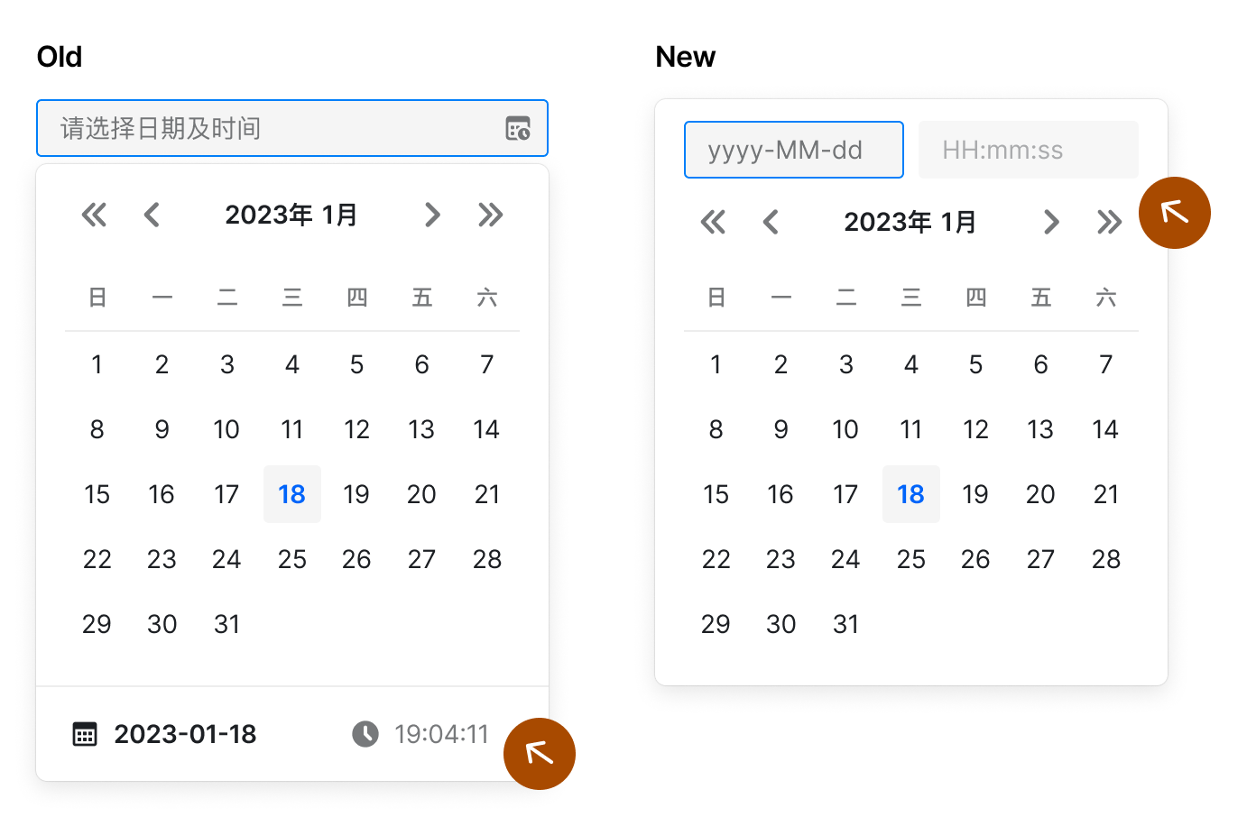
Use insetInput to control whether the date panel is inset with the input box, the default is false. Supported since v2.7.0. Inset input boxes are suitable for the following scenarios:
- Date and time selection, you can directly input the time through the embedded input box, no need to select the time through the scroll wheel
- With a custom trigger and range selection, use the inset input box to modify the start and end dates independently
After insetInput is turned on, it includes the following functions:
- After clicking the trigger, the panel will pop up in the original position by default. You can customize the popup position by
position - Click the embedded date input box, the panel switches to date selection; click the embedded time input box, the panel switches to time selection
- Consistent with the external input box, if an illegal date is entered, the date will return to the previous legal date after the panel is closed
Code
<script lang="ts">
    import { DatePicker } from '@fibrae/semi-ui-svelte';
</script>

<div>
    <DatePicker insetInput type="date" />
    <br />
    <br />
    <DatePicker insetInput type="dateTime" />
    <br />
    <br />
    <DatePicker insetInput style="width: 260px" type="dateRange" />
    <br />
    <br />
    <DatePicker insetInput style="width: 400px" type="dateTimeRange" />
    <br />
    <br />
    <DatePicker insetInput placeholder="请选择年月" style="width: 140px" type="month" />
    <br />
    <br />
    <DatePicker insetInput placeholder="请选择年月范围" style="width: 200px" type="monthRange" />
    <br />
    <br />
    <DatePicker insetInput position="bottomLeft" type="date" />
    <br />
    <br />
    <DatePicker format="yyyy-MM-dd HH:mm" insetInput type="dateTime" />
</div>
Synchronously switch months
version:>= 1.28.0
In the scenario of range selection, turning on syncSwitchMonth means to switch the two panels simultaneously. The default is false.
Note: Clicking the year button will also switch the two panels synchronously. Switching the year and month from the scroll wheel will not switch the panels synchronously. This ensures the user's ability to select months at non-fixed intervals.
Code
<script lang="ts">
    import { DatePicker } from '@fibrae/semi-ui-svelte';
</script>

<DatePicker style="width: 400px" syncSwitchMonth type="dateTimeRange" />
Panel Change Callback
version:>=1.28.0
onPanelChange is called when the month or year of the panel is changed.
Code
<script lang="ts">
    import { DatePicker } from '@fibrae/semi-ui-svelte';

    const onPanelChange = (date: Date | Date[], dateString: string | string[]) => console.log(date, dateString);
</script>

<DatePicker {onPanelChange} style="width: 400px" syncSwitchMonth type="dateTimeRange" />
Select Week
daterange is used with startDateOffset and endDateOffset to select range with single click, such as weekly selection and biweekly selection. Support after v1.10.0.
选择自然周
选择双周
选择当前日和后6日
Code
<script lang="ts">
    import * as dateFns from 'date-fns';
    import { DatePicker } from '@fibrae/semi-ui-svelte';

    const handleChange = (date: Date | Date[] | undefined) => {
        console.log('date changed', date);
    };

    const startOfWeek = (date: Date) => dateFns.startOfWeek(date, { weekStartsOn: 1 });
    const endOfWeek = (date: Date) => dateFns.endOfWeek(date, { weekStartsOn: 1 });
    const endOfNextWeek = (date: Date) => dateFns.add(endOfWeek(date), { days: 7 });
    const sixDaysLater = (date: Date) => dateFns.add(date, { days: 6 });
</script>

<div>
    <h4>选择自然周</h4>
    <DatePicker endDateOffset={endOfWeek} onChange={handleChange} startDateOffset={startOfWeek} style="width: 260px" type="dateRange" weekStartsOn={1} />
    <br />
    <br />
    <h4>选择双周</h4>
    <DatePicker endDateOffset={endOfNextWeek} onChange={handleChange} startDateOffset={startOfWeek} style="width: 260px" type="dateRange" weekStartsOn={1} />
    <br />
    <br />
    <h4>选择当前日和后6日</h4>
    <DatePicker endDateOffset={sixDaysLater} onChange={handleChange} style="width: 260px" type="dateRange" weekStartsOn={1} />
    <br />
    <br />
</div>
Selection
Version: > = 0.21.0
Set type to month, can make year-to-month selection.
Code
<script lang="ts">
    import { DatePicker } from '@fibrae/semi-ui-svelte';

    const value = new Date(2024, 4, 6, 10, 30, 0);
</script>

<DatePicker style="width: 140px" type="month" {value} />
Year and Month Range Selection
version: >= 2.32.0
Set type to monthRange to select the year and month range, small size and quick panel are not supported yet.
Code
<script lang="ts">
    import { DatePicker } from '@fibrae/semi-ui-svelte';
</script>

<DatePicker style="width: 200px" type="monthRange" />
Year Selection
Set type to year to select a year. The panel has a single year column, the selected value is January 1 of that year, and the default format is yyyy. disabledDate decides whether a year can be picked from January 1 of that year.
Code
<script lang="ts">
    import { DatePicker } from '@fibrae/semi-ui-svelte';

    const value = new Date(2024, 4, 6, 10, 30, 0);
</script>

<DatePicker style="width: 140px" type="year" {value} />
Confirm Date and Time Selection
Version: > = 0.18.0
For the selection of "datetime" (type = "dateTime") or "datetime range" (type = "dateTimeRange"), you can confirm it before writing the value into the input box. You can pass NeedConfirm = true to enable this behavior.
At the same time, the click callbacks of the "confirm" (onConfirm) and "cancel" (onCancel) buttons are supported.
The following example passes three callbacks: onChange, onConfirm and onCancel, and you can open the console to see the difference in print information.
Note: When opening
needConfirm, you need to click the cancel button to close the panel, and clicking the blank area will no longer close the panel (v2.2.0)
Code
<script lang="ts">
    import { DatePicker, type DatePickerProps } from '@fibrae/semi-ui-svelte';

    const onConfirm: DatePickerProps['onConfirm'] = (...args) => {
        console.log('Confirmed: ', ...args);
    };
    const onCancel: DatePickerProps['onCancel'] = (...args) => {
        console.log('Canceled: ', ...args);
    };
    const onChange: DatePickerProps['onChange'] = (...args) => {
        console.log('Changed: ', ...args);
    };
</script>

<DatePicker needConfirm {onCancel} {onChange} {onConfirm} type="dateTime" />
Date and Time Selection with Shortcuts
Pass parameter Presets to set shortcuts for date selection.
Code
<script lang="ts">
    import { DatePicker, type DatePickerPresetsType } from '@fibrae/semi-ui-svelte';

    const presets: DatePickerPresetsType = [
        {
            text: 'Today',
            start: () => new Date(),
            end: () => new Date(),
        },
        () => ({
            text: 'Tomorrow',
            start: new Date(new Date().valueOf() + 1000 * 3600 * 24),
            end: new Date(new Date().valueOf() + 1000 * 3600 * 24),
        }),
    ];
</script>

<DatePicker presetPosition="left" {presets} type="dateTime" />
Render TopSlot/BottomSlot
With the topSlot and bottomSlot snippets, you can customize the rendering of the top and bottom extra areas. The leftSlot and rightSlot snippets render the left and right extra areas.
Code
<script lang="ts">
    import { IconBulb } from '@fibrae/semi-icons-svelte';
    import { DatePicker, Space, Tabs, TypographyText, type DatePickerValueType, type PlainTab } from '@fibrae/semi-ui-svelte';

    const uedDisabledDate = (currentDate?: Date) => !!currentDate && currentDate.getDate() > 10 && currentDate.getDate() < 15;
    const testDisabledDate = (currentDate?: Date) => !!currentDate && currentDate.getDate() > 15 && currentDate.getDate() < 25;

    const tabList: PlainTab[] = [
        { itemKey: '1', tab: 'UED 排期' },
        { itemKey: '2', tab: '测试排期' },
    ];

    let activeTab = $state('1');
    let date = $state<DatePickerValueType | null>();
    const disabledDate = $derived(activeTab === '1' ? uedDisabledDate : testDisabledDate);
</script>

{#snippet tabs(padding: string)}
    <Tabs bind:activeKey={activeTab} onChange={() => (date = null)} size="small" style={`padding: ${padding}`} {tabList} />
{/snippet}

{#snippet notice(padding: string, text: string, linkText: string)}
    <Space style={`padding: ${padding}`}>
        <IconBulb style="color: var(--semi-amber-5)" />
        <TypographyText strong style="color: var(--semi-color-text-2)">{text}</TypographyText>
        <TypographyText link={{ href: 'https://semi.design/', target: '_blank' }}>{linkText}</TypographyText>
    </Space>
{/snippet}

<div>
    <DatePicker bind:value={date} {disabledDate} dropdownClassName="components-datepicker-demo-slot" placeholder="请选择排期">
        {#snippet topSlot()}{@render tabs('12px 20px 0')}{/snippet}
    </DatePicker>
    <br />
    <br />
    <DatePicker placeholder="请选择发版时间">
        {#snippet bottomSlot()}{@render notice('12px 20px', '定版前请阅读', '发版须知')}{/snippet}
    </DatePicker>
    <br />
    <br />
    <DatePicker placeholder="请选择年月" type="month">
        {#snippet bottomSlot()}{@render notice('12px 20px', '请阅读', '须知')}{/snippet}
    </DatePicker>
    <br />
    <br />
    <DatePicker density="compact" dropdownClassName="components-datepicker-demo-slot" placeholder="小尺寸">
        {#snippet topSlot()}{@render tabs('8px 12px 0')}{/snippet}
        {#snippet bottomSlot()}{@render notice('8px 12px', '定版前请阅读', '发版须知')}{/snippet}
    </DatePicker>
    <br />
    <br />
    <DatePicker placeholder="请选择时间范围" style="width: 400px" type="dateTimeRange">
        {#snippet bottomSlot()}{@render notice('12px 20px', '定版前请阅读', '发版须知')}{/snippet}
    </DatePicker>
    <br />
    <br />
</div>
.components-datepicker-demo-slot {
.semi-tabs-content {
padding: 0;
}
.semi-tabs-bar-line.semi-tabs-bar-top {
border-bottom: none;
}
}Disable Date Selection
Code
<script lang="ts">
    import { DatePicker } from '@fibrae/semi-ui-svelte';

    const value = new Date(2024, 4, 6, 10, 30, 0);
</script>

<DatePicker disabled type="dateTime" {value} />
Disable Partial Date or Time
Pass in disabledDate to disable the specified date, pass in disabledTime to disable the specified time, and with defaultPickerValue you can specify the year and month when the panel is opened.
disabledDate anddisabledTime, the accepted input parameters are the current date, the former returns a boolean value, the latter returns an object It will be directly passed to the TimePicker component.
禁用时间:禁用今天下午5-6点
禁用时间:两个面板禁用不同时间
禁用日期:禁用下个月28号之前的所有日期
Code
<script lang="ts">
    import * as dateFns from 'date-fns';
    import { range } from 'es-toolkit';
    import { DatePicker, type DatePickerDisabledDateType, type DatePickerDisabledTimeType } from '@fibrae/semi-ui-svelte';

    const nextValidMonth = dateFns.addMonths(Date.now(), 1);

    const disabledTime: DatePickerDisabledTimeType = (date) =>
        // With type dateTime, date is a single Date
        dateFns.isToday(date as Date)
            ? {
                  disabledHours: () => [17, 18],
                  disabledMinutes: (hour) => (19 === hour ? range(0, 10, 1) : []),
                  disabledSeconds: (hour, minute) => (hour === 20 && minute === 20 ? range(0, 20, 1) : []),
              }
            : {};

    const disabledTime2: DatePickerDisabledTimeType = (_date, panelType) => (panelType === 'left' ? { disabledHours: () => [17, 18] } : { disabledHours: () => [12, 13, 14, 15, 16, 17, 18] });

    const disabledDate: DatePickerDisabledDateType = (date) => {
        const deadDate = dateFns.setDate(dateFns.addMonths(Date.now(), 1), 28);
        return !!date && date.getTime() < deadDate.getTime();
    };
</script>

<div>
    <div>
        <h4>禁用时间:禁用今天下午5-6点</h4>
        <DatePicker {disabledTime} hideDisabledOptions={false} type="dateTime" />
    </div>
    <div>
        <h4>禁用时间:两个面板禁用不同时间</h4>
        <DatePicker disabledTime={disabledTime2} hideDisabledOptions={false} style="width: 400px" type="dateTimeRange" />
    </div>
    <div>
        <h4>禁用日期:禁用下个月28号之前的所有日期</h4>
        <DatePicker defaultPickerValue={nextValidMonth} {disabledDate} style="width: 400px" type="dateTimeRange" />
    </div>
</div>
When type contains range, the date can be disabled dynamically according to the rangeStart. The options parameter is supported after 1.9.0
动态禁用日期:禁止选择之前的日期
Code
<script lang="ts">
    import * as dateFns from 'date-fns';
    import { DatePicker, type DatePickerDisabledDateType } from '@fibrae/semi-ui-svelte';

    const disabledDate: DatePickerDisabledDateType = (date, options) => {
        if (!date || !options?.rangeStart) {
            return false;
        }
        return dateFns.isBefore(date, dateFns.parseISO(options.rangeStart));
    };
</script>

<div>
    <h4>动态禁用日期:禁止选择之前的日期</h4>
    <DatePicker {disabledDate} style="width: 260px" type="dateRange" />
</div>
When type contains range, dates can be disabled based on the focus state. The focus state is passed through the rangeInputFocus parameter in options.
开始日期禁用今天前2日和后2日,结束日期禁用今天前3天和后3天
Code
<script lang="ts">
    import * as dateFns from 'date-fns';
    import { DatePicker, type DatePickerDisabledDateType } from '@fibrae/semi-ui-svelte';

    const today = new Date();

    const disabledDate: DatePickerDisabledDateType = (date, options) => {
        if (!date) {
            return false;
        }
        const rangeInputFocus = options?.rangeInputFocus;
        const baseDate = dateFns.set(today, { hours: 0, minutes: 0, seconds: 0, milliseconds: 0 });
        if (rangeInputFocus === 'rangeStart') {
            return dateFns.subDays(baseDate, 2) <= date && date <= dateFns.addDays(baseDate, 2);
        } else if (rangeInputFocus === 'rangeEnd') {
            return dateFns.subDays(baseDate, 3) <= date && date <= dateFns.addDays(baseDate, 3);
        }
        return false;
    };
</script>

<div>
    <h4>开始日期禁用今天前2日和后2日,结束日期禁用今天前3天和后3天</h4>
    <DatePicker defaultPickerValue={today} {disabledDate} motion={false} type="dateRange" />
</div>
Custom Display Format
Pass parameter format to custom display format.
Code
<script lang="ts">
    import { DatePicker } from '@fibrae/semi-ui-svelte';

    const value = new Date(2024, 4, 6, 10, 30, 0);
</script>

<DatePicker format="yyyy年MM月dd日 HH:mm" type="dateTime" {value} />
Custom Trigger
Version: >=0.34.0
By default we use the Input component as the trigger for the DatePicker component. You can customize this trigger with the trigger snippet.
The custom trigger is a complete customization of the trigger, the default clear button will not take effect, if you need clear function, please customize a clear button that calls onClear from the snippet parameter, or sets the bound value to null.
The snippet parameter provides value, inputValue, placeholder, disabled, size, inputReadOnly, rangeInputFocus, type, format, multiple, autofocus and componentProps, plus onChange (sets the input text, as typing does), onEnterPress (commits the input text) and onClear (reports a click on the clear button). inputValue is null until the user types; show the formatted value then. The snippet parameter carries no aria-* attributes, so name the custom content yourself.
Code
<script lang="ts">
    import * as dateFns from 'date-fns';
    import { IconChevronDown, IconClose } from '@fibrae/semi-icons-svelte';
    import { Button, ButtonGroup, DatePicker, type DatePickerValueType } from '@fibrae/semi-ui-svelte';

    const formatToken = 'yyyy-MM-dd';
    let date = $state<DatePickerValueType | null>(new Date(2024, 4, 6, 10, 30, 0));
</script>

<DatePicker bind:value={date} format={formatToken}>
    {#snippet trigger({ value, placeholder })}
        <!-- The clear button is a sibling of the trigger button: buttons cannot nest -->
        <ButtonGroup theme="light">
            <Button iconPosition="right">
                {#snippet icon()}<IconChevronDown />{/snippet}
                {value.length ? dateFns.format(value[0], formatToken) : placeholder}
            </Button>
            {#if date}
                <Button
                    aria-label="清除"
                    onclick={(event) => {
                        event.stopPropagation();
                        date = null;
                    }}
                >
                    {#snippet icon()}<IconClose />{/snippet}
                </Button>
            {/if}
        </ButtonGroup>
    {/snippet}
</DatePicker>Code
<script lang="ts">
    import * as dateFns from 'date-fns';
    import { IconChevronDown, IconClose } from '@fibrae/semi-icons-svelte';
    import { Button, ButtonGroup, DatePicker, type DatePickerValueType } from '@fibrae/semi-ui-svelte';

    const formatToken = 'yyyy-MM-dd HH:mm:ss';
    let date = $state<DatePickerValueType | null>(null);

    const onChange = (value: Date | Date[] | undefined) => {
        console.log(value);
    };
</script>

<DatePicker bind:value={date} {onChange} type="dateTimeRange">
    {#snippet trigger({ value })}
        <!-- The clear button is a sibling of the trigger button: buttons cannot nest -->
        <ButtonGroup theme="light">
            <Button iconPosition="right">
                {#snippet icon()}<IconChevronDown />{/snippet}
                {value.length ? `${dateFns.format(value[0], formatToken)} ~ ${dateFns.format(value[1], formatToken)}` : '请选择日期时间范围'}
            </Button>
            {#if value.length}
                <Button
                    aria-label="清除"
                    onclick={(event) => {
                        event.stopPropagation();
                        date = null;
                    }}
                >
                    {#snippet icon()}<IconClose />{/snippet}
                </Button>
            {/if}
        </ButtonGroup>
    {/snippet}
</DatePicker>
Custom Render Date Content
Version:>=1.4.0
The date snippet receives { dayNumber, fullDate }.
dayNumber: such as13.fullDate: such as2020-08-13.
Code
<script lang="ts">
    import { DatePicker, Tooltip } from '@fibrae/semi-ui-svelte';

    const dateStyle = 'width: 100%; height: 100%; border: 1px solid var(--semi-color-primary); display: flex; justify-content: center; align-items: center';
</script>

<DatePicker>
    {#snippet date({ dayNumber })}
        {#if dayNumber === 1}
            <Tooltip>
                {#snippet content()}Always Day 1{/snippet}
                <div style={dateStyle}>{dayNumber}</div>
            </Tooltip>
        {:else}
            {dayNumber}
        {/if}
    {/snippet}
</DatePicker>
Custom Render Date Box
Version:>=1.4.0
The fullDate snippet receives { dayNumber, fullDate, dayStatus } and replaces the whole date box; the box keeps only its base and active class names.
dayStatus is this status of current date box. The included keys are as follows.
type DayStatusType = { isToday?: boolean, isSelected?: boolean, isDisabled?: boolean, isSelectedStart?: boolean, isSelectedEnd?: boolean, isInRange?: boolean, isHover?: boolean, isOffsetRangeStart?: boolean, isOffsetRangeEnd?: boolean, isHoverInOffsetRange?: boolean, }Code
<script lang="ts">
    import { DatePicker } from '@fibrae/semi-ui-svelte';

    const prefix = 'components-datepicker-demo';
    const dayStyle = 'display: flex; align-items: center; justify-content: center; width: 80%; height: 80%; border-radius: var(--semi-border-radius-circle)';
</script>

<DatePicker style="width: 260px" type="dateRange">
    {#snippet fullDate({ dayNumber, dayStatus })}
        <div
            class={{
                [`${prefix}-day-inrange`]: dayStatus.isInRange,
                [`${prefix}-day-hover`]: dayStatus.isHover,
                [`${prefix}-day-selected`]: dayStatus.isSelected,
                [`${prefix}-day-selected-start`]: dayStatus.isSelectedStart,
                [`${prefix}-day-selected-end`]: dayStatus.isSelectedEnd,
            }}
            style={dayStyle}
        >
            {dayNumber}
        </div>
    {/snippet}
</DatePicker>.components-datepicker-demo-day-inrange,
.components-datepicker-demo-day-hover {
background: var(--semi-color-primary-light-hover);
}
.components-datepicker-demo-day-selected,
.components-datepicker-demo-day-selected-start,
.components-datepicker-demo-day-selected-end {
color: var(--semi-color-bg-2);
background: var(--semi-color-primary);
}API Reference
Props
| Property | Description | Type | Default |
|---|---|---|---|
| autoAdjustOverflow | Whether the panel adjusts its direction when it is clipped. | boolean | true |
| autofocus | Focuses the input on mount, which opens the panel. | boolean | false |
| autoSwitchDate | Switches the selected date automatically when the year or month is changed with the arrow buttons or the dropdown. Only for the date type. | boolean | true |
| borderless | Removes the border of the input. | boolean | false |
| bottomSlot | Extra area at the bottom of the panel. | Snippet | - |
| clearIcon | Custom clear icon, used when showClear is true. | Snippet | - |
| date | Content of a day cell, with dayNumber and fullDate (yyyy-MM-dd). | TypeSnippet<[DatePickerDateSnippetProps]> | - |
| defaultPickerValue | The date the panel shows while there is no value; for dateTime types it is also the default time at the bottom. Compared by content: when the content changes the panel moves back to it, so passing new Date() on every render counts as a change. | DatePickerValueType | - |
| density | Size of the panel: default or compact. | DatePickerDensity | "default" |
| disabled | Whether the picker is disabled. | boolean | - |
| disabledDate | Returns true to disable a date. The second argument carries rangeStart, rangeEnd and rangeInputFocus. When type is year, it is called with January 1 of each year, and returning true disables that year. | DatePickerDisabledDateType | - |
| disabledTime | Returns disabledHours, disabledMinutes and disabledSeconds for the current date and panel position. | DatePickerDisabledTimeType | - |
| disabledTimePicker | Whether the time selection is disabled; for dateTime and dateTimeRange only. | boolean | false |
| dropdownClassName | Class name of the panel. | string | - |
| dropdownStyle | Style string of the panel. | string | - |
| endDateOffset | For dateRange, the end date of a range chosen with one click. | DatePickerDateOffsetType | - |
| endYear | Last year of the year wheel, which must be after the start year. Defaults to 100 years after this year. | number | - |
| format | Format of the text in the input; the default depends on type. A format without time tokens turns dateTime into date and dateTimeRange into dateRange. | string | - |
| fullDate | Replaces the whole day cell, with dayNumber, fullDate and dayStatus. The cell keeps only its base and active classes. | TypeSnippet<[DatePickerFullDateSnippetProps]> | - |
| hideDisabledOptions | Hides the times that are disabled. | boolean | false |
| inputReadOnly | Whether the input is read-only. | boolean | false |
| inputStyle | Style string of the root element of the input. | string | - |
| insetInput | Moves the inputs into the panel; pass an object to set the placeholders of the inputs. | boolean | DatePickerInsetInputProps | false |
| insetLabel | Inset label of the input. | Snippet | - |
| insetLabelId | The id of the inset label element. | string | - |
| leftSlot | Extra area at the left of the panel. | Snippet | - |
| max | The number of dates multiple allows; unlimited when omitted. | number | - |
| motion | Whether the panel animates when it opens. | boolean | true |
| multiple | Whether several dates can be chosen; only for type date. | boolean | false |
| needConfirm | Whether the value is written only after a confirmation; for dateTime and dateTimeRange only. | boolean | false |
| onBlur | Called when the panel closes. The argument is the mousedown that closed it from outside; other ways to close, such as confirming, choosing a date or Esc, pass none. | Type(event?: MouseEvent) => void | - |
| onCancel | Called when the selection is cancelled, with the last confirmed value. Only with needConfirm. | Type(date: Date | Date[], dateString: string | string[]) => void | - |
| onChange | Called when the value changes, with the date and the date string; both are arrays for range and multiple. When cleared, a single value is undefined and range and multiple are []. A range type calls it only after both dates are chosen. | Type(date: Date | Date[] | undefined, dateString: string | string[]) => void | - |
| onClear | Called when the clear button is clicked. | Type(event: MouseEvent) => void | - |
| onClickOutSide | Called when the panel is open and the user presses outside the panel and the trigger, with the native mousedown event. | Type(event: MouseEvent) => void | - |
| onConfirm | Called when the selection is confirmed, with the selected value. Only with needConfirm. | Type(date: Date | Date[], dateString: string | string[]) => void | - |
| onFocus | Called when an input gets focus, or when a click or key press on the trigger focuses the range start. rangeType is set for range inputs only, and moving between them does not call it again. | Type(event: FocusEvent | MouseEvent | KeyboardEvent, rangeType?: DatePickerRangeInput) => void | - |
| onOpenChange | Called when the panel opens or closes. | Type(open: boolean) => void | - |
| onPanelChange | Called when the year or month of the panel changes. | Type(date: Date | Date[], dateString: string | string[]) => void | - |
| onPresetClick | Called when a preset button is clicked; the second argument is the native MouseEvent. | Type(item: DatePickerPresetType, event: MouseEvent) => void | - |
| open | Whether the panel is open, two-way bindable with bind:open. A plain value is the initial state. While bound, open() and close() do not change the visibility; the bound value wins. | boolean | - |
| placeholder | Placeholder of the input; an array for range types. Defaults to the text of the locale for type. | string | string[] | - |
| position | Position of the panel. Defaults to bottomLeft (bottomRight in RTL), and to leftTopOver with insetInput. | Position | - |
| prefix | Prefix of the input. | Snippet | - |
| presetPosition | Position of the presets: left, right, top or bottom. | DatePickerPresetPosition | "bottom" |
| presets | Shortcuts for dates and times. An item, and its start or end, can be a function that is called when the panel renders and when it is clicked. | DatePickerPresetsType | - |
| preventScroll | Whether focusing the input prevents the browser from scrolling to it. | boolean | - |
| rangeSeparator | Separator between the dates of a range input, also used to parse the text. Use the rangeSeparatorNode snippet to change only how it is shown. | string | " ~ " |
| rangeSeparatorNode | How the separator between the range inputs is shown. It does not affect parsing. | Snippet | - |
| rightSlot | Extra area at the right of the panel. | Snippet | - |
| showClear | Whether the clear button is shown. | boolean | true |
| size | Size of the input: small, default or large. | InputSize | - |
| spacing | Distance between the panel and the trigger. 1 for an insetInput panel over the trigger, otherwise the Popover spacing. | number | - |
| startDateOffset | For dateRange, the start date of a range chosen with one click. | DatePickerDateOffsetType | - |
| startYear | First year of the year wheel. Defaults to 100 years before this year. | number | - |
| stopPropagation | Whether click events on the panel stop propagating. | boolean | string | true |
| syncSwitchMonth | Switches both panels of a range together. | boolean | false |
| timePickerOpts | Options for the time panel: use12Hours, hourStep, minuteStep, secondStep, defaultIsAM and scrollItemProps. The panel owns the format, the value and the disabled times. | DatePickerTimePickerOpts | - |
| timeZone | Time zone; a number is the offset from UTC in hours. Falls back to the timeZone of ConfigProvider, then to the global default. | string | number | - |
| topSlot | Extra area at the top of the panel. | Snippet | - |
| trigger | Replaces the trigger. It receives value, inputValue, placeholder, disabled, size, inputReadOnly, rangeInputFocus, type, format, multiple, autofocus and componentProps, plus onChange (sets the input text), onEnterPress (commits it) and onClear. The default clear button no longer applies. | TypeSnippet<[DatePickerTriggerRenderProps]> | - |
| type | Type: date, dateRange, dateTime, dateTimeRange, month, monthRange or year. | DatePickerType | "date" |
| validateStatus | Validation status: default, error or warning. Only affects the style. | ValidateStatus | - |
| value | The value, two-way bindable with bind:value: a Date, a timestamp or a string in format, and an array for range and multiple. A plain value is the initial value; null is a controlled empty value, undefined leaves the picker uncontrolled. | DatePickerValueType | null | - |
| weekStartsOn | The first day of the week: 0 is Sunday, 1 is Monday, and so on. | WeekStartNumber | 0 |
| yearAndMonthOpts | Options for the year and month columns: cycled, mode, motion and transform. The panel owns the list and the selection. | DatePickerYearAndMonthOpts | - |
Methods
| Method | Description | Type |
|---|---|---|
| blur | Blurs the input. | Type() => void |
| close | Closes the panel. A bound open wins. | Type() => void |
| focus | Focuses the input. A range focuses its start input unless rangeEnd is given. With insetInput the focus goes to the input in the panel. | Type(focusType?: RangeInput) => void |
| open | Opens the panel. A bound open wins. | Type() => void |
value and open can be bound with bind:, or given a plain value as the initial state; there is no defaultValue or defaultOpen. autofocus is lowercase; triggerRender, renderDate, renderFullDate and the other ReactNode props are snippets of the same name (trigger, date, fullDate), and the separator is shown by the rangeSeparatorNode snippet. Callbacks are written onChange and so on, not native events. style, inputStyle and dropdownStyle are strings.
Undeclared attributes such as class, style, id, title, data-* and aria-label land on the root element, which is role="group" when it has an aria-label. Where aria-labelledby, aria-describedby, aria-errormessage, aria-invalid and aria-required land:
- A single input: all of them land on the input
- A range type: the root element is
role="group"and takesaria-labelledby; the other four land on both inputs triggercontent without a focusable element:aria-labelledby,aria-describedby,aria-errormessageandaria-invalidland on the wrapper with the rolebutton;aria-requiredis not forwardedtriggercontent with its own focusable element: none of them is forwarded, so set them on the snippet content
Methods
DatePicker exposes open(), close(), focus(rangeEnd?) and blur() through export function; get the instance with bind:this and call them. focus focuses the input; a range focuses its start input unless rangeEnd is given, and with insetInput the focus goes to the input in the panel. blur blurs the input. A bound open wins: open() and close() do not change the visibility of the panel then.
Code
<script lang="ts">
    import { Button, DatePicker, Space } from '@fibrae/semi-ui-svelte';

    let picker = $state<ReturnType<typeof DatePicker>>();

    const handleClickOutside = () => {
        console.log('click outside');
    };
</script>

<Space align="start" vertical>
    <Space>
        <Button onclick={() => picker?.open()}>open</Button>
        <Button onclick={() => picker?.close()}>close</Button>
        <Button onclick={() => picker?.focus()}>focus</Button>
        <Button onclick={() => picker?.blur()}>blur</Button>
    </Space>
    <div>
        <DatePicker bind:this={picker} onClickOutSide={handleClickOutside} type="dateTime" />
    </div>
</Space>
Interface Define
type DatePickerBaseValueType = string | number | Date;
type DatePickerValueType = DatePickerBaseValueType | DatePickerBaseValueType[];
type DatePickerType = 'date' | 'dateRange' | 'dateTime' | 'dateTimeRange' | 'month' | 'monthRange' | 'year';
type DatePickerRangeInput = 'rangeStart' | 'rangeEnd';
interface DatePickerTriggerRenderProps {
    value: Date[];
    inputValue: string | null;
    placeholder: string | string[];
    disabled: boolean;
    size: InputSize;
    inputReadOnly: boolean;
    rangeInputFocus: DatePickerRangeInput | false | undefined;
    type: DatePickerType;
    format?: string;
    multiple: boolean;
    autofocus: boolean;
    // The declared props, without snippets, callbacks and undeclared attributes
    componentProps: Partial<DatePickerProps>;
    onChange: (inputValue: string) => void;
    onEnterPress: (inputValue: string) => void;
    onClear: (event: MouseEvent) => void;
}
Accessibility
ARIA
- The input has the role
comboboxwitharia-haspopup="dialog", anaria-expandedthat follows the panel, andaria-controlspointing at the panel; both inputs of a range do - A single input is named
Choose datewhile no date is selected andChange dateonce one is (anaria-labelledbyyou pass wins) - When the content of a custom trigger (
triggerRenderin React, the#triggerslot in Vue) has no focusable element, the wrapper is the focus target with the rolebutton, named as above - The role of the month in the date panel is
grid, named by the year and month title at the top of the panel; the role of the week is set torow, and the date cell is set togridcell - The year and month scroll columns are
listboxlists named "year" and "month" aria-disabledis true for the corresponding option when date and time are disabled- With multiple or range selection,
aria-multiselectableof month is true, andaria-selectedof date grid is true when selected - Some decorative icons in the panel, their
aria-hiddenis true
Keyboard and Focus
Down Arrowin the input opens the panel; once the panel is open,Down Arrowmoves focus into it- The date grid is one Tab stop: the
arrow keys,Home,End,PageUpandPageDown(by year withShift) move the active date, andEnterorSpacepicks it - The date and time switches at the bottom of a dateTime panel are buttons that
EnterorSpaceactivates - With a range value, Tab reaches the clear button after the end input, and
EnterorSpaceclears the range Esccloses the panel; focus inside the panel returns to the input, or to the custom trigger when there is one- When the content of a custom trigger has no focusable element, Tab reaches the wrapper, and
Enter,SpaceorDown Arrowopens the panel
Date and Time Format
Adopted in the semi-ui component library date-fns v4 As a date and time engine, formatting token means the following:
"y": Year"M": month"d": day"H": hours"h": hours (12h)"m": minutes"s": seconds
The following uses new Date('2023-12-09 08:08:00') or [new Date('2023-12-09 08:08:00'), new Date('2023-12-10 10 :08:00')] as value to explain the impact of different types and different format values on the displayed value:
| type | format | display value |
|---|---|---|
| date | yyyy-MM-dd | 2023-12-09 |
| dateTime | yyyy-MM-dd HH:mm:ss | 2023-12-09 08:08:00 |
| month | yyyy-MM | 2023-12 |
| year | yyyy | 2023 |
| dateRange | yyyy-MM-dd | 2023-12-09 ~ 2023-12-10 |
| dateTimeRange | yyyy-MM-dd HH:mm:ss | 2023-12-09 08:08 ~ 2023-12-10 10:08 |
Multiple dates or times are used by default "," (English comma) separated.
More token available Date-fns official website
Content Guidelines
- Date picker is recommended to be used with tags
- Use concise labels to indicate what the date selection refers to
- Please refer to Date and Time
Design Tokens
| Sass variable | Value | Usage |
|---|---|---|
| $width-datepicker_day | 36px | 日期格子及星期标题尺寸 |
| $width-datepicker_day_main | 32px | 日期格子内容尺寸 |
| $width-datepicker_month | $width-datepicker_day * 7 | 日期视图单月面板宽度 |
| $width-datepicker_nav | 32px | 顶部导航栏高度 |
| $height-datepicker_switch | 54px | 日期时间切换高度 |
| $height-datepicker_timeType_yam | calc(100% - 54px) | 时间面板高度 |
| $height-datepicker_timeType_tpk | calc(100% - 54px) | 时间面板高度 |
| $height-datepicker_panel_yam_scrolllist | 266px | 年月选择列表滚动区域高度 |
| $width-datepicker_monthPanel_max | 284px | 年月选择器最大宽度 |
| $width-datepicker_monthRangePanel_max | 384px | 年月选择器最大宽度 |
| $height-datepicker_timepicker_header_min | 24px | 年月选择面板顶部导航栏最小高度 |
| $width-datepicker_navigation_button_min | 32px | 顶部导航栏按钮最小宽度 |
| $height-datepicker_yamShowing_min | 378px | 日期时间选择器菜单最小高度 |
| $width-datepicker_yamShowing_min | 284px | 选择器菜单最小宽度 |
| $height-datepicker_dateType_yamShowing_min | 325px | 日期选择器菜单最小高度 |
| $width-datepicker_panel_yam_scrolllist_li_min | 64px | 年月、时间滚动菜单项最小高度 |
| $width-datepicker_presetPanel_left_and_right | 200px | 左右方位快捷选择面板宽度 |
| $height-datepicker_presetPanel_top_and_bottom_max | 100px | 上下方位快捷选择面板最大高度 |
| $width-datepicker_presetPanel_scroll_bar | 15px | 快捷选择面板scrollbar宽度 |
| $width-datepicker-border | $border-thickness-control | 年月选择面板顶部导航栏底部分割线宽度 |
| $width-datepicker_yam_header-borderRadius | var(--semi-border-radius-medium) | 年月选择面板顶部导航栏圆角 |
| $width-datepicker_day_main-borderRadius | var(--semi-border-radius-small) | 日期格子圆角 |
| $width-datepicker_slot-border | 1px | 日期星期分割线宽度 |
| $width-datepicker_range_input-border | $border-thickness-control-focus | |
| $width-datepicker_day_main-border | 1px | |
| $height-datepicker_timeType_insetInput_yam | 100% | 时间面板高度 - 内嵌输入框 |
| $height-datepicker_timeType_insetInput_tpk | 100% | 时间面板高度 - 内嵌输入框 |
| $width-datepicker_insetInput_date_type_wrapper | 284px | 日期类型内嵌输入框宽度 |
| $width-datepicker_insetInput_date_range_type_wrapper | $width-datepicker_insetInput_date_type_wrapper * 2 | 范围选择内嵌输入框宽度 |
| $width-datepicker_insetInput_month_type_wrapper | 165px | 月份类型内嵌输入框宽度 |
| $width-datepicker_insetInput_month_range_type_wrapper | 331px | 年月范围类型内嵌输入框宽度 |
| $height-datepicker_insetInput_separator | 32px | |
| $height-datepicker_month_grid_yearType_insetInput | 317px | |
| $height-datepicker_month_grid_timeType_insetInput | 317px | |
| $width-datepicker_range_trigger-border | 0px | 触发器边框宽度 |
| $spacing-datepicker_day-marginX | ($width-datepicker_day - $width-datepicker_day_main) * 0.5 | 日期格子水平外边距 |
| $spacing-datepicker_yam_header-paddingX | $spacing-base | 年月选择面板顶部导航栏水平内边距 |
| $spacing-datepicker_yam_header-paddingY | $spacing-base-tight | 年月选择面板顶部导航栏垂直内边距 |
| $spacing-datepicker_scrolllist_header-padding | $spacing-base | 时间选择 header 内边距 |
| $spacing-datepicker_scrolllist_body-padding | 0 | 时间选择滚动菜单内边距 |
| $spacing-datepicker_footer-paddingTop | 10px | 确认选择 footer 顶部内边距 |
| $spacing-datepicker_footer-paddingBottom | 10px | 确认选择 footer 底部内边距 |
| $spacing-datepicker_footer-paddingRight | 8px | 确认选择 footer 右侧内边距 |
| $spacing-datepicker_footer_cancel_button-marginRight | 12px | 确认选择 footer 取消按钮右外边距 |
| $spacing-datepicker_footer_confirm_button-marginRight | 8px | 确认选择 footer 确认按钮右外边距 |
| $spacing-datepicker_navigation-paddingY | $spacing-base-tight | 年月切换 header 垂直内边距 |
| $spacing-datepicker_navigation-paddingX | $spacing-base | 年月切换 header 水平内边距 |
| $spacing-datepicker_month-padding | $spacing-base | |
| $spacing-datepicker_switch_datetime-paddingTop | $spacing-base | 日期时间切换顶部内边距 |
| $spacing-datepicker_switch_datetime-paddingBottom | $spacing-base | 日期时间切换底部内边距 |
| $spacing-datepicker_switch_text-paddingLeft | $spacing-tight | 日期时间切换左侧内边距 |
| $spacing-datepicker_quick_control_header-paddingTop | 18px | 快捷预设面板标题区域上内边距 |
| $spacing-datepicker_quick_control_top_and_bottom_content-paddingX | $spacing-base-loose | 上下方位快捷操作面板, 左右内边距,默认20px |
| $spacing-datepicker_quick_control_content-paddingX | 12px | 快捷面板内容,左右内边距 |
| $spacing-datepicker_quick_control_content-marginTop | 14px | 快捷面板内容,上边距 |
| $spacing-datepicker_quick_control_item-margin | $spacing-tight | 快捷操作面板按钮间距 |
| $spacing-datepicker_range_input-paddingX | 8px | |
| $spacing-datepicker_range_input_inputWrapper_input-paddingY | 2px | |
| $spacing-datepicker_range_input_inputWrapper_input-paddingX | 4px | |
| $spacing-datepicker_range_input_prefix-paddingLeft | 12px | |
| $spacing-datepicker_range_input_prefix-paddingRight | 8px | |
| $spacing-datepicker_range_input_suffix-paddingLeft | 8px | |
| $spacing-datepicker_range_input_suffix-paddingRight | 12px | |
| $spacing-datepicker_range_input_clearbtn-paddingLeft | 8px | |
| $spacing-datepicker_range_input_clearbtn-paddingRight | 12px | |
| $spacing-datepicker_navigation_insetInput-paddingY | 8px | 年月切换 header 垂直内边距 - 内嵌输入框 |
| $spacing-datepicker_insetInput_wrapper-margin | 8px | |
| $spacing-datepicker_insetInput_wrapper-paddingY | 12px | |
| $spacing-datepicker_insetInput_wrapper-paddingX | 16px | |
| $spacing-datepicker_insetInput_wrapper-paddingBottom | 0 | |
| $spacing-datepicker_insetInput_separator-paddingY | 0 | |
| $spacing-datepicker_insetInput_separator-paddingX | 4px | |
| $color-datepicker_header-bg-default | var(--semi-color-bg-3) | 日期选择器 header 背景颜色 |
| $color-datepicker_list-bg-default | var(--semi-color-bg-3) | 日期选择器滚动列表背景颜色 |
| $color-datepicker_border-bg-default | var(--semi-color-border) | 日期选择器描边颜色 |
| $color-datepicker_footer-bg-default | var(--semi-color-fill-0) | 日期选择器确认选择 footer 背景颜色 |
| $color-datepicker_quick-bg-default | transparent | 日期选择器快捷操作背景颜色 |
| $color-datepicker_quick_button-text-default | var(--semi-color-primary) | 日期选择器快捷操作按钮文字颜色 |
| $color-datepicker_day-text-default | var(--semi-color-text-2) | 星期标题及日期时间切换按钮文字颜色 - 默认 |
| $color-datepicker_day-text-active | var(--semi-color-text-0) | 日期时间切换文字颜色 - 选中 |
| $color-datepicker_date-text-default | var(--semi-color-text-0) | 日期格子文字颜色 - 默认 |
| $color-datepicker_date-bg-default | var(--semi-color-fill-0) | 日期格子背景颜色 - 默认 |
| $color-datepicker_date-bg-hover | var(--semi-color-fill-0) | 日期格子背景颜色 - 悬浮 |
| $color-datepicker_date-bg-active | var(--semi-color-fill-1) | 日期格子背景颜色 - 按下 |
| $color-datepicker_date_selected-text-default | var(--semi-color-white) | 日期格子文字颜色 - 选中 |
| $color-datepicker_date_selected-bg-default | var(--semi-color-primary) | 日期格子背景颜色 - 选中 |
| $color-datepicker_date_disabled-text-default | var(--semi-color-disabled-text) | 禁用日期格子文字颜色 |
| $color-datepicker_date_disabled-bg-default | var(--semi-color-disabled-fill) | 禁用日期格子背景颜色 |
| $color-datepicker_date_today-text-default | var(--semi-color-primary) | 今日文字颜色 |
| $color-datepicker_date_today_disabled-text-default | var(--semi-color-primary-disabled) | 今日文字颜色 - 禁用 |
| $color-datepicker_date_inHover-bg-default | var(--semi-color-primary-light-default) | 范围选择日期格子颜色 |
| $color-datepicker_date_inRangeHover-bg-default | var(--semi-color-fill-0) | 范围选择时悬停路径内的日期背景色 |
| $color-datepicker_date_hoverDay-bg-default | var(--semi-color-fill-1) | 范围选择时日期格子背景色 - 悬停 |
| $color-datepicker_date_selectedRange-bg-hover | var(--semi-color-primary-light-hover) | 范围选择日期格子颜色 - 悬浮 |
| $color-datepicker_date_hoverday_range-bg-default | var(--semi-color-primary-light-active) | |
| $color-datepicker_date_hoverday_around_single_selected-bg-default | var(--semi-color-primary-light-active) | |
| $color-datepicker_nav_monthIcon-text-default | var(--semi-color-text-0) | 顶部导航栏年月文字颜色 - 默认 |
| $color-datepicker_navIcon-text-default | var(--semi-color-text-2) | 日期选择器 header 左右箭头颜色 |
| $color-datepicker_input_primary-text-default | var(--semi-color-primary) | |
| $color-datepicker_range_input-text-default | var(--semi-color-text-2) | |
| $color-datepicker_range_input-bg-default | var(--semi-color-fill-0) | |
| $color-datepicker_range_input-bg-hover | var(--semi-color-fill-1) | |
| $color-datepicker_range_input-border-default | transparent | |
| $color-datepicker_range_input-border-active | var(--semi-color-focus-border) | |
| $color-datepicker_range_input_warning-border-active | var(--semi-color-warning) | |
| $color-datepicker_range_input_warning-bg-active | var(--semi-color-warning-light-hover) | |
| $color-datepicker_range_input_warning-bg-default | var(--semi-color-warning-light-default) | |
| $color-datepicker_range_input_warning-bg-hover | var(--semi-color-warning-light-hover) | |
| $color-datepicker_range_input_warning-border-default | var(--semi-color-warning-light-default) | |
| $color-datepicker_range_input_error-border-default | var(--semi-color-danger-light-default) | |
| $color-datepicker_range_input_error-bg-hover | var(--semi-color-danger-light-hover) | |
| $color-datepicker_range_input_error-border-active | var(--semi-color-danger) | |
| $color-datepicker_range_input_error-bg-active | var(--semi-color-danger-light-hover) | |
| $color-datepicker_range_input_disabled-text-default | var(--semi-color-disabled-text) | |
| $color-datepicker_range_input_disabled-bg-default | var(--semi-color-disabled-fill) | |
| $color-datepicker_range_input_disabled-bg-hover | var(--semi-color-disabled-fill) | |
| $color-datepicker_range_input_clearbtn-icon-hover | var(--semi-color-primary-hover) | |
| $color-datepicker_range_input_inputWrapper-border-default | transparent | |
| $color-datepicker_range_input_inputWrapper-bg-default | transparent | |
| $color-datepicker_range_input_inputWrapper-bg-focus | var(--semi-color-fill-1) | |
| $color-datepicker_range_input_separator-text-active | var(--semi-color-text-0) | |
| $color-datepicker_day_main-border | var(--semi-color-primary-active) | |
| $color-datepicker_insetInput_separator | var(--semi-color-text-3) | |
| $color-datepicker_range_trigger-border | transparent | 范围日期选择模式触发器边框颜色 |
| $color-datepicker_range_trigger-border-hover | transparent | 范围日期选择模式触发器边框颜色 - 悬浮 |
| $color-datepicker_range_trigger-border-active | transparent | 范围日期选择模式触发器边框颜色 - 激活 |
| $color-datepicker_range_trigger-border-focus | transparent | 范围日期选择模式触发器边框颜色 - 聚焦 |
| $font-datepicker_range_input_prefix_suffix_clearbtn-fontWeight | 600 | |
| $font-datepicker_preset_header-fontWeight | 600 | |
| $font-datepicker_range_input_prefix_suffix_clearbtn-fontSize | 14px | |
| $font-datepicker_range_input_prefix_suffix_clearbtn-lineHeight | 20px | |
| $font-datepicker_range_input_large-fontSize | 16px | |
| $spacing-datepicker_month_compact-padding | 10px | |
| $width-datepicker_day_compact | 28px | |
| $width-datepicker_day_main_compact | 24px | |
| $width-datepicker_day_compact-borderRadius | 4px | |
| $width-datepicker_month_compact | $width-datepicker_day_compact * 7 + $spacing-datepicker_month_compact-padding * 2 | |
| $width-datepicker_nav_compact | 24px | |
| $width-datepicker_panel_compact | 216px | |
| $height-datepicker_switch_compact | 32px | |
| $height-datepicker_tpk_compact | 256px | |
| $height-datepicker_yam_panel_compact | 256px | |
| $height-datepicker_yam_li_compact | 32px | |
| $height-datepicker_yam_panel_header_compact | 48px | |
| $radius-datepicker_range_input_inputWrapper | var(--semi-border-radius-small) | |
| $height-datepicker_range_input-default | 32px | |
| $height-datepicker_range_input-small | 24px | |
| $height-datepicker_range_input-large | 40px | |
| $width-datepicker_insetInput_date_type_wrapper_compact | 216px | |
| $width-datepicker_insetInput_date_range_type_wrapper_compact | $width-datepicker_insetInput_date_type_wrapper_compact * 2 | |
| $width-datepicker_insetInput_month_type_wrapper_compact | 195px | |
| $height-datepicker_insetInput_tpk_compact | 100% | |
| $height-datepicker_timeType_insetInput_yam_compact | 100% | |
| $height-datepicker_insetInput_wrapper_compact | 28px | |
| $lineHeight-datepicker_compact | 20px | |
| $lineHeight-datepicker_weekday_item_compact | 28px | |
| $height-datepicker_insetInput_compact | 26px | |
| $fontSize-datepicker_insetInput_compact-fontSize | 12px | |
| $spacing-datepicker_switch_compact-padding | 6px | |
| $spacing-datepicker_day_compact-margin | ($width-datepicker_day_compact - $width-datepicker_day_main_compact) * 0.5 | |
| $spacing-datepicker_weeks_compact-padding | 10px | |
| $spacing-datepicker_weeks_compact-paddingTop | $spacing-tight - 2px | |
| $spacing-datepicker_weekday_compact-paddingLeft | 10px | |
| $spacing-datepicker_weekday_compact-paddingRight | 10px | |
| $spacing-datepicker_weekday_compact-paddingBottom | $spacing-tight | |
| $spacing-datepicker_nav_compact-padding | 12px | |
| $spacing-datepicker_yam_panel_header_compact-padding | 12px | |
| $spacing-datepicker_footer_compact-paddintTop | 10px | |
| $spacing-datepicker_footer_compact-paddintBottom | 10px | |
| $spacing-datepicker_footer_compact-paddintRight | 8px | |
| $spacing-datepicker_scrolllist_shade_pre_compact-marginTop | -17px | |
| $spacing-datepicker_scrolllist_shade_post_compact-marginTop | 17px | |
| $spacing-datepicker_insetInput_wrapper_compact-margin | 4px | |
| $spacing-datepicker_insetInput_wrapper_compact-paddingY | 8px | |
| $spacing-datepicker_insetInput_wrapper_compact-paddingX | 8px | |
| $spacing-datepicker_insetInput_wrapper_compact-paddingBottom | 0 | |
| $spacing-datepicker_insetInput_wrapper_rangeType_compact-paddingTop | 0 | |
| $spacing-datepicker_quick_control_header_compact-paddingTop | 16px | compact, 快捷面板标题,上内边距 |
| $spacing-datepicker_quick_control_content_compact-marginTop | 12px | compact, 快捷面板内容,上边距 |
| $spacing-datepicker_quick_control_left_and_right_content_compact-paddingX | 12px | compact,左右方位,快捷面板内容,左右内边距 |
| $spacing-datepicker_quick_control_top_and_bottom_content_compact-paddingX | 10px | compact,上下方位,快捷面板内容,左右内边距 |
| $radius-datepicker_range_input | var(--semi-border-radius-small) | |
| $transition-datepicker_range_input | background-color 0.16s ease-in-out | |
| $width-datepicker_presetPanel_left_and_right_content | $width-datepicker_presetPanel_left_and_right - $spacing-datepicker_quick_control_content-paddingX * 2 | 左右方位快捷选择面板,内容宽度 |
| $width-datepicker_presetPanel_top_and_bottom_content_date | $width-datepicker_day * 7 + $spacing-datepicker_month-padding * 2 - $spacing-datepicker_quick_control_top_and_bottom_content-paddingX * 2 | date/dateTime下, 上下方位快捷选择面板内容宽度, 默认(284 - 40)px |
| $width-datepicker_presetPanel_top_and_bottom_content_range | ($width-datepicker_day * 7 + $spacing-datepicker_month-padding * 2) * 2 - $spacing-datepicker_quick_control_top_and_bottom_content-paddingX * 2 | dateRange/dateTimeRange下, 上下方位快捷选择内容面板宽度,默认528px |
| $width-datepicker_presetPanel_top_and_bottom_content_month | 165px - $spacing-datepicker_quick_control_top_and_bottom_content-paddingX * 2 | month下,上下方位快捷选择内容面板宽度, 默认154px |
| $height-datepicker_month_max | $width-datepicker_day * 7 + 1px | 年月面板最大高度, 最多6 + 1行,再加上一个border宽度, 默认253px |
| $height-datepicker_month_max_compact | $width-datepicker_day_compact * 7 + $spacing-datepicker_weeks_compact-paddingTop + $spacing-datepicker_weeks_compact-padding + $spacing-datepicker_weekday_compact-paddingBottom | 年月面板最大高度, 最多6 + 1行,再加上padding,默认220px |
| $height-datepicker_date_panel | $height-datepicker_month_max + $spacing-datepicker_month-padding + $width-datepicker_nav + $spacing-datepicker_navigation-paddingY * 2 | date/dateRange,面板渲染最大高度,默认325px |
| $height-datepicker_date_time_panel | $height-datepicker_date_panel + $height-datepicker_switch - 1px | dateTime/dateTImeRange 面板渲染最大高度. 默认378px |
| $height-datepicker_presetPanel_left_and_right_except_content | 20px + $spacing-datepicker_quick_control_header-paddingTop + $spacing-datepicker_quick_control_content-marginTop | 除去content以外的高度,默认52px |
| $width-datepicker_presetPanel_top_and_bottom_content_date_compact | $width-datepicker_day_compact * 7 + $spacing-datepicker_weeks_compact-padding * 2 - $spacing-datepicker_quick_control_top_and_bottom_content_compact-paddingX * 2 | date/dateTime下, 上下方位快捷选择面板内容宽度, 默认(216 - 20)px |
| $width-datepicker_presetPanel_top_and_bottom_content_range_compact | ($width-datepicker_day_compact * 7 + $spacing-datepicker_weeks_compact-padding * 2) * 2 - $spacing-datepicker_quick_control_top_and_bottom_content_compact-paddingX * 2 | dateRange/dateTimeRange下, 上下方位快捷选择内容面板宽度,默认412px |
| $width-datepicker_presetPanel_top_and_bottom_content_month_compact | 165px - $spacing-datepicker_quick_control_top_and_bottom_content_compact-paddingX * 2 | month下,上下方位快捷选择内容面板宽度, 默认174px |
| $height-datepicker_date_panel_compact | $height-datepicker_month_max_compact + $width-datepicker_nav_compact + $spacing-datepicker_nav_compact-padding | compact,date/dateRange,面板渲染最大高度,默认256px |
| $height-datepicker_date_time_panel_compact | $height-datepicker_date_panel_compact + $height-datepicker_switch_compact | compact,dateTime/dateTImeRange,面板渲染最大高度,默认288px |
| $height-datepicker_presetPanel_left_and_right_except_content_compact | 20px + $spacing-datepicker_quick_control_header_compact-paddingTop + $spacing-datepicker_quick_control_content_compact-marginTop | compact,除去content以外的高度,默认48px |
| $width-datepicker_presetPanel_left_and_right_two_col_button | ($width-datepicker_presetPanel_left_and_right_content - $spacing-datepicker_quick_control_item-margin) * 0.5 | 左右方位快捷选择面板,固定两列,按钮宽度 |
| $width-datepicker_presetPanel_top_and_bottom_three_col_button | ($width-datepicker_presetPanel_top_and_bottom_content_date - $spacing-datepicker_quick_control_item-margin * 2) * 0.333 | 上下方位快捷选择面板,固定三列,按钮宽度 |
| $width-datepicker_presetPanel_top_and_bottom_five_col_button | ($width-datepicker_presetPanel_top_and_bottom_content_range - $spacing-datepicker_quick_control_item-margin * 4) * 0.2 | 上下方位快捷选择面板,固定五列,按钮宽度 |
| $width-datepicker_presetPanel_top_and_bottom_two_col_button | ($width-datepicker_presetPanel_top_and_bottom_content_month - $spacing-datepicker_quick_control_item-margin) * 0.5 | 上下方位快捷选择面板,固定两列,按钮宽度 |
| $width-datepicker_presetPanel_top_and_bottom_three_col_button_compact | ($width-datepicker_presetPanel_top_and_bottom_content_date_compact - $spacing-datepicker_quick_control_item-margin * 2) * 0.333 | 上下方位快捷选择面板,固定三列,按钮宽度 |
| $width-datepicker_presetPanel_top_and_bottom_five_col_button_compact | ($width-datepicker_presetPanel_top_and_bottom_content_range_compact - $spacing-datepicker_quick_control_item-margin * 4) * 0.2 | 上下方位快捷选择面板,固定五列,按钮宽度 |
| $width-datepicker_presetPanel_top_and_bottom_two_col_button_compact | ($width-datepicker_presetPanel_top_and_bottom_content_month_compact - $spacing-datepicker_quick_control_item-margin) * 0.5 | 上下方位快捷选择面板,固定两列,按钮宽度 |
| $height-datepicker_inset_input | 32px + $spacing-datepicker_insetInput_wrapper-paddingY | 默认尺寸,insetInput高度 |
| $height-datepicker_preset_panel_inset_input | $height-datepicker_month_max + $spacing-datepicker_month-padding + $width-datepicker_nav + $spacing-datepicker_navigation_insetInput-paddingY * 2 + $height-datepicker_inset_input | inset_input下,非month面板渲染最大高度,默认361px |
| $height-datepicker_inset_input_compact | 28px + $spacing-datepicker_insetInput_wrapper_compact-paddingY | compact,insetInput高度, 默认36px |
| $height-datepicker_preset_panel_inset_input_compact | $height-datepicker_month_max_compact + $width-datepicker_nav_compact + $spacing-datepicker_insetInput_wrapper_compact-paddingY * 2 + $height-datepicker_inset_input_compact | inset_input下,非month面板渲染最大高度,默认296px |
FAQ
-
Date time picker, when you choose time, minute and second, you don't want to scroll infinitely. How to achieve the effect?
Starting from version V2.22.0, we changed the default mode of ScrollItem in TimePicker from wheel to normal. If you want to apply the infinite scrolling effect again, you can control this behavior through a specific switch in timePickerOpts, that is:timePickerOpts={{ scrollItemProps: { mode: 'wheel', cycled: true } }}. -
How to set the default display time when the panel is opened?
You can use the defaultPickerValue property. -
Date time selection, range date selection, after inputting some dates, the panel does not echo the date?
The input box needs to be entered completely before it is showed to the panel. For example, for
dateTimetype, the full requested date and time have been entered. FordateRangetype, full requires start and end dates to be entered. -
What is the displayed time at the bottom of the date time selection panel?
When no time is selected, it is the value of the time in
defaultPickerValue, if not set it is the time when the panel was opened. After selecting a time, it is the selected time.Since it has two hidden meanings in design, which may lead to ambiguity, it is recommended to use inline styles and open them through
insetInput. It is recommended to read the relevant Documentation before use.