When to use
The Chat component can be used in scenarios such as regular conversations or AI conversations.
The rendering of the conversation content is based on the MarkdownRender component, which supports Markdown and MDX (Note: The default format mode of MarkdownRender in Chat is md. If you need to use MDX format, you can set it through the markdownRenderProps API). It allows for common rich text features such as images, tables, links, bold text, code blocks, and more. More complex customization is achieved with snippets. Register the languages of code blocks with CodeHighlight.register of CodeHighlight to highlight them.
Demos
How to import
<script lang="ts">
    import { Chat } from '@fibrae/semi-ai-svelte';
</script>
Basic usage
Bind the conversation list with bind:chats and listen to onMessageSend to achieve basic conversation display and interaction. When a message is sent, liked, reset, cleared or deleted, Chat writes the new list back to chats first and then calls onChatsChange. Replacing the list, a push and in-place growth of the last message's text are followed; other in-place edits (a deep content edit, a lone status flip) render but are not followed, so replace the array as a whole when updating a message.
Attachments can be uploaded by clicking the upload button, pasting into the input box, or dragging files into the Chat area. Set the upload parameters through uploadProps. For details, refer to Upload.
The prompt text of the upload button is set through the uploadTip snippet, and the other properties of the Tooltip through uploadTipProps (without content). For details, please refer to Tooltip. The upload button itself can be replaced with the uploadButton snippet. uploadProps leaves out fileList and children, as Chat owns the attachment list; nothing is uploaded unless a customRequest or an action is given.
Dialogue is a scene involving multiple parties and multiple rounds of interaction. Role information (including name, avatar, etc.) can be passed in through roleConfig, and the specific parameter details are RoleConfig.
Use the align attribute to set the layout of the dialog, supporting left and right layout (leftRight, default) and left alignment (leftAlign).

Hello, I'm your AI assistant.

给一个 Semi Design 的 Button 组件的使用示例
以下是一个 Semi 代码的使用示例:
svelte
Code
<script lang="ts">
    import { Chat, type ChatAlign, type ChatMessage, type ChatMode } from '@fibrae/semi-ai-svelte';
    import { Radio, RadioGroup, type RadioValue } from '@fibrae/semi-ui-svelte';

    const roleConfig = {
        user: {
            name: 'User',
            avatar: '/assets/docs-icon.png',
        },
        assistant: {
            name: 'Assistant',
            avatar: '/assets/placeholder/logo.svg',
        },
        system: {
            name: 'System',
            avatar: '/assets/placeholder/logo.svg',
        },
    };

    const uploadProps = { action: 'https://api.semi.design/upload' };

    let id = 0;
    const getId = () => `id-${id++}`;

    let messages = $state<ChatMessage[]>([
        {
            role: 'system',
            id: '1',
            createAt: 1715676751919,
            content: "Hello, I'm your AI assistant.",
        },
        {
            role: 'user',
            id: '2',
            createAt: 1715676751919,
            content: '给一个 Semi Design 的 Button 组件的使用示例',
        },
        {
            role: 'assistant',
            id: '3',
            createAt: 1715676751919,
            content: '以下是一个 Semi 代码的使用示例:\n```svelte \n<Button>Click me</Button>\n```\n',
        },
    ]);
    let mode = $state<RadioValue | undefined>('bubble');
    let align = $state<RadioValue | undefined>('leftRight');

    const onMessageSend = () => {
        const newAssistantMessage: ChatMessage = {
            role: 'assistant',
            id: getId(),
            createAt: Date.now(),
            content: '这是一条 mock 回复信息',
        };
        setTimeout(() => {
            messages = [...messages, newAssistantMessage];
        }, 200);
    };

    const onMessageReset = () => {
        setTimeout(() => {
            const lastMessage = messages[messages.length - 1];
            const newLastMessage: ChatMessage = {
                ...lastMessage,
                status: 'complete',
                content: 'This is a mock reset message.',
            };
            messages = [...messages.slice(0, -1), newLastMessage];
        }, 200);
    };
</script>

<span style="display: flex; flex-direction: column; row-gap: 8px">
    <span style="display: flex; align-items: center; column-gap: 10px">
        模式
        <RadioGroup aria-label="模式" bind:value={mode} type="button">
            <Radio value="bubble">气泡</Radio>
            <Radio value="noBubble">非气泡</Radio>
            <Radio value="userBubble">用户会话气泡</Radio>
        </RadioGroup>
    </span>
    <span style="display: flex; align-items: center; column-gap: 10px">
        会话布局方式
        <RadioGroup aria-label="会话布局方式" bind:value={align} type="button">
            <Radio value="leftRight">左右分布</Radio>
            <Radio value="leftAlign">左对齐</Radio>
        </RadioGroup>
    </span>
</span>
{#key `${align}${mode}`}
    <Chat align={align as ChatAlign} bind:chats={messages} mode={mode as ChatMode} {onMessageReset} {onMessageSend} {roleConfig} style="border: 1px solid var(--semi-color-border); border-radius: 16px; margin: 8px 16px; height: 550px" {uploadProps}>
        {#snippet uploadTip()}自定义上传按钮提示信息{/snippet}
    </Chat>
{/key}
Chat status
The chats type is Message[], where each Message contains various information about the conversation, such as role, content, attachment, status, unique identifier (id), creation time (createAt), and more. For detailed information, please refer to Message. The conversation style may vary depending on the different status values.
请求成功
请求错误
Code
<script lang="ts">
    import { Chat, type ChatMessage } from '@fibrae/semi-ai-svelte';

    const roleConfig = {
        user: {
            name: 'User',
            avatar: '/assets/docs-icon.png',
        },
        assistant: {
            name: 'Assistant',
            avatar: '/assets/placeholder/logo.svg',
        },
        system: {
            name: 'System',
            avatar: '/assets/placeholder/logo.svg',
        },
    };

    const uploadProps = { action: 'https://api.semi.design/upload' };

    let id = 0;
    const getId = () => `id-${id++}`;

    let messages = $state<ChatMessage[]>([
        {
            role: 'assistant',
            id: '1',
            createAt: 1715676751919,
            content: '请求成功',
        },
        {
            id: 'loading',
            role: 'assistant',
            status: 'loading',
        },
        {
            role: 'assistant',
            id: 'error',
            content: '请求错误',
            status: 'error',
        },
    ]);

    const onMessageSend = () => {
        const newAssistantMessage: ChatMessage = {
            role: 'assistant',
            id: getId(),
            createAt: Date.now(),
            content: '这是一条 mock 回复信息',
        };
        setTimeout(() => {
            messages = [...messages, newAssistantMessage];
        }, 200);
    };
</script>

<Chat bind:chats={messages} {onMessageSend} {roleConfig} style="border: 1px solid var(--semi-color-border); border-radius: 16px; height: 400px" {uploadProps} />
Dynamic update chats
For the case of receiving Server-Sent Event data from the backend, the obtained data can be used to update the chats, and the conversation content will be updated in real-time.
The showStopGenerate parameter can be used to determine whether to display the stop generation button, with a default value of false. The logic for stopping the generation can be handled in the onStopGenerator function. When streaming a message, replace the last item with a new object and replace the array as a whole each time, and Chat follows the update.
Hello, I'm your AI assistant.
介绍一下 Semi design
Semi Design 是由抖音前端团队和MED产品设计团队设计、开发并维护的设计系统。作为一个全面、易用、优质的现代应用UI解决方案,Semi Design从字节跳动各业务线的复杂场景中提炼而来,目前已经支撑了近千个平台产品,服务了内外部超过10万用户[1]。 Semi Design的特点包括:
- 设计简洁、现代化。
- 提供主题方案,可深度样式定制。
- 提供明暗色两套模式,切换方便。
- 国际化,覆盖了简/繁体中文、英语、日语、韩语、葡萄牙语等20+种语言,日期时间组件提供全球时区支持,全部组件可自动适配阿拉伯文RTL布局。
- 采用 Foundation 和 Adapter 跨框架技术方案,方便扩展。
Learn more:
Code
<script lang="ts">
    import { onDestroy } from 'svelte';
    import { Chat, type ChatMessage } from '@fibrae/semi-ai-svelte';

    const roleConfig = {
        user: {
            name: 'User',
            avatar: '/assets/docs-icon.png',
        },
        assistant: {
            name: 'Assistant',
            avatar: '/assets/placeholder/logo.svg',
        },
        system: {
            name: 'System',
            avatar: '/assets/placeholder/logo.svg',
        },
    };

    const uploadProps = { action: 'https://api.semi.design/upload' };

    let id = 0;
    const getId = () => `id-${id++}`;

    let messages = $state<ChatMessage[]>([
        {
            role: 'system',
            id: '1',
            createAt: 1715676751919,
            content: "Hello, I'm your AI assistant.",
        },
        {
            role: 'user',
            id: '2',
            createAt: 1715676751919,
            content: '介绍一下 Semi design',
        },
        {
            role: 'assistant',
            id: '3',
            createAt: 1715676751919,
            content: `
Semi Design 是由抖音前端团队和MED产品设计团队设计、开发并维护的设计系统。作为一个全面、易用、优质的现代应用UI解决方案,Semi Design从字节跳动各业务线的复杂场景中提炼而来,目前已经支撑了近千个平台产品,服务了内外部超过10万用户[[1]](https://semi.design/zh-CN/start/introduction)。
Semi Design的特点包括:
1. 设计简洁、现代化。
2. 提供主题方案,可深度样式定制。
3. 提供明暗色两套模式,切换方便。
4. 国际化,覆盖了简/繁体中文、英语、日语、韩语、葡萄牙语等20+种语言,日期时间组件提供全球时区支持,全部组件可自动适配阿拉伯文RTL布局。
5. 采用 Foundation 和 Adapter 跨框架技术方案,方便扩展。
---
Learn more:
1. [Introduction 介绍 - Semi Design](https://semi.design/zh-CN/start/introduction)
2. [Getting Started 快速开始 - Semi Design](https://semi.design/zh-CN/start/getting-started)
3. [Semi D2C 设计稿转代码的演进之路 - 知乎](https://zhuanlan.zhihu.com/p/667189184)
`,
        },
    ]);

    let timer: ReturnType<typeof setInterval> | null = null;

    const stopTimer = () => {
        if (timer) {
            clearInterval(timer);
            timer = null;
        }
    };

    const replaceLast = (update: (last: ChatMessage) => ChatMessage) => {
        messages = [...messages.slice(0, -1), update(messages[messages.length - 1])];
    };

    const generateMockResponse = (content: string) => {
        timer = setInterval(() => {
            const last = messages[messages.length - 1];
            if (last.status === 'loading') {
                replaceLast((m) => ({ ...m, content: `mock Response for ${content} \n`, status: 'incomplete' }));
            } else if (last.status === 'incomplete') {
                const next = `${last.content} mock stream message`;
                if ((last.content?.length ?? 0) > 200) {
                    stopTimer();
                    replaceLast((m) => ({ ...m, content: next, status: 'complete' }));
                } else {
                    replaceLast((m) => ({ ...m, content: next }));
                }
            }
        }, 400);
    };

    const onMessageSend = (content: string) => {
        messages = [...messages, { role: 'assistant', status: 'loading', createAt: Date.now(), id: getId() }];
        generateMockResponse(content);
    };

    const onStopGenerator = () => {
        if (!timer) {
            return;
        }
        stopTimer();
        const last = messages[messages.length - 1];
        if (last.status && last.status !== 'complete') {
            replaceLast((m) => ({ ...m, status: 'complete' }));
        }
    };

    onDestroy(stopTimer);
</script>

<Chat bind:chats={messages} {onMessageSend} {onStopGenerator} {roleConfig} showStopGenerate style="border: 1px solid var(--semi-color-border); border-radius: 16px; height: 600px" {uploadProps} />
Clear context
Displaying the clear context button in the input box can be enabled through showClearContext, which defaults to false. The context can also be cleared by calling the clearContext method on the component instance (bind:this), which also offers resetMessage, scrollToBottom and sendMessage; see Methods in the API. The divider after clearing can be customized with the divider snippet.
<script lang="ts">
    import { Chat, type ChatHandle } from '@fibrae/semi-ai-svelte';

    let chat = $state<ChatHandle>();
</script>

<Chat bind:this={chat} showClearContext />
<button onclick={() => chat?.clearContext()}>Clear context</button>Hello, I'm your AI assistant.
介绍一下 semi design
Semi Design 是由抖音前端团队和MED产品设计团队设计、开发并维护的设计系统
Code
<script lang="ts">
    import { Chat, type ChatMessage } from '@fibrae/semi-ai-svelte';

    const roleConfig = {
        user: {
            name: 'User',
            avatar: '/assets/docs-icon.png',
        },
        assistant: {
            name: 'Assistant',
            avatar: '/assets/placeholder/logo.svg',
        },
        system: {
            name: 'System',
            avatar: '/assets/placeholder/logo.svg',
        },
    };

    const uploadProps = { action: 'https://api.semi.design/upload' };

    let id = 0;
    const getId = () => `id-${id++}`;

    let messages = $state<ChatMessage[]>([
        {
            role: 'system',
            id: '1',
            createAt: 1715676751919,
            content: "Hello, I'm your AI assistant.",
        },
        {
            role: 'user',
            id: '2',
            createAt: 1715676751919,
            content: '介绍一下 semi design',
        },
        {
            role: 'assistant',
            id: '3',
            createAt: 1715676751919,
            content: 'Semi Design 是由抖音前端团队和MED产品设计团队设计、开发并维护的设计系统',
        },
    ]);

    const onMessageSend = () => {
        const newAssistantMessage: ChatMessage = {
            role: 'assistant',
            id: getId(),
            createAt: Date.now(),
            content: '这是一条 mock 回复信息',
        };
        setTimeout(() => {
            messages = [...messages, newAssistantMessage];
        }, 200);
    };

    const onMessageReset = () => {
        setTimeout(() => {
            const lastMessage = messages[messages.length - 1];
            const newLastMessage: ChatMessage = {
                ...lastMessage,
                status: 'complete',
                content: 'This is a mock reset message.',
            };
            messages = [...messages.slice(0, -1), newLastMessage];
        }, 200);
    };
</script>

<Chat bind:chats={messages} {onMessageReset} {onMessageSend} {roleConfig} showClearContext style="border: 1px solid var(--semi-color-border); border-radius: 16px; margin: 8px 16px; height: 550px" {uploadProps}>
    {#snippet uploadTip()}自定义上传按钮提示信息{/snippet}
</Chat>
Custom rendering dialog box
Customize the parts of the chat box through the snippets of the same names; the snippet parameter types are as follows. The class in the parameters is the default class name of that part, and a custom root element needs to bind it; default* are the built-in nodes, of type snippet, rendered with {@render} where needed.
import type { Snippet } from 'svelte';

export interface ChatTitleSnippetProps {
    message: ChatMessage;
    role: ChatMetadata;
    defaultTitle: Snippet;
}

export interface ChatAvatarSnippetProps {
    message: ChatMessage;
    role: ChatMetadata;
    defaultAvatar: Snippet;
}

/* For a role without an image URL: renders the content inside the avatar */
export interface ChatRoleAvatarSnippetProps {
    message: ChatMessage;
    role: ChatMetadata;
}

export interface ChatContentSnippetProps {
    message: ChatMessage;
    role: ChatMetadata;
    defaultContent: Snippet;
    class: string;
}

/* The buttons the default action bar shows; a key is missing when its button is not shown (such as for an unfinished message) */
export interface ChatDefaultActionNodeObj {
    copyNode?: Snippet;
    likeNode?: Snippet;
    dislikeNode?: Snippet;
    resetNode?: Snippet;
    deleteNode?: Snippet;
}

export interface ChatActionSnippetProps {
    message: ChatMessage;
    defaultActions: Snippet[];
    defaultActionsObj: ChatDefaultActionNodeObj;
    class: string;
}

/* Each part is the message's default rendering, including what the avatar, title, content and action snippets give */
export interface ChatFullChatBoxNodes {
    avatar: Snippet;
    title: Snippet;
    content: Snippet;
    action: Snippet;
}

export interface ChatFullChatBoxSnippetProps {
    message: ChatMessage;
    role: ChatMetadata;
    defaultNodes: ChatFullChatBoxNodes;
    class: string;
}
Customize the avatar and the title through the avatar and title snippets. When a snippet is provided but renders nothing, the avatar or the title is hidden; the avatar of roleConfig accepts an image URL only, so use the roleAvatar snippet for an avatar node.
Hello, I'm your AI assistant.
这张图片里有什么?
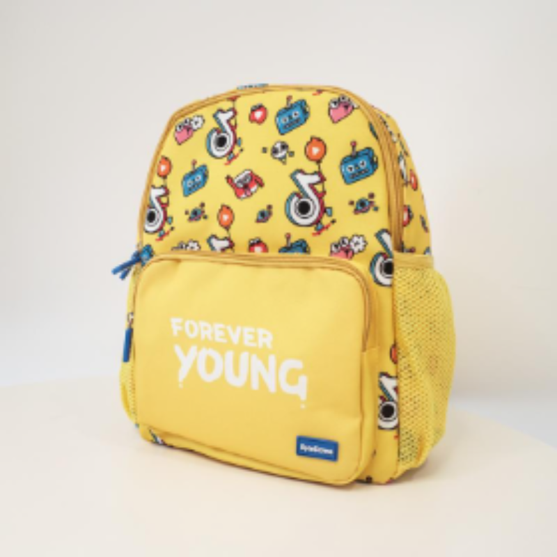
图片中是一个有卡通画像装饰的黄色背包。
Code
<script lang="ts">
    import { Chat, type ChatAvatarSnippetProps, type ChatMessage, type ChatTitleSnippetProps } from '@fibrae/semi-ai-svelte';
    import { Avatar, Radio, RadioGroup, type RadioValue } from '@fibrae/semi-ui-svelte';

    const roleConfig = {
        user: {
            name: 'User',
            avatar: '/assets/docs-icon.png',
        },
        assistant: {
            name: 'Assistant',
            avatar: '/assets/placeholder/logo.svg',
        },
        system: {
            name: 'System',
            avatar: '/assets/placeholder/logo.svg',
        },
    };

    const uploadProps = { action: 'https://api.semi.design/upload' };

    let id = 0;
    const getId = () => `id-${id++}`;

    const formatTime = (createAt = Date.now()) => {
        const date = new Date(createAt);
        return `${String(date.getHours()).padStart(2, '0')}:${String(date.getMinutes()).padStart(2, '0')}`;
    };

    let messages = $state<ChatMessage[]>([
        {
            role: 'system',
            id: '1',
            createAt: 1715676751919,
            content: "Hello, I'm your AI assistant.",
        },
        {
            role: 'user',
            id: '2',
            createAt: 1715676751919,
            content: [
                {
                    type: 'text',
                    text: '这张图片里有什么?',
                },
                {
                    type: 'image_url',
                    image_url: {
                        url: '/assets/root-web-sites/edit-bag.jpeg',
                    },
                },
            ],
        },
        {
            role: 'assistant',
            id: '3',
            createAt: 1715676751919,
            content: '图片中是一个有卡通画像装饰的黄色背包。',
        },
    ]);
    let titleMode = $state<RadioValue | undefined>('null');
    let avatarMode = $state<RadioValue | undefined>('null');

    const onMessageSend = () => {
        const newAssistantMessage: ChatMessage = {
            role: 'assistant',
            id: getId(),
            content: 'This is a mock response',
        };
        setTimeout(() => {
            messages = [...messages, newAssistantMessage];
        }, 200);
    };
</script>

{#snippet customAvatar({ role }: ChatAvatarSnippetProps)}
    <Avatar shape="square" size="extra-small" style="flex-shrink: 0">{role.name}</Avatar>
{/snippet}

{#snippet customTitle({ role, message }: ChatTitleSnippetProps)}
    <span class="title">
        {role.name}
        <span class="time">{formatTime(message.createAt)}</span>
    </span>
{/snippet}

<!-- a provided snippet that renders nothing hides the avatar or the title -->
{#snippet nothing()}{/snippet}

<span style="display: flex; flex-direction: column; row-gap: 8px; margin-bottom: 5px">
    <span style="display: flex; align-items: center; column-gap: 10px">
        头像渲染模式
        <RadioGroup aria-label="头像渲染模式" bind:value={avatarMode} type="button">
            <Radio value="default">默认头像</Radio>
            <Radio value="null">无头像</Radio>
            <Radio value="custom">自定义头像</Radio>
        </RadioGroup>
    </span>
    <span style="display: flex; align-items: center; column-gap: 10px">
        标题渲染模式
        <RadioGroup aria-label="标题渲染模式" bind:value={titleMode} type="button">
            <Radio value="default">默认标题</Radio>
            <Radio value="null">无标题</Radio>
            <Radio value="custom">自定义标题</Radio>
        </RadioGroup>
    </span>
</span>
{#key `${avatarMode}${titleMode}`}
    <Chat
        avatar={avatarMode === 'custom' ? customAvatar : avatarMode === 'null' ? nothing : undefined}
        bind:chats={messages}
        class="component-chat-demo-custom-render"
        {onMessageSend}
        {roleConfig}
        style="border: 1px solid var(--semi-color-border); border-radius: 16px; height: 400px"
        title={titleMode === 'custom' ? customTitle : titleMode === 'null' ? nothing : undefined}
        {uploadProps}
    />
{/key}
When hovering over a conversation, the conversation action area will be displayed. You can customize the rendering of the action area using the action snippet. defaultActions is an array of snippets of the default buttons, rendered with {#each} and {@render}.
Hello, I'm your AI assistant.
介绍一下 semi design
Semi Design 是由抖音前端团队和MED产品设计团队设计、开发并维护的设计系统
Code
<script lang="ts">
    import { Chat, type ChatMessage } from '@fibrae/semi-ai-svelte';
    import { IconForward, IconMoreStroked } from '@fibrae/semi-icons-svelte';
    import { Button, Dropdown, type DropDownMenuItem } from '@fibrae/semi-ui-svelte';

    const roleConfig = {
        user: {
            name: 'User',
            avatar: '/assets/docs-icon.png',
        },
        assistant: {
            name: 'Assistant',
            avatar: '/assets/placeholder/logo.svg',
        },
        system: {
            name: 'System',
            avatar: '/assets/placeholder/logo.svg',
        },
    };

    const uploadProps = { action: 'https://api.semi.design/upload' };
    const menu: DropDownMenuItem[] = [{ node: 'item', name: '分享' }];

    let id = 0;
    const getId = () => `id-${id++}`;

    let messages = $state<ChatMessage[]>([
        {
            role: 'system',
            id: '1',
            createAt: 1715676751919,
            content: "Hello, I'm your AI assistant.",
        },
        {
            role: 'user',
            id: '2',
            createAt: 1715676751919,
            content: '介绍一下 semi design',
        },
        {
            role: 'assistant',
            id: '3',
            createAt: 1715676751919,
            content: 'Semi Design 是由抖音前端团队和MED产品设计团队设计、开发并维护的设计系统',
        },
    ]);

    const onMessageSend = () => {
        const newAssistantMessage: ChatMessage = {
            role: 'assistant',
            id: getId(),
            content: 'This is a mock response',
        };
        setTimeout(() => {
            messages = [...messages, newAssistantMessage];
        }, 200);
    };
</script>

<Chat bind:chats={messages} {onMessageSend} {roleConfig} style="border: 1px solid var(--semi-color-border); border-radius: 16px; height: 400px" {uploadProps}>
    {#snippet action({ defaultActions, class: actionClass })}
        <span class={actionClass}>
            {#each defaultActions as defaultAction, index (index)}
                {@render defaultAction()}
            {/each}
            <Dropdown {menu} position="top" trigger="click">
                {#snippet menuIcon()}
                    <IconForward />
                {/snippet}
                {#snippet child({ props })}
                    <Button {...props} aria-label="更多" class="semi-chat-chatBox-action-btn" theme="borderless" type="tertiary">
                        {#snippet icon()}
                            <IconMoreStroked />
                        {/snippet}
                    </Button>
                {/snippet}
            </Dropdown>
        </span>
    {/snippet}
</Chat>
You can customize the content area using the content snippet; render the built-in content with {@render defaultContent()} when needed.
Code
<script lang="ts">
    import { Chat, type ChatMessage } from '@fibrae/semi-ai-svelte';
    import { IconChevronUp } from '@fibrae/semi-icons-svelte';
    import { Avatar, AvatarGroup, MarkdownRender } from '@fibrae/semi-ui-svelte';

    interface Source {
        avatar: string;
        url: string;
        title: string;
        subTitle: string;
        content: string;
    }

    const roleConfig = {
        user: {
            name: 'User',
            avatar: '/assets/docs-icon.png',
        },
        assistant: {
            name: 'Assistant',
            avatar: '/assets/placeholder/logo.svg',
        },
        system: {
            name: 'System',
            avatar: '/assets/placeholder/logo.svg',
        },
    };

    const uploadProps = { action: 'https://api.semi.design/upload' };

    let id = 0;
    const getId = () => `id-${id++}`;

    const sourcesOf = (item: ChatMessage): Source[] | undefined => item.source;

    let messages = $state<ChatMessage[]>([
        {
            role: 'assistant',
            id: '3',
            createAt: 1715676751919,
            content: 'Semi Design 是由抖音前端团队,MED 产品设计团队设计、开发并维护的设计系统。它作为全面、易用、优质的现代应用 UI 解决方案,从字节跳动各业务线的复杂场景提炼而来,支撑近千计平台产品,服务内外部 10 万+ 用户。',
            source: [
                {
                    avatar: '/assets/placeholder/logo.svg',
                    url: '/zh-CN/start/introduction',
                    title: 'semi Design',
                    subTitle: 'Semi design website',
                    content: 'Semi Design 是由抖音前端团队,MED 产品设计团队设计、开发并维护的设计系统。',
                },
                {
                    avatar: '/assets/placeholder/logo.svg',
                    url: '/dsm/landing',
                    subTitle: 'Semi DSM website',
                    title: 'Semi 设计系统',
                    content: '从 Semi Design,到 Any Design 快速定义你的设计系统,并应用在设计稿和代码中',
                },
                {
                    avatar: '/assets/placeholder/logo.svg',
                    url: '/code/zh-CN/start/introduction',
                    subTitle: 'Semi D2C website',
                    title: '设计稿转代码',
                    content: 'Semi 设计稿转代码(Semi Design to Code,或简称 Semi D2C),是由抖音前端 Semi Design 团队推出的全新的提效工具',
                },
            ],
        },
    ]);
    // Only the first message carries sources, so one open state serves the whole list
    let collapsed = $state(true);

    const onMessageSend = () => {
        const newAssistantMessage: ChatMessage = {
            role: 'assistant',
            id: getId(),
            content: 'This is a mock response',
        };
        setTimeout(() => {
            messages = [...messages, newAssistantMessage];
        }, 200);
    };

    const buttonReset = 'border: none; background: var(--semi-color-tertiary-light-hover); border-radius: 16px; font-family: inherit; line-height: inherit';
</script>

<Chat bind:chats={messages} {onMessageSend} {roleConfig} style="border: 1px solid var(--semi-color-border); border-radius: 16px; height: 500px" {uploadProps}>
    {#snippet content({ message, class: contentClass })}
        {@const sources = sourcesOf(message)}
        <div class={contentClass}>
            {#if sources}
                <div style="transition: {collapsed ? 'height 0.4s ease, width 0.4s ease' : 'height 0.4s ease'}; height: {collapsed ? '30px' : '200px'}; width: {collapsed ? '190px' : '100%'}; background: var(--semi-color-tertiary-light-hover); border-radius: 16px; box-sizing: border-box; margin-bottom: 10px">
                    {#if collapsed}
                        <button style="{buttonReset}; display: flex; width: fit-content; column-gap: 10px; padding: 5px 10px; cursor: pointer; font-size: 14px; color: var(--semi-color-text-1)" type="button" onclick={() => (collapsed = false)}>
                            <span>基于{sources.length}个搜索来源</span>
                            <AvatarGroup items={sources.map((source) => ({ alt: '', src: source.avatar }))} size="extra-extra-small" />
                        </button>
                    {:else}
                        <button style="{buttonReset}; width: 100%; height: 100%; box-sizing: border-box; display: flex; flex-direction: column; padding: 12px; text-align: start; font-size: inherit; color: inherit" type="button" onclick={() => (collapsed = true)}>
                            <span style="display: flex; align-items: center; justify-content: space-between; padding: 5px 10px; column-gap: 10px; color: var(--semi-color-text-1)">
                                <span style="font-size: 14px; font-weight: 500">Source</span>
                                <IconChevronUp />
                            </span>
                            <span style="display: flex; flex-wrap: wrap; gap: 10px; overflow: scroll; padding: 5px 10px">
                                {#each sources as source (source.url)}
                                    <span style="display: flex; flex-direction: column; row-gap: 5px; flex-basis: 150px; flex-grow: 1; border: 1px solid var(--semi-color-border); border-radius: 12px; padding: 12px; font-size: 12px">
                                        <span style="display: flex; column-gap: 5px; align-items: center">
                                            <Avatar alt="" shape="square" src={source.avatar} style="width: 16px; height: 16px; flex-shrink: 0" />
                                            <span style="color: var(--semi-color-text-2); text-overflow: ellipsis">
                                                {source.title}
                                            </span>
                                        </span>
                                        <span style="color: var(--semi-color-primary); font-size: 12px">{source.subTitle}</span>
                                        <span style="display: -webkit-box; -webkit-box-orient: vertical; -webkit-line-clamp: 3; text-overflow: ellipsis; overflow: hidden; color: var(--semi-color-text-2)">
                                            {source.content}
                                        </span>
                                    </span>
                                {/each}
                            </span>
                        </button>
                    {/if}
                </div>
            {/if}
            <MarkdownRender raw={typeof message.content === 'string' ? message.content : ''} />
        </div>
    {/snippet}
</Chat>
Use the fullChatBox snippet to custom render the entire chat box; render the parts in defaultNodes with {@render defaultNodes.title()} and the like.
System Hello, I'm your AI assistant.
介绍一下 semi design
Assistant Semi Design 是由抖音前端团队和MED产品设计团队设计、开发并维护的设计系统
Code
<script lang="ts">
    import { Chat, type ChatMessage } from '@fibrae/semi-ai-svelte';
    import { Avatar } from '@fibrae/semi-ui-svelte';

    const roleConfig = {
        user: {
            name: 'User',
            avatar: '/assets/docs-icon.png',
        },
        assistant: {
            name: 'Assistant',
            avatar: '/assets/placeholder/logo.svg',
        },
        system: {
            name: 'System',
            avatar: '/assets/placeholder/logo.svg',
        },
    };

    const uploadProps = { action: 'https://api.semi.design/upload' };
    const titleStyle = 'display: flex; align-items: center; justify-content: center; column-gap: 10px; padding: 5px 0px; width: fit-content';

    let id = 0;
    const getId = () => `id-${id++}`;

    let messages = $state<ChatMessage[]>([
        {
            role: 'system',
            id: '1',
            createAt: 1715676751919,
            content: "Hello, I'm your AI assistant.",
        },
        {
            role: 'user',
            id: '2',
            createAt: 1715676751919,
            content: '介绍一下 semi design',
        },
        {
            role: 'assistant',
            id: '3',
            createAt: 1715676751919,
            content: 'Semi Design 是由抖音前端团队和MED产品设计团队设计、开发并维护的设计系统',
        },
    ]);

    const onMessageSend = () => {
        const newAssistantMessage: ChatMessage = {
            role: 'assistant',
            id: getId(),
            content: 'This is a mock response',
        };
        setTimeout(() => {
            messages = [...messages, newAssistantMessage];
        }, 200);
    };
</script>

<Chat bind:chats={messages} {onMessageSend} {roleConfig} style="border: 1px solid var(--semi-color-border); border-radius: 16px; height: 400px" {uploadProps}>
    {#snippet fullChatBox({ role, message, defaultNodes, class: boxClass })}
        <div class={boxClass}>
            <div style="display: flex; flex-direction: column; row-gap: 4px;{message.role === 'user' ? ' align-items: end' : ''}">
                {#if message.role !== 'user'}
                    <span style={titleStyle}>
                        <Avatar alt="" shape="square" size="extra-small" src={role.avatar} />
                        {@render defaultNodes.title()}
                    </span>
                {/if}
                <div style="width: fit-content">
                    {@render defaultNodes.content()}
                </div>
                {@render defaultNodes.action()}
            </div>
        </div>
    {/snippet}
</Chat>
Custom render InputArea
The input area can be customized through the inputArea snippet, the parameters are as follows
import type { Snippet } from 'svelte';

export interface ChatInputAreaSnippetProps {
    /* Default node */
    defaultNode: Snippet;
    /* Clear context button */
    clearContextNode: Snippet;
    /* Upload button, null when every upload way is off */
    uploadNode: Snippet | null;
    /* Text input */
    inputNode: Snippet;
    /* Send button */
    sendNode: Snippet;
    /* If the input is customized, call it when sending a message */
    onSend: (content?: string, attachment?: FileItem[]) => void;
    /* If the clear context button is customized, call it when clearing the context */
    onClear: () => void;
    /* Handler that focuses the text input on click */
    onClick: () => void;
}
An example of using the part nodes is as follows
<Chat bind:chats>
    {#snippet inputArea({ uploadNode, inputNode, sendNode, onClick })}
        <div style="margin: 8px 16px; display: flex; flex-direction: row; align-items: flex-end; border-radius: 16px; padding: 10px; border: 1px solid var(--semi-color-border)" role="presentation" onclick={onClick}>
            {@render uploadNode?.()}
            {@render inputNode()}
            {@render sendNode()}
        </div>
    {/snippet}
</Chat>
Other Example:
Hello, I'm your AI assistant.
Code
<script lang="ts">
    import { Chat, type ChatMessage } from '@fibrae/semi-ai-svelte';
    import { IconUpload } from '@fibrae/semi-icons-svelte';
    import { Button, Form, FormInput, FormUpload, type FileItem, type FormApi } from '@fibrae/semi-ui-svelte';

    interface InputValues {
        name?: string;
        file?: FileItem[];
    }

    const roleConfig = {
        user: {
            name: 'User',
            avatar: '/assets/docs-icon.png',
        },
        assistant: {
            name: 'Assistant',
            avatar: '/assets/placeholder/logo.svg',
        },
        system: {
            name: 'System',
            avatar: '/assets/placeholder/logo.svg',
        },
    };

    const uploadProps = { action: 'https://api.semi.design/upload' };

    let id = 0;
    const getId = () => `id-${id++}`;

    let messages = $state<ChatMessage[]>([
        {
            role: 'system',
            id: '1',
            createAt: 1715676751919,
            content: "Hello, I'm your AI assistant.",
        },
    ]);

    type Send = (content?: string, attachment?: FileItem[]) => void;

    let formApi: FormApi<InputValues> | undefined;

    const onMessageSend = () => {
        const newAssistantMessage: ChatMessage = {
            role: 'assistant',
            id: getId(),
            content: 'This is a mock response',
        };
        setTimeout(() => {
            messages = [...messages, newAssistantMessage];
        }, 200);
    };

    const submit = (onSend: Send) => {
        if (!formApi) {
            return;
        }
        const values = formApi.getValues();
        if (values.name?.length || values.file?.length) {
            onSend(values.name, values.file);
            formApi.reset();
        }
    };
</script>

<Chat bind:chats={messages} {onMessageSend} {roleConfig} style="border: 1px solid var(--semi-color-border); border-radius: 16px; height: 500px" {uploadProps}>
    {#snippet inputArea({ onSend })}
        <div style="display: flex; flex-direction: column; border: 1px solid var(--semi-color-border); margin: 8px 16px; border-radius: 8px; padding: 8px">
            <Form getFormApi={(api) => (formApi = api)}>
                <strong>输入信息</strong>
                <FormInput field="name" label="名称(Input)" style="width: 250px" trigger="blur" />
                <FormUpload action={uploadProps.action} field="file" label="文档">
                    <Button theme="light">
                        {#snippet icon()}
                            <IconUpload />
                        {/snippet}
                        点击上传
                    </Button>
                </FormUpload>
            </Form>
            <Button style="width: fit-content" onclick={() => submit(onSend)}>提交</Button>
        </div>
    {/snippet}
</Chat>
Hint
The prompt area content can be set through hints. After clicking the prompt content, it is sent as a new user message and triggers the onHintClick callback.
Semi Design 是由抖音前端团队和MED产品设计团队设计、开发并维护的设计系统,你可以向我提问任何关于 Semi 的问题。
Code
<script lang="ts">
    import { Chat, type ChatMessage } from '@fibrae/semi-ai-svelte';

    const roleConfig = {
        user: {
            name: 'User',
            avatar: '/assets/docs-icon.png',
        },
        assistant: {
            name: 'Assistant',
            avatar: '/assets/placeholder/logo.svg',
        },
        system: {
            name: 'System',
            avatar: '/assets/placeholder/logo.svg',
        },
    };

    const uploadProps = { action: 'https://api.semi.design/upload' };

    let id = 0;
    const getId = () => `id-${id++}`;

    let messages = $state<ChatMessage[]>([
        {
            role: 'assistant',
            id: '1',
            createAt: 1715676751919,
            content: 'Semi Design 是由抖音前端团队和MED产品设计团队设计、开发并维护的设计系统,你可以向我提问任何关于 Semi 的问题。',
        },
    ]);
    let hints = $state(['告诉我更多', 'Semi Design 的组件有哪些?', '我能够通过 DSM 定制自己的主题吗?']);

    const onMessageSend = () => {
        const newAssistantMessage: ChatMessage = {
            role: 'assistant',
            id: getId(),
            createAt: Date.now(),
            content: '这是一条 mock 回复信息',
        };
        setTimeout(() => {
            messages = [...messages, newAssistantMessage];
        }, 200);
    };
</script>

<Chat bind:chats={messages} {hints} onClear={() => (hints = [])} onHintClick={() => (hints = [])} {onMessageSend} {roleConfig} style="border: 1px solid var(--semi-color-border); border-radius: 16px; height: 400px" {uploadProps} />
Custom render Hint
Customize the content of the prompt area through the hintBox snippet, the parameters are as follows
export interface ChatHintBoxSnippetProps {
    content: string;
    index: number;
    onHintClick: () => void;
}
Example:
Semi Design 是由抖音前端团队和MED产品设计团队设计、开发并维护的设计系统,你可以向我提问任何关于 Semi 的问题。
Code
<script lang="ts">
    import { Chat, type ChatMessage } from '@fibrae/semi-ai-svelte';
    import { IconArrowRight } from '@fibrae/semi-icons-svelte';

    const roleConfig = {
        user: {
            name: 'User',
            avatar: '/assets/docs-icon.png',
        },
        assistant: {
            name: 'Assistant',
            avatar: '/assets/placeholder/logo.svg',
        },
        system: {
            name: 'System',
            avatar: '/assets/placeholder/logo.svg',
        },
    };

    const hintStyle = 'border: 1px solid var(--semi-color-border); padding: 10px; border-radius: 10px; background: none; color: var(--semi-color-text-1); display: flex; justify-content: space-between; align-items: center; text-align: left; cursor: pointer; font-family: inherit; font-size: 14px; line-height: inherit';
    const uploadProps = { action: 'https://api.semi.design/upload' };

    let id = 0;
    const getId = () => `id-${id++}`;

    let messages = $state<ChatMessage[]>([
        {
            role: 'assistant',
            id: '1',
            createAt: 1715676751919,
            content: 'Semi Design 是由抖音前端团队和MED产品设计团队设计、开发并维护的设计系统,你可以向我提问任何关于 Semi 的问题。',
        },
    ]);
    let hints = $state(['告诉我更多', 'Semi Design 的组件有哪些?', '我能够通过 DSM 定制自己的主题吗?']);

    const onMessageSend = () => {
        const newAssistantMessage: ChatMessage = {
            role: 'assistant',
            id: getId(),
            createAt: Date.now(),
            content: '这是一条 mock 回复信息',
        };
        setTimeout(() => {
            messages = [...messages, newAssistantMessage];
        }, 200);
        hints = [];
    };
</script>

<Chat bind:chats={messages} {hints} onClear={() => (hints = [])} onHintClick={() => (hints = [])} {onMessageSend} {roleConfig} style="border: 1px solid var(--semi-color-border); border-radius: 16px; height: 400px" {uploadProps}>
    {#snippet hintBox({ content, onHintClick })}
        <button style={hintStyle} type="button" onclick={onHintClick}>
            {content}
            <IconArrowRight style="margin-inline-start: 10px" />
        </button>
    {/snippet}
</Chat>
API Reference
Props
| Property | Description | Type | Default |
|---|---|---|---|
| action | Snippet that customizes the message action bar, with message, the default buttons defaultActions (an array of snippets), defaultActionsObj indexed by name, and the class name class. | TypeSnippet<[ChatActionSnippetProps]> | - |
| align | Conversation layout: leftRight or leftAlign. | ChatAlign | "leftRight" |
| avatar | Snippet that customizes the message avatar, with message, role and the built-in avatar defaultAvatar (a snippet). Provided and rendering nothing, it hides the avatar. | TypeSnippet<[ChatAvatarSnippetProps]> | - |
| bottomSlot | Snippet for the content below the input box. | Snippet | - |
| canSend | Whether the send button is enabled. It is decided internally by default; when set, this value wins. | boolean | - |
| chats | The conversation list, bindable with bind:chats. When a message is sent, liked, reset, cleared or deleted, Chat writes the new list back first and then calls onChatsChange. Replacing the list, a push and in-place growth of the last message's text are followed; other in-place edits (a deep content edit, a lone status flip) render but are not followed, so replace the array as a whole. | ChatMessage[] | - |
| content | Snippet that customizes the message content area, with message, role, the built-in content defaultContent (a snippet) and the class name class. | TypeSnippet<[ChatContentSnippetProps]> | - |
| customMarkDownComponents | Custom Markdown render components, keyed by element name, passed to the MarkdownRender of the message content. | MarkdownRenderComponents | - |
| divider | Snippet that customizes the divider after the context is cleared, with message. | TypeSnippet<[ChatDividerSnippetProps]> | - |
| enableUpload | Whether upload is enabled. A boolean controls paste, click and drag upload together; an object sets pasteUpload, clickUpload and dragUpload separately, and an unset item is true. | boolean | ChatEnableUploadProps | true |
| escapeHtml | Whether to escape HTML tags in the user's messages, so the Markdown parser does not treat them as HTML and drop the content. | boolean | true |
| fullChatBox | Snippet that customizes the whole message box, with message, role, the default nodes defaultNodes (snippets) and the class name class. | TypeSnippet<[ChatFullChatBoxSnippetProps]> | - |
| hintBox | Snippet that customizes a hint, with content, index and the click handler onHintClick. | TypeSnippet<[ChatHintBoxSnippetProps]> | - |
| hintCls | Class name of the outermost element of the hints area. | string | - |
| hints | The list of hints. Clicking one calls onHintClick and sends it as a new user message. | string[] | - |
| hintStyle | Style of the outermost element of the hints area, a string. | string | - |
| inputArea | Snippet that customizes the input area, with defaultNode, the part nodes (clearContextNode, uploadNode, inputNode, sendNode, all snippets), and onSend, onClear and onClick, which you call yourself. | TypeSnippet<[ChatInputAreaSnippetProps]> | - |
| inputBoxCls | Class name of the input box. | string | - |
| inputBoxStyle | Style of the input box, a string. | string | - |
| markdownRenderProps | Props passed to the MarkdownRender that renders the message content; the default format is md. raw and components cannot be set; use customMarkDownComponents for custom render components. | ChatMarkdownRenderProps | - |
| mode | Conversation mode: bubble, noBubble or userBubble. | ChatMode | "bubble" |
| onChatsChange | Called when the conversation list changes, after chats is written back. | Type(chats: ChatMessage[]) => void | - |
| onClear | Called when the context is cleared. | Type() => void | - |
| onHintClick | Called when a hint is clicked, with the hint text. | Type(hint: string) => void | - |
| onInputChange | Called when the input or the attachments change, with { inputValue, attachment }. | Type(props: ChatInputChangeProps) => void | - |
| onMessageBadFeedback | Called when a message gets negative feedback. | Type(message: ChatMessage) => void | - |
| onMessageCopy | Called when a message is copied. | Type(message: ChatMessage) => void | - |
| onMessageDelete | Called when a message is deleted. | Type(message: ChatMessage) => void | - |
| onMessageGoodFeedback | Called when a message gets positive feedback. | Type(message: ChatMessage) => void | - |
| onMessageReset | Called when a message is reset; the argument is null when it comes from the resetMessage method. | Type(message: ChatMessage | null) => void | - |
| onMessageSend | Called when a message is sent, with the text and the attachments. | Type(content: string, attachment?: FileItem[]) => void | - |
| onStopGenerator | Called when the stop button is clicked. | Type(event: MouseEvent) => void | - |
| placeholder | Placeholder of the input box. | string | - |
| roleAvatar | Snippet for the avatar content of a role without an image URL, with message and role. | TypeSnippet<[ChatRoleAvatarSnippetProps]> | - |
| roleConfig | Role information, keyed by the message role. avatar takes an image URL only; an avatar node goes through the roleAvatar snippet. color is passed to Avatar. | ChatRoleConfig | - |
| sendHotKey | Send hot key: enter or shift+enter. With enter, Enter sends and Shift+Enter inserts a line break; shift+enter is the reverse. | SendHotKey | "enter" |
| showClearContext | Whether to show the clear context button in the input box. | boolean | false |
| showStopGenerate | Whether to show the stop button while the last message is generating. Sending is disabled meanwhile, and clicking the stop button calls onStopGenerator. | boolean | false |
| title | Snippet that customizes the message title, with message, role and the built-in title defaultTitle (a snippet). Provided and rendering nothing, it hides the title. | TypeSnippet<[ChatTitleSnippetProps]> | - |
| topSlot | Snippet for the content at the top of the conversation area. | Snippet | - |
| uploadButton | Snippet that replaces the upload button. | Snippet | - |
| uploadProps | Props passed to Upload. Chat owns fileList and children, and the upload button content is the uploadButton snippet; Chat handles onChange itself when an attachment is added or removed, and the other callbacks pass through. action falls back to an empty string, so nothing is uploaded unless a customRequest or an action is given. | ChatUploadProps | - |
| uploadTip | Snippet for the upload button's tip text. | Snippet | - |
| uploadTipProps | Props of the upload button's Tooltip, without content; the tip text is the uploadTip snippet. | TypeOmit<TooltipProps, 'content' | 'children' | 'child'> | - |
Methods
| Method | Description | Type |
|---|---|---|
| clearContext | Appends a divider at the end of the conversation to clear the context and calls onClear; it has no effect when the list already ends with a divider. | Type() => void |
| resetMessage | Resets the last message to an empty loading state and calls onMessageReset with null. | Type() => void |
| scrollToBottom | Scrolls to the bottom, smoothly when animation is true, otherwise it jumps. | Type(animation?: boolean) => void |
| sendMessage | Sends a message; without attachment the message content is a string. | Type(text: string, attachment?: FileItem[]) => void |
class, style and the other undeclared attributes and events (such as data-*, aria-* and ondragover) land on the root div, and class is merged with the component's own class name. When the root has aria-label or aria-labelledby and no role, it gets role="group". The ondragover, ondragstart and ondragend listeners also land on the root, and Chat's own drag-upload handling runs before the caller's listener.
RoleConfig
| PROPERTIES | INSTRUCTIONS | TYPE | DEFAULT |
|---|---|---|---|
| user | User information | ChatMetadata | - |
| assistant | Assistant information | ChatMetadata | - |
| system | System information | ChatMetadata | - |
Metadata
| PROPERTIES | INSTRUCTIONS | TYPE | DEFAULT |
|---|---|---|---|
| name | name | string | - |
| avatar | avatar image URL; an avatar node goes through the roleAvatar snippet | string | - |
| color | Avatar background color, same as the color parameter of Avatar component, support amber、 blue、 cyan、 green、 grey、 indigo、 light-blue、 light-green、 lime、 orange、 pink、 purple、 red、 teal、 violet、 yellow | AvatarColor | grey |
Message
| PROPERTIES | INSTRUCTIONS | TYPE | DEFAULT |
|---|---|---|---|
| role | role | string | - |
| name | name | string | - |
| id | Uniquely identifies | string | - |
| content | all content | string | Content[] | - |
| parentId | parent Uniquely identifies | string | - |
| createAt | creation time | number | - |
| status | Information status, loading | incomplete | complete | error | string | complete |
Content
| PROPERTIES | INSTRUCTIONS | TYPE | DEFAULT |
|---|---|---|---|
| type | type, support text | image_url | file_url | string | - |
| text | Content data when type is text | string | - |
| image_url | Content data when type is image_url | { url: string } | - |
| file_url | Content data when type is file_url | { url: string; name: string; size: string; type: string } | - |
Accessibility
Keyboard and Focus
- In the input box,
EnterorShift+Entersends the message, as decided bysendHotKey: withenter,Entersends andShift+Enterinserts a line break;shift+enteris the reverse. Shift+Tabin the input box returns to the upload button. The default upload button is a native button:EnterorSpaceopens the file dialog. When an upload tip is set, its text is the description of that button and is shown while the button has focus.- The stop generation button only exists while generating. When generation ends and the button is unmounted, focus that was on it moves to the input box instead of falling to the start of the page.
- Except on the last finished message, the message action bar stays hidden while remaining in the
Taborder, and shows when focus enters one of its buttons. The confirmation opened by the delete button closes withEscand focus returns to the delete button; inside a Modal only the confirmation closes and the Modal stays open. - The message list is a named
role="log"region witharia-busy="true"while the last message is generating, so screen readers announce the reply once it completes rather than chunk by chunk.
Design Token
| Sass variable | Value | Usage |
|---|---|---|
| $radius-chat_chatBox_content | var(--semi-border-radius-large) | 聊天框内容圆角 |
| $radius-chat_inputBox_container | 16px | 输入框容器圆角 |
| $radius-chat_attachment_img | var(--semi-border-radius-medium) | 附件图片圆角 |
| $radius-chat_attachment_file | var(--semi-border-radius-medium) | 附件文件圆角 |
| $radius-chat_hint_item | var(--semi-border-radius-large) | 提示条圆角 |
| $radius-chat_chatBox_content_code | var(--semi-border-radius-large) | 代码块圆角 |
| $radius-chat_chatBox_content_code_topSlot_copy | var(--semi-border-radius-large) | 代码块顶部复制按钮圆角 |
| $radius-chat_dropArea | 16px | 拖拽上传区域圆角 |
| $color-chat_action_content-bg | var(--semi-color-bg-0) | 返回按钮/停止生成内容按钮背景颜色 |
| $color-chat_action_content-border | var(--semi-color-border) | 返回按钮/停止生成按钮描边颜色 |
| $color-chat_divider | var(--semi-color-text-2) | 分割线文字颜色 |
| $color-chat_chatBox_title | var(--semi-color-text-0) | 聊天框标题颜色 |
| $color-chat_chatBox_action_icon | var(--semi-color-text-2) | 聊天框操作区域按钮图标颜色 |
| $color-chat_chatBox_action_icon-hover | var(--semi-color-text-0) | 聊天框操作区域按钮图标hover颜色 |
| $color-chat_chatBox_action-bg-hover | transparent | 聊天框操作区域按钮hover背景颜色 |
| $color-chat_chatBox_content_text | var(--semi-color-text-0) | 聊天框内容文字颜色 |
| $color-chat_chatBox_content_bg | var(--semi-color-fill-0) | 聊天框内容背景颜色 |
| $color-chat_chatBox_content_user-bg | var(--semi-color-primary) | 聊天框内容用户背景颜色 |
| $color-chat_chatBox_content_user-text | var(--semi-color-white) | 聊天框内容用户文字颜色 |
| $color-chat_chatBox_content_error-bg | var(--semi-color-danger-hover) | 聊天框内容错误背景颜色 |
| $color-chat_chatBox_content_error-text | var(--semi-color-white) | 聊天框内容错误文字颜色 |
| $color-chat_inputBottom_clearButton_icon | var(--semi-color-text-2) | 清空按钮图标颜色 |
| $color-chat_inputBottom_uploadButton_icon | var(--semi-color-text-0) | 上传按钮图标颜色 |
| $color-chat_inputBottom_sendButton_icon-disable | var(--semi-color-primary-disabled) | 发送按钮禁用态图标颜色 |
| $color-chat_inputBox_container-border | var(--semi-color-border) | 输入框容器边框颜色 |
| $color-chat_attachment_clear_icon | var(--semi-color-text-2) | 附件清除图标颜色 |
| $color-chat_attachment_file-bg | var(--semi-color-fill-0) | 附件文件背景颜色 |
| $color-chat_attachment_fail | var(--semi-color-danger) | 附件上传失败的提示图标颜色 |
| $color-chat_chatBox_user_attachment_file-bg | var(--semi-color-bg-0) | 用户聊天框附件文件背景颜色 |
| $color-chat_chatBox_other_attachment_file-bg | var(--semi-color-fill-2) | 聊天框附件文件背景颜色 |
| $color-chat_attachment_file_icon | var(--semi-color-text-2) | 附件文件图标颜色 |
| $color-chat_attachment_file_title | var(--semi-color-text-0) | 附件文件标题颜色 |
| $color-chat_attachment_file_metadata_text | var(--semi-color-text-2) | 附件文件元数据文字颜色 |
| $color-chat_hint_item-border | var(--semi-color-border) | 提示条边框颜色 |
| $color-chat_hint_item-bg | transparent | 提示条背景颜色 |
| $color-chat_hint_item-bg-hover | var(--semi-color-fill-0) | 提示条hover背景颜色 |
| $color-chat_hint_content_text | var(--semi-color-text-1) | 提示条文字颜色 |
| $color-chat_hint_icon | var(--semi-color-text-2) | 提示条图标颜色 |
| $color-chat_chatBox_loading-bg | var(--semi-color-text-0) | 聊天内容加载图标圆圈颜色 |
| $color-chat_chatBox_code_topSlot | var(--semi-white) | 代码块顶部字体颜色 |
| $color-chat_chatBox_code_topSlot-bg | var(--semi-grey-4) | 代码块顶部背景色 |
| $color-chat_chatBox_code_topSlot_toCopy-bg-hover | var(--semi-grey-5) | 代码块顶部复制按钮hover背景色 |
| $color-chat_chatBox_code_content | var(--semi-color-bg-0) | 代码块内容背景色 |
| $color-chat_action_content-bg-hover | var(--semi-color-tertiary-light-hover) | 返回按钮/停止生成按钮hover背景颜色 |
| $color-chat_dropArea-bg | rgb(from var(--semi-grey-2) r g b / 0.9) | 拖拽区域文字颜色 |
| $color-chat_dropArea-border | var(--semi-color-border) | 拖拽区域边框颜色 |
| $spacing-chat_paddingY | 12px | chat组件上下内边距 |
| $spacing-chat_container-paddingX | 16px | 消息框水平内边距 |
| $spacing-chat_action_content-bottom | 0 | 返回按钮/停止生成按钮底部边距 |
| $spacing-chat_chatBox-marginY | 8px | 聊天框上下外边距 |
| $spacing-chat_chatBox-columnGap | 12px | 聊天框内容列间距 |
| $spacing-chat_chatBox_action-columnGap | 10px | 聊天框操作区域按钮列间距 |
| $spacing-chat_chatBox_action-marginX | 10px | 聊天框操作区域左右外边距 |
| $spacing-chat_chatBox_action_btn-padding | 0 | 聊天框操作区域按钮内边距 |
| $spacing-chat_chatBox_content-paddingY | 8px | 聊天框内容上下内边距 |
| $spacing-chat_chatBox_content-paddingX | 12px | 聊天框内容左右内边距 |
| $spacing-chat_inputBox-paddingTop | 8px | 输入框顶部内边距 |
| $spacing-chat_inputBox-paddingBottom | 8px | 输入框底部内边距 |
| $spacing-chat_inputBox-paddingX | 16px | 输入框左右内边距 |
| $spacing-chat_inputBox_container-padding | 11px | 输入框容器内边距 |
| $spacing-chat_inputBox_inner-columnGap | 4px | 输入框容器列间距 |
| $spacing-chat_inputBox-marginY | 4px | |
| $spacing-chat_attachment-columnGap | 10px | 附件列间距 |
| $spacing-chat_attachment-RowGap | 5px | 附件行间距 |
| $spacing-chat_attachment-marginX | 12px | 附件左右外边距 |
| $spacing-chat_attachment_clear-top | 8px | 附件清除图标顶部间距 |
| $spacing-chat_attachment_clear-right | 8px | 附件清除图标右内边距 |
| $spacing-chat_attachment_file-columnGap | 5px | 文件附件列间距 |
| $spacing-chat_attachment_file-padding | 5px | 文件附件内边距 |
| $spacing-chat_chatBox_loading_item-gap | 15px | 聊天内容加载图标间距 |
| $spacing-chat_divider-marginY | 12px | 分割线上下外边距 |
| $spacing-chat_chatBox_content_attachment-marginY | 4px | 聊天框内容文件/图片上下外间距 |
| $spacing-chat_chatBox_content_attachment-marginRight | 4px | 聊天框内容文件/图片上下右间距 |
| $spacing-chat_chatBox_content_code_topSlot-paddingX | 5px | 聊天框代码块顶部上下内边距 |
| $spacing-chat_chatBox_content_code_topSlot-paddingY | 8px | 聊天框代码块顶部左右内边距 |
| $spacing-chat_chatBox_content_code_topSlot_copy-columnGap | 5px | 聊天框代码块顶部复制按钮列间距 |
| $spacing-chat_chatBox_content_code_topSlot_copy-padding | 5px | 聊天框代码块顶部复制按钮列间距 |
| $spacing-chat_chatBox_wrap | 8px | 聊天框外层间距 |
| $spacing-chat_hint-rowGap | 10px | 提示条行间距 |
| $spacing-chat_hint-marginY | 12px | 提示条容器上下外边距 |
| $spacing-chat_hint-marginLeft | 34px | 提示条容器左外边距 |
| $spacing-chat_hint_item-marginY | 8px | 提示条上下外边距 |
| $spacing-chat_hint_item-marginX | 12px | 提示条左右外边距 |
| $spacing-chat_hint_item-columnGap | 20px | 提示条内容列间距 |
| $spacing-chat_chatBox_loading-item-marginX | 18px | 聊天内容加载图标中心圆圈左右外边距 |
| $spacing-chat_chatBox_loading-item-marginY | 6px | 聊天内容加载图标中心圆圈上下外边距 |
| $width-chat_backBottom_wrapper | 42px | 返回按钮宽度 |
| $width-chat_action_content-border | 1px | 返回按钮/停止生成按钮描边宽度 |
| $width-chat_inputBottom_clearButton | 48px | 清空按钮宽度 |
| $width-chat_inputBottom_uploadButton | 32px | 上传按钮宽度 |
| $width-chat_inputBottom_sendButton | 32px | 发送按钮宽度 |
| $width-chat_inputBox_container-border | 1px | 输入框容器边框宽度 |
| $width-chat_hint_item-border | 1px | 提示条边框宽度 |
| $width-chat_chatBox_loading | 8px | 加载中单个圆圈图标宽度 |
| $width-chat_attachment_file_title | 90px | 附件文件标题最大宽度 |
| $width-chat_max | 800px | chat组件最大宽度 |
| $width-chat_dropArea-border | 5px | 拖拽上传边框宽度 |
| $width-chat_chatBox_content_code_topSlot_copy | 150px | 聊天框代码块顶部复制按钮最小宽度 |
| $width-chat_chatBox_avatar | 24px | 聊天框头像宽度 |
| $height-chat_action_stop | 42px | 停止生成按钮高度 |
| $font-chat_divider-fontWeight | $font-weight-regular | 分割线字重 |
| $font-chat_divider-fontSize | $font-size-small | 分割线字体大小 |
| $font-chat_chatBox_title-lineHeight | 20px | 聊天框标题行高 |
| $font-chat_chatBox_title-fontSize | $font-size-header-6 | 聊天框标题字体大小 |
| $font-chat_chatBox_title-fontWeight | $font-weight-regular | 聊天框标题字重 |
| $font-chat_inputBottom_clearButton_icon-fontSize | 30px | 输入区清空上下文按钮图标大小 |
| $font-chat_attachment_file_title-fontSize | $font-size-header-6 | 附件文件标题字体大小 |
| $font-chat_attachment_file_metadata-fontSize | $font-size-regular | 附件文件元数据字体大小 |
| $font-chat_hint_content-fontSize | $font-size-regular | 提示条文字大小 |
| $font-chat_chatBox_code_topSlot | 12px | 代码块顶部字体大小 |
| $font-chat_chatBox_code_topSlot-lineHeight | 16px | 代码块顶部区域字体行高 |
| $font-chat_dropArea_text | 48px | 拖拽上传区域文字大小 |
| $z-chat_dropArea | 10 | 拖拽上传区域z-index |
| $z-chat_action | 1 | 返回按钮/停止生成按钮z-index |