When to use
Cropper is used to crop pictures. It supports custom cropping box styles. The positions of the cropping box, cropped image can be adjusted by dragging. It can zoom and rotate the cropped pictures.
Demos
How to import
<script lang="ts">
    import { Cropper } from '@fibrae/semi-ui-svelte';
</script>
Basic usage
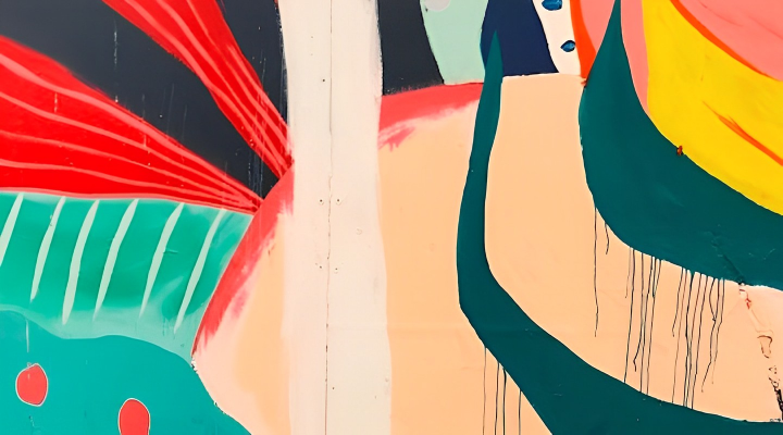
Use src to set the cropped image; use shape to set the shape of the cropping box, which defaults to square.
Code
<script lang="ts">
    import { Button, Cropper, Radio, RadioGroup, type CropperShape, type RadioValue } from '@fibrae/semi-ui-svelte';

    const containerStyle = 'width: 550px; height: 300px; margin: 20px';

    let cropper = $state<ReturnType<typeof Cropper>>();
    let shape = $state<RadioValue | undefined>('rect');
    let cropperUrl = $state('');

    const onButtonClick = () => {
        const canvas = cropper?.getCropperCanvas();
        if (canvas) cropperUrl = canvas.toDataURL();
    };
</script>

<RadioGroup aria-label="裁切框形状" bind:value={shape} name="demo-cropper-shape">
    <Radio value="rect">rect</Radio>
    <Radio value="round">round</Radio>
    <Radio value="roundRect">roundRect</Radio>
</RadioGroup>
<Cropper bind:this={cropper} shape={shape as CropperShape} src="/assets/other/image.png" style={containerStyle} />
<Button onclick={onButtonClick}>裁切</Button>
<br />
<br />
{#if cropperUrl}
    <img alt="裁切结果" src={cropperUrl} style="height: 400px" />
{/if}
Customize crop box ratio
The initial crop box ratio can be passed through defaultAspectRatio (default is 1). A fixed crop box ratio can be set via aspectRatio.
Setting defaultAspectRatio only takes effect on the initial crop box ratio. When dragging, the crop box ratio will change with dragging.
When setting aspectRatio, the crop box ratio is fixed, and the crop box will change according to this ratio when dragging. When aspectRatio changes after the image has loaded, the crop box is laid out again at the new ratio: its height is kept, its width follows the ratio, it shrinks to fit the container when it would overflow, and its center stays where it is as far as possible. When aspectRatio becomes undefined the box is not laid out again.
Code
<script lang="ts">
    import { Button, Cropper } from '@fibrae/semi-ui-svelte';

    const containerStyle = 'width: 550px; height: 300px; margin: 20px';

    let cropper = $state<ReturnType<typeof Cropper>>();
    let cropperUrl = $state('');

    const onButtonClick = () => {
        const canvas = cropper?.getCropperCanvas();
        if (canvas) cropperUrl = canvas.toDataURL();
    };
</script>

<Cropper aspectRatio={3 / 4} bind:this={cropper} src="/assets/other/image.png" style={containerStyle} />
<Button onclick={onButtonClick}>裁切</Button>
<br />
<br />
{#if cropperUrl}
    <img alt="裁切结果" src={cropperUrl} style="height: 400px" />
{/if}
Controlled rotation/zooming of images
Control image rotation and zoom through rotate and zoom. zoom can be bound with bind:zoom, a function binding bind:zoom={get, set}, or passed one-way as zoom={x}; wheel zooming also calls onZoomChange(zoom). rotate is one-way only: the component never changes it. zoom does not read the global default.
Code
<script lang="ts">
    import { Button, Cropper, Slider } from '@fibrae/semi-ui-svelte';

    const containerStyle = 'width: 550px; height: 300px; margin: 20px';
    const actionStyle = 'margin-top: 20px; display: flex; align-items: center; justify-content: center; width: fit-content';

    let rotate = $state(0);
    let zoom = $state(1);
    let cropper = $state<ReturnType<typeof Cropper>>();
    let cropperUrl = $state('');

    const onSliderChange = (value: number | number[]) => {
        if (typeof value === 'number') rotate = value;
    };

    const onZoomSliderChange = (value: number | number[]) => {
        if (typeof value === 'number') zoom = value;
    };

    const onButtonClick = () => {
        const canvas = cropper?.getCropperCanvas();
        if (canvas) cropperUrl = canvas.toDataURL();
    };
</script>

<div id="cropper-container">
    <Cropper bind:this={cropper} bind:zoom {rotate} src="/assets/other/image.png" style={containerStyle} />
    <div style={actionStyle}>
        <span id="cropper-rotate-zoom-rotate">旋转</span>
        <Slider aria-labelledby="cropper-rotate-zoom-rotate" max={360} min={-360} onChange={onSliderChange} step={1} style="width: 500px" value={rotate} />
    </div>
    <div style={actionStyle}>
        <span id="cropper-rotate-zoom-zoom">缩放</span>
        <Slider aria-labelledby="cropper-rotate-zoom-zoom" max={3} min={0.1} onChange={onZoomSliderChange} step={0.1} style="width: 500px" value={zoom} />
    </div>
    <br />
    <Button onclick={onButtonClick}>裁切</Button>
    <br />
    <br />
    {#if cropperUrl}
        <img alt="裁切结果" src={cropperUrl} style="height: 400px" />
    {/if}
</div>
Crop box settings
The crop box style can be customized through cropperBoxStyle, cropperBoxCls. You can use showResizeBox to set whether to display the adjustment blocks at the corners of the crop box.
Code
<script lang="ts">
    import { Button, Cropper } from '@fibrae/semi-ui-svelte';

    const containerStyle = 'width: 550px; height: 300px; margin: 20px';

    let cropper = $state<ReturnType<typeof Cropper>>();
    let cropperUrl = $state('');

    const onButtonClick = () => {
        const canvas = cropper?.getCropperCanvas();
        if (canvas) cropperUrl = canvas.toDataURL();
    };
</script>

<strong>showResizeBox = false,并修改边框颜色</strong>
<Cropper bind:this={cropper} cropperBoxStyle="outline-color: var(--semi-color-bg-0)" showResizeBox={false} src="/assets/other/image.png" style={containerStyle} />
<Button onclick={onButtonClick}>裁切</Button>
<br />
<br />
{#if cropperUrl}
    <img alt="裁切结果" src={cropperUrl} style="height: 400px" />
{/if}
Live preview
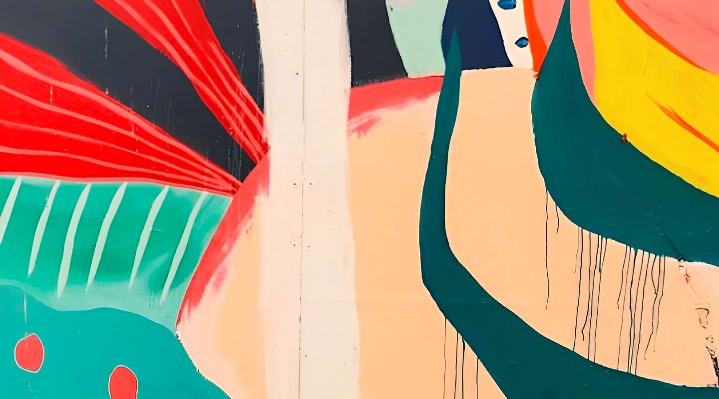
Use preview to specify a container that previews the crop result in real time. preview is a function returning the container DOM; it may return null or undefined while the container is not mounted yet.
Code
<script lang="ts">
    import { Button, Cropper, Slider } from '@fibrae/semi-ui-svelte';

    const containerStyle = 'width: 550px; height: 300px; margin: 20px';
    const actionStyle = 'margin-top: 20px; display: flex; align-items: center; justify-content: center; width: fit-content';

    let rotate = $state(0);
    let zoom = $state(1);
    let cropperUrl = $state('');
    let cropper = $state<ReturnType<typeof Cropper>>();
    let previewWrapper = $state<HTMLDivElement>();

    const onSliderChange = (value: number | number[]) => {
        if (typeof value === 'number') rotate = value;
    };

    const onZoomSliderChange = (value: number | number[]) => {
        if (typeof value === 'number') zoom = value;
    };

    const onButtonClick = () => {
        const canvas = cropper?.getCropperCanvas();
        if (canvas) cropperUrl = canvas.toDataURL();
    };

    // a function so the cropper reads the wrapper when it needs it; the element is undefined until it has mounted
    const preview = () => previewWrapper;
</script>

<div>
    <Cropper bind:this={cropper} bind:zoom {preview} {rotate} src="/assets/root-web-sites/abstract.jpg" style={containerStyle} />
    <div style={actionStyle}>
        <span id="cropper-preview-rotate">旋转</span>
        <Slider aria-labelledby="cropper-preview-rotate" max={360} min={-360} onChange={onSliderChange} step={1} style="width: 500px" value={rotate} />
    </div>
    <div style={actionStyle}>
        <span id="cropper-preview-zoom">缩放</span>
        <Slider aria-labelledby="cropper-preview-zoom" max={3} min={0.1} onChange={onZoomSliderChange} step={0.1} style="width: 500px" value={zoom} />
    </div>
    <br />
    <div style="display: flex">
        <div style="width: 50%; flex-grow: 1">
            <strong>实时预览</strong>
            <div bind:this={previewWrapper} style="height: 300px; margin-top: 8px"></div>
        </div>
        <div style="width: 50%; flex-grow: 1; padding-left: 10px">
            <Button onclick={onButtonClick}>裁切</Button>
            <br />
            <br />
            {#if cropperUrl}
                <img alt="裁切结果" src={cropperUrl} style="width: 90%" />
            {/if}
        </div>
    </div>
</div>
API
Props
| Property | Description | Type | Default |
|---|---|---|---|
| aspectRatio | Fixed aspect ratio of the crop box. When it changes after loading, the box is laid out again at the new ratio. | number | - |
| cropperBoxCls | Class name of the crop box. | string | - |
| cropperBoxStyle | Style string of the crop box. | string | - |
| defaultAspectRatio | Initial aspect ratio of the crop box, which changes while dragging. | number | 1 |
| fill | Fill color of the parts of the result that are not the image. | string | "rgba(0, 0, 0, 0)" |
| imgProps | Attributes passed to the img element being cropped. src and the layout style belong to the component; class and style are merged with its own, and onload is called after the component has handled it. alt defaults to an empty string and crossorigin to anonymous; both can be overridden. | HTMLImgAttributes | - |
| maxZoom | Maximum zoom factor. | number | 3 |
| minZoom | Minimum zoom factor. | number | 0.1 |
| onZoomChange | Called by wheel zooming, with the new zoom. | Type(zoom: number) => void | - |
| preview | Function returning the DOM element that mirrors the cropped area live. It may return null while the element is not mounted yet. | Type() => HTMLElement | null | undefined | - |
| rotate | Image rotation angle. It is one-way: the component never changes it. | number | - |
| shape | Shape of the crop box. | CropperShape | "rect" |
| showResizeBox | Whether to show the resize handles on the corners of the crop box. | boolean | true |
| src | Address of the image to crop. | string | - |
| zoom | Zoom, applied on top of the initial scaling that fits the image into the cropper; use bind:zoom, a function binding or a one-way value. Wheel zooming updates the bound value and calls onZoomChange. | number | - |
| zoomStep | Zoom change per wheel step. | number | 0.1 |
Methods
| Method | Description | Type |
|---|---|---|
| getCropperCanvas | Draws the area inside the crop box at the image's own resolution onto a new canvas and returns it. It throws when called before the image has loaded. | Type() => HTMLCanvasElement |
class, style and native attributes and events (such as id, data-*, aria-* and onkeydown) land on the root <div>; role can be overridden. Call getCropperCanvas() on the component instance obtained through bind:this.
Accessibility
- With
aria-labeloraria-labelledbyand noroleon the root, the root getsrole="group"; aroleyou pass wins - The crop box is a focusable named group (
role="group", with its name and role description from the locale, andaria-describedbypointing to the usage hint). It becomes focusable once the image has loaded. Theimgbeing cropped is decorative: itsaltdefaults to an empty string and can be overridden throughimgProps - Only a mouse press with the primary button, or a touch or pen contact, starts dragging the crop box, a resize handle or the image; a middle or right mouse press does not
Keyboard and focus
- The crop box is the only tab stop in the component, and is focusable only after the image has loaded
- With focus on the crop box, each arrow key moves the box by 10px, and the box stays inside the container
- Shift + arrow keys move the bottom right corner of the box by 10px to resize it, within the container; when
aspectRatiois set the ratio is kept (a horizontal change is converted to height). This works only whileshowResizeBoxis true (the handles are shown); with false, Shift + arrow keys do nothing - Zoom and rotation have no built-in keyboard control; provide a keyboard-operable control for them (such as the Slider in the demos)
Design Token
| Sass variable | Value | Usage |
|---|---|---|
| $color-cropper_mask-bg | var(--semi-color-overlay-bg) | |
| $color-cropper_box-outline | var(--semi-color-primary) | |
| $color-cropper_box_corner-bg | var(--semi-color-primary) | |
| $width-cropper_box-outline | 1px | |
| $width-cropper_box_corner | 10px |